Manual: Lowercase Letters

Roman capital letters are ideal for monumental inscriptions, serving as elegant tools that command respect. The letters commanded respect but are impractical for daily communication such as business documents, literature, personal correspondence, grocery lists, and graffiti, all of which were also vital in ancient Roman life, making the slowly constructed capitals cumbersome.
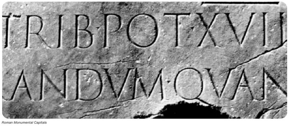
As always, form follows function, leading to the evolution of letterforms suited for less formal purposes. Monumental inscriptions were crafted by stone cutters, while scribes – specialists in writing on papyrus or other materials – began developing more flexible styles. Over time, other handwriting styles emerged: Square Capitals, Rustic Capitals (or Rustica), and Roman Cursive.
Square Capitals aimed to replicate inscriptional letters, primarily reserved for formal documents. They displayed careful craftsmanship yet allowed for quicker writing compared to stone inscriptions.
Rustic Capitals were introduced to save space and time, featuring a narrower and simpler design that made them more economical for less important documents.

Roman Cursive, used for mundane tasks like bookkeeping and correspondence, became the standard hand until around 500 A.D. Unlike Square and Rustic Capitals, Roman Cursive facilitated faster writing, often resulting in illegible outcomes. Its distinctive feature was the connected letters, which included ascenders and descenders that differentiated it from the capital forms.

As the Roman Empire expanded, the demand for written documents grew, leading to the development of two new styles: Uncial and Half-Uncial. Uncial, designed for formal works like Bibles, marked an early step toward lowercase letters. By the early sixth century, Half-Uncial emerged, providing a more condensed and readable style, moving closer to the modern alphabet we recognize today.

With the spread of Christianity, local monks began adapting these styles, leading to what are now referred to as “National Hands,” unique writing styles specific to geographical regions.
Up until about 800 A.D., changes in the alphabet were gradual and evolutionary, without distinct lines of demarcation in design development. This began to shift dramatically when Charlemagne ascended the throne of the Holy Roman Empire in 771.

Charlemagne was not content with merely reigning; he expanded reforms initiated by his father, Pepin, and sought to stimulate a revival of learning and civic betterment. During a visit to Parma, he met the renowned English scholar Alcuin, whom he invited to create an educational system for his empire. Alcuin accepted and, as part of the plan, began standardizing a style of writing for the numerous new versions of the Vulgate Bible. This resulted in the creation of Carolingian minuscule, the predecessor of today’s lowercase letters.

Carolingian minuscules are significant because they provided models for lowercase printing types still in use today. They eliminated cursive forms, ensuring letters remained distinct from one another and avoided ligatures. When combined, the letters resulted in only minor changes in form. Additionally, these letters were drawn more robustly than their predecessors, making them well-suited for movable type, when Gutenberg invented typography
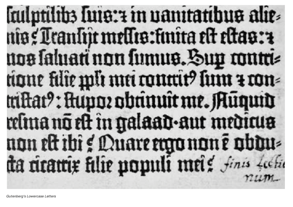
In the 15th and 16th centuries, early Latin typeface designers, such as Griffo, Jensen and Garamond used Carolingian minuscules as models for lowercase letters. used them as models in the 15th and 16th centuries.
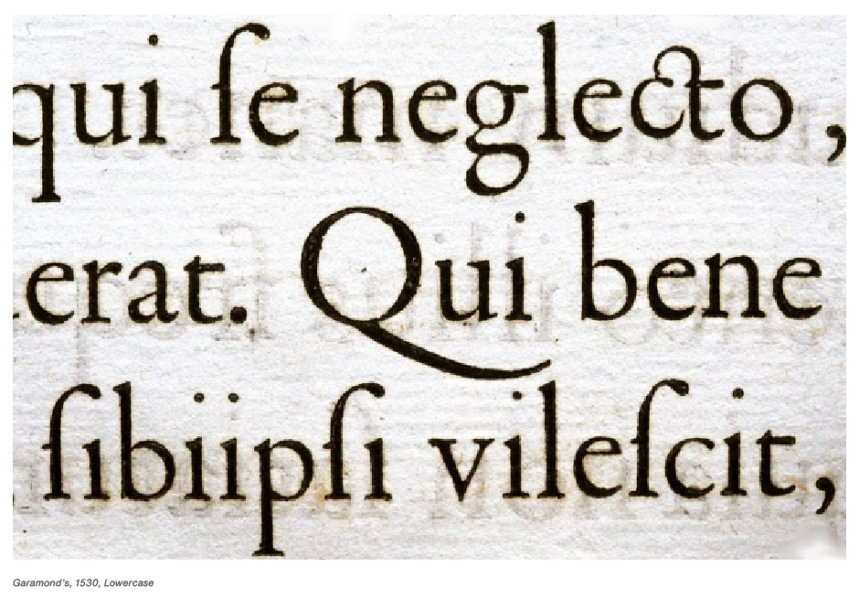
This standard was maintained in the 18th century in the work of John Baskerville, and has continued well into the 20th, with the type designs of Frederick Goudy, Hermann Zapf and Matthew Carter.
Although attempts have been made to tamper with letterform designs: to condense them or expand them, to equalize their varying widths, to electronically change their proportions, the results have not replaced the design standard set by the Romans and their successors. It has become the quintessential melding of art and information.
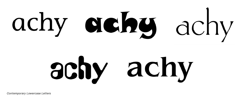
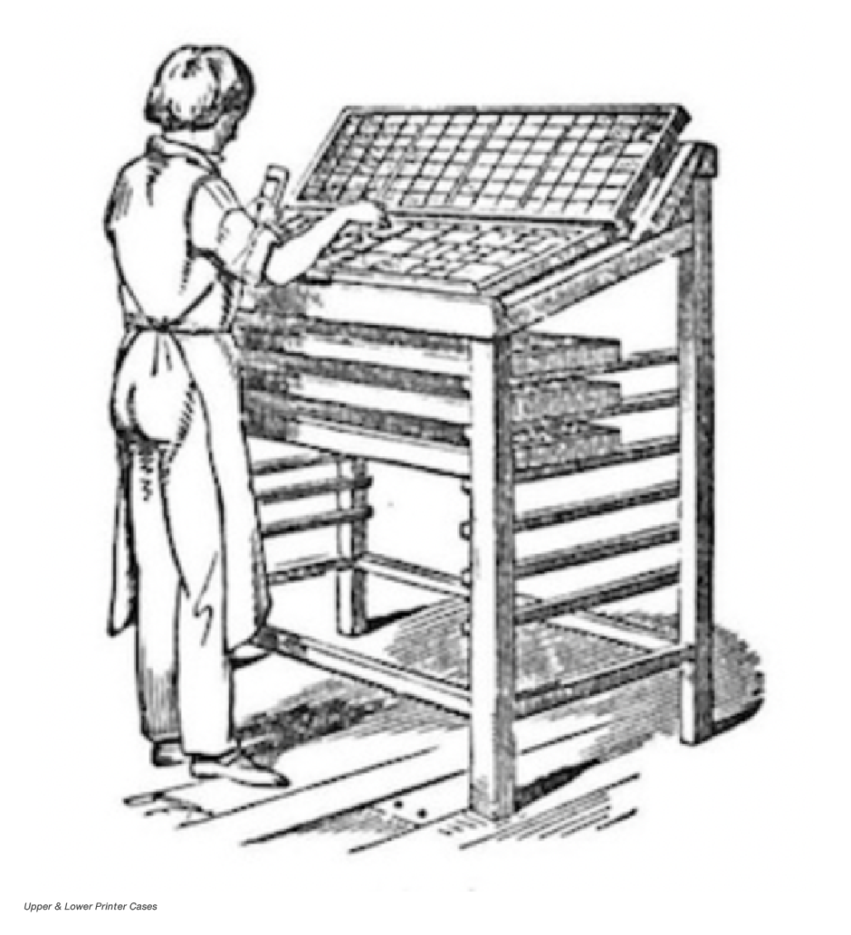
The term “lowercase” originated in the mid-19th century when typesetters organized metal letters into separate cases. Small letters, used more frequently than capitals, were placed in a lower tray for convenience. The capital letters were stored above, in an upper case, leading to the terms “lowercase” and “uppercase.”
