Manual: Reversing Display Type - Enhancing Emphasis and Hierarchy
Reversing type – placing light or white copy against a dark background – can be an effective way to add emphasis and establish a strong typographic hierarchy. A reverse headline creates an inviting, eye-catching focal point, guiding the viewer’s attention before they explore other elements.
The goal of reversing display type is to generate visual interest and contrast without compromising harmony or readability. Key considerations include:
Choosing a Typeface
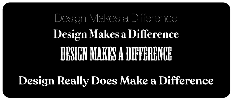
Type can appear altered when reversed, so select a typeface that performs well under these conditions. Sans serif or serif designs with sturdy serifs work best. Avoid ultra-thin strokes, very light serifs, extreme weight contrasts, and small counters, as these may lose clarity when reversed.
Selecting the Background
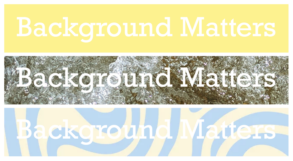
Reversing type on a solid, dark background yields consistent results. However, vibrant or irregular backgrounds – such as busy images, patterns, bright colors, or variable tones – can reduce legibility. Opt for backgrounds with uniform patterns and colors for the best results.
Adjusting Spacing
Light or white type on dark backgrounds often appears to space tighter than dark type on light backgrounds. The extent depends on typestyle, size, copy length, printing surface, and medium. To maintain readability, adjust tracking (letter spacing) as needed to counteract this optical tightening effect.

Designing for the Imaging Medium
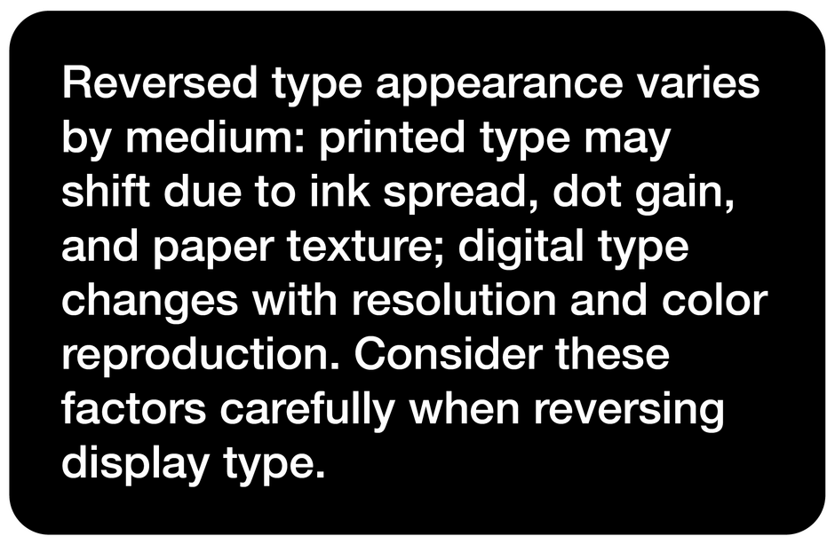
Reversed type appearance varies by medium. Printed type may shift due to ink spread, dot gain, and paper texture, while digital type changes with resolution and color reproduction. Consider these factors when reversing display type.
The idea of reversing a block of text type out of a dark background is about as sound an idea as skating on pond ice in April. Reversed text type is harder to read than dark type against a light background; studies have also shown that readers don’t like to read blocks of reversed type.
Reversing display type can be a dynamic and powerful communications tool. Attention to detail, however, is key to making it work.


