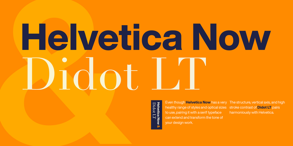
Helvetica Now & Didot LT Font Pairing

Dressed Up
Helvetica Now’s Micro designs are simplified and exaggerated to maintain the impression of Helvetica in tiny type. There’s also an extensive set of alternates, which allow designers the opportunity to experiment with and adapt Helvetica’s tone of voice. The new Condensed weights put more type into smaller spaces—for intense emphasis, sophisticated contrast, or just everyday space-fitting. “For more than six decades, Helvetica has been the essential typeface,” says Monotype Type Director Charles Nix. “The release of Helvetica Now insures that it will be a typographic force for decades to come.”
The strong clear forms of Didot LT’s alphabet display objective, rational characteristics and are representative of the time and philosophy of the Enlightenment. Adrian Frutiger’s Didot is a sensitive interpretation of the French Modern Face Didot. Another model for this design is the Henriade, an historical printing of the original Didot from 1818. The font Didot gives text a classic and elegant feel.