Select this license type when you are developing an app for iOS, Android, or Windows Phone, and you will be embedding the font file in your mobile application's code.
1790 Royal Printing
by GLC
Individual Styles from $15.00
Complete family of 4 fonts: $85.00

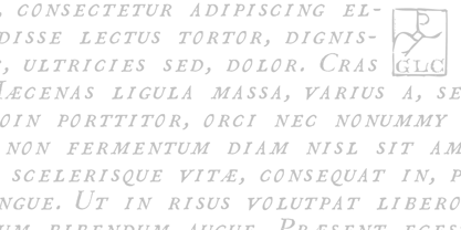
1790 Royal Printing Font Family was
designed by
published by
GLC. 1790 Royal Printing contains
4
styles and family package options.
More about this family
- Aa Glyphs
-
Best ValueFamily Packages
- Individual Styles
- Tech Specs
- Licensing
Per style:
$21.25
Pack of 4 styles:
$85.00
About 1790 Royal Printing Font Family
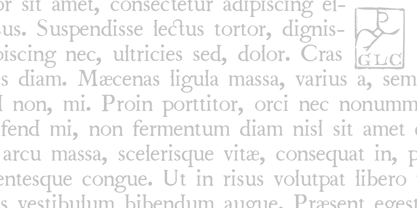
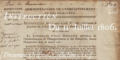
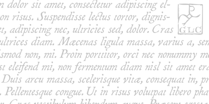
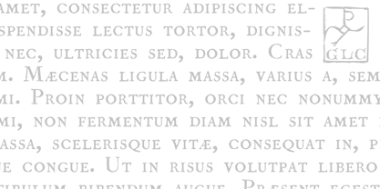
From 1702 to 1811 the French "Royal", then "Imperial", Printers, neglected Garamond and Fournier's designs and used only the font called "Romain du Roy", carved (1693 to 1723) by Philippe Grandjean by order of the king Louis XIV. 1790 Royal Printing was inspired by various variants of Romain du Roy that were in use during this period. Our sources were mainly official and legal documents printed in the late royal period, and in the beginning of the French revolution. There was no bold style. The 1790 Royal Printing Caps fonts contain small caps, plus titling caps for headlines as 1790 Royal Printing capitals are intended to be used preferably for text.
1790 Royal Printing

About GLC
Gilles Le Corre was born in 1950 in Nantes, France. Painter since the end of 70s, he is also an engraver and calligrapher. He has been learning about medieval art and old books for as long as he can remember. More recently he has made the computer a tool for writing like the quill pen and ink. With it, he aims to make it possible to print books that look just like old ones! Beginning in 2007 he has been trying to reproduce, very exactly, a wide range of historic European typefaces, mainly from medieval and early periods of printing - his favorite period - from 1456 with Gutenberg, up to 1913 with a font inspired by a real old typewriter.
Read more
Read less
- Choosing a selection results in a full page refresh.