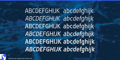
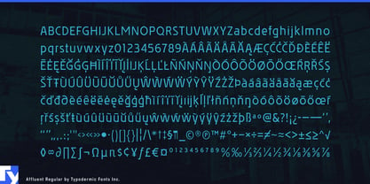
Affluent is an ugly typeface with a good reason for looking that way. It was designed near the end of the CRT era, when small lettering on inexpensive television displays could shimmer, blur, and break into colour fringes. Its near-horizontal strokes were quantized and sharpened in an attempt to reduce those problems, while its verticals were allowed to run more freely. The resulting letterforms are stiff, uneven, and unmistakably governed by a system.
That system is Affluent’s most useful quality. The construction is visible, but its purpose is not obvious. Little shelves, steps, and flattened curves suggest that the lettering has been adapted to an unfamiliar technical requirement. Like MICR characters encountered without any knowledge of magnetic-ink recognition, the shapes appear to obey rules established somewhere beyond the design itself. An unseen standards committee, proprietary display technology, procurement specification, or safety regulation seems to have decided that information must look this way.
This implied constraint can add bureaucratic depth to science-fiction world building. Most futuristic typefaces establish the genre through conspicuous geometry, segmented strokes, gaps, or streamlined proportions. Affluent takes a quieter route: it resembles an institutional sans distorted by some necessary but unexplained process. The lettering supplies evidence of a larger system without revealing how that system works. It can make a fictional technology feel as though it has accumulated standards, compatibility problems, and decades of administrative history.
That quality suits the ordinary infrastructure of invented worlds: specimen records, access credentials, pharmaceutical cartons, laboratory notices, equipment interfaces, identification plates, public-information screens, safety procedures, cloned-food labels, and internal documents from corporations engaged in programs they would prefer not to explain. It can suggest an underfunded research facility, an obsolete electronics manufacturer, or an institution whose technology was once considered advanced and has remained mandatory long after anyone remembers why.
Affluent also belongs naturally to the less glamorous side of turn-of-the-millennium technology: diagnostic displays, cable-TV graphics, instruction screens, electronics packaging, DVD menus, karaoke machines, off-brand game hardware, and fictional operating systems assembled under severe budgetary constraints. In electronic-music graphics, its awkward rhythm can evoke electroclash flyers, industrial-techno releases, pirate-radio schedules, track listings, and venue projections made with unfashionable software.
Affluent never acquired the elegance its name promises; it sounds less like the typeface than the corporation responsible for it.