This is a listing of all glyphs contained in the
font, including
OpenType variants that may only be accessible via OpenType-aware
applications.
Each basic character (“A”) is followed by Unicode variants of the same
character (Á, Ä…), then OpenType variants (small caps, alternates,
ligatures…). This way you can see all the variations on a single
character in one place.
You can use this font in any of the following places. Read the full EULA text for details about each license. If
you have a usage in mind that's not covered by these licenses, contact us and we'll see what we can do.
Desktop: for use on a desktop workstation
For the most common uses, both personal and professional, for use in desktop applications with a font
menu.
For example:
Install the font on your Mac OS X or Windows system
Use the font within desktop applications such as Microsoft Word, Mac Pages, Adobe InDesign, Adobe
Photoshop, etc.
Create and print documents, as well as static images (.jpeg, .tiff, .png)
Desktop licenses are based on the number of users of the fonts. You can change the number of users by
clicking the quantity dropdown option on Buying Choices or Cart pages.
Please be sure to review the listing foundry's
Desktop license agreement
as some restrictions may apply—such as use in logos/trademarks, geographic restrictions (number of
locations), and products that will be sold.
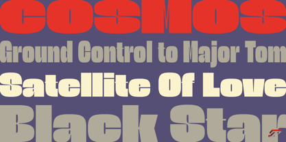
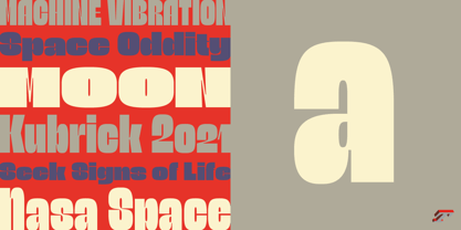
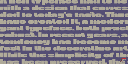
The Astronef Super borrows from the charm of retro-futuristic universes. Without concessions, and even radical, the Astronef Super, declined in three styles, pushes the weight limits as far as possible systematically while preserving a unique design.
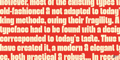
Using the Astronef Super in large size is a real pleasure, it is a very identifiable typeface family, recognizable immediately. Undeniably, choosing the Astronef Super in your designs is not insignificant. This typeface used in large sizes will strengthen your graphic identities.
Background
The Astronef Super could be considered as the “Spin-off” of the Astronef currently being designed, that will offer an important variation of styles. Of course the Astronef, is wiser in his drawing, it places himself in the tradition of the Univers more than the Helvetica.
Genesis and the creative process
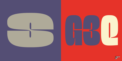
The idea for an Astronef Super comes from an excerpt from a 60s TV show which shows a logo in the background with a very bold S and this super thin in the middle.
The Astronef is already modular in its design. The brief then becomes simple for the Super: accentuate the strongest weights of the Astronef by minimizing the counterform that will remain constant for the three styles. It is the mass effect that maintains the overall cohesion of the Astronef Super family.
Founded in 1994 by Jean-François Porchez, Typofonderie is an independent digital type foundry in France, designing, manufacturing and distributing a selection of high quality typefaces for adventurous digital typographers. This is the first place in the world to buy our digital fonts.
Based in Clamart (France) from the end of 2008, Typofonderie as foundry, is dedicated to the distribution of a selection of high quality typeface designs, while ZeCraft focuses on the bespoke typefaces and lettering projects.
Many of the Typofonderie typefaces have won prizes in international competitions.