What happens when ordinary letters stop behaving like ordinary letters?
You get Brashkick.
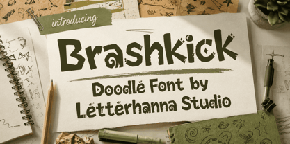
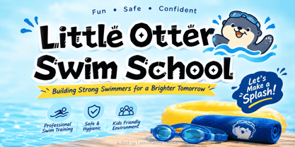
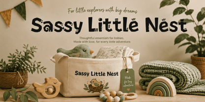
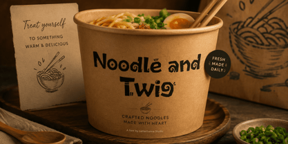
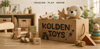
Brashkick is an expressive Doodle Font created for designers who want typography with attitude. Its bold, irregular letterforms combine rough geometry, hand-drawn imperfections, quirky details, and unexpected shapes to create a typeface that immediately grabs attention.
It doesn't look like it came from a perfectly measured grid.
It looks alive.
When Perfect Typography Feels Too Boring
Clean fonts are useful. Elegant fonts have their place. But sometimes a design can become so polished that it loses its personality.
That's where Brashkick comes in.
Instead of hiding imperfections, this Hand drawn font style turns them into the main attraction. Letters have uneven edges, exaggerated structures, strange little cuts, decorative marks, and distinctive shapes that make the alphabet feel illustrated.
Every character seems to have its own attitude.
Some letters look sharp and aggressive. Others feel playful and eccentric. Together, they create a visual language that is difficult to ignore.
The Unexpected Beauty of Imperfection
Brashkick is inspired by the visual freedom of doodling, but it pushes the idea much further.
Traditional doodles can feel casual and spontaneous. Brashkick takes that spontaneity and combines it with a heavy display presence.
The result is a Doodle Font that can dominate a composition without requiring complicated graphic effects.
This is the mind-blowing part: sometimes a single expressive word can create more visual impact than an entire collection of decorative elements.
The typography itself becomes the artwork.
A Font Built for Attention
Brashkick is particularly suitable for projects that need to feel youthful, creative, alternative, handmade, or slightly rebellious.
Try it for:
Streetwear and apparel graphics
Stickers and merchandise
Posters and event artwork
Logo concepts
Music covers
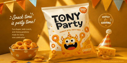
Creative packaging
Social media campaigns
YouTube thumbnails
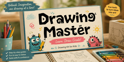
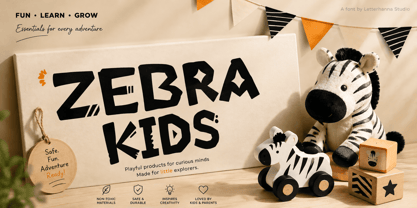
Children's products
Greeting cards
Fun editorial headlines
Personal creative projects
What Does Brashkick Feel Like?
Think of a sketchbook filled with strange ideas.
A marker moving too quickly.
A doodle becoming unexpectedly bold.
A playful drawing that refuses to stay inside the lines.
That is the personality of Brashkick.
It is quirky without being overly cute. Rough without feeling unfinished. Bold without losing its playful character.
Most importantly, it gives designers something that conventional fonts often struggle to provide: instant personality.
If your project needs a bold Doodle Font with a hand-drawn edge and an unmistakably unconventional personality, Brashkick is ready to kick predictable typography out of the frame.
Make your next headline louder, stranger, and more memorable with Brashkick.