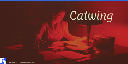
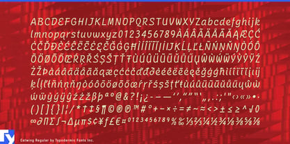
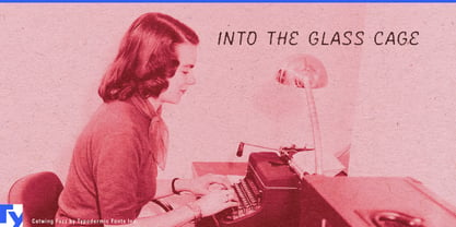
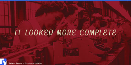
Catwing captures a typewriter’s attempt at handwriting. Script typewriters produced a machine-made version of personal correspondence: every character repeated exactly, every movement constrained by the mechanism, yet the result carried more warmth than an ordinary office face. Catwing preserves that curious middle ground between individual gesture and standardized production.
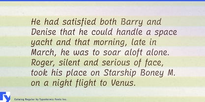
Its letterforms come from manual script typewriters, but the spacing has been redesigned proportionally. Narrow characters receive less room and wide ones receive more, allowing words to flow without the gaps and collisions imposed by fixed-pitch typing. Catwing evokes the machine without reproducing every mechanical restriction. Its restrained capitals can handle product names, menu sections, and headings; the lowercase carries notes, descriptions, quotations, and short passages.
This combination is particularly useful in food design. Many food scripts imitate brush lettering, chalk, or casual handwriting; Catwing offers a more orderly kind of personal attention. It can suggest a recipe card, test-kitchen note, restaurant office, or correspondence from a long-established producer. A package can feel as though its description was typed by someone who knows the recipe, even when the surrounding design is precise and contemporary.
Catwing can shape specialty-food packaging for preserves, biscuits, tea, coffee, confectionery, baking products, and seasonal releases. Its capitals suit product names and flavours, while the lowercase works for founder’s notes, serving suggestions, and short recipe introductions. Commercial cookbooks can use it to distinguish recipes, personal observations, or archival material from the main editorial typography.
Restaurant and hospitality identities offer another natural setting. Catwing can appear on cocktail lists, tasting menus, reservation cards, guest letters, room-service materials, table cards, and chef’s notes. The typewritten origin gives these pieces an administrative plausibility that conventional calligraphy lacks; they seem personal, but reproducible enough to belong to an operating business.
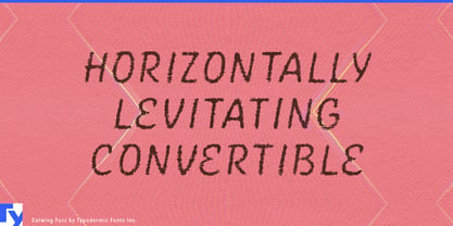
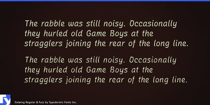
Regular and Fuzz provide two impressions of the same voice rather than a range of weights. Regular gives packaging, menus, and editorial layouts a clean interpretation of script typing. Fuzz introduces the roughness of an uneven ribbon impression, while automatic letter-pair substitutions reduce obvious repetition. It is particularly effective for reproduced recipes, historical inserts, period packaging, and correspondence props.
Catwing also suits period-drama titles, documentary quotations, archival captions, book covers, and exhibitions about correspondence, office culture, travel, or domestic history. A serif or sans family can carry ingredients, prices, instructions, and hierarchy; Catwing supplies the product name, recipe note, or message that seems to come from a particular person. It turns standardized typing into something unexpectedly intimate.