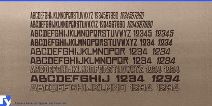
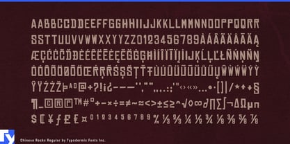
A distressed font is easy to use once. The harder problem begins when that rough headline has to become an identity. A game may need the same voice on a title card, faction name, settlement sign, freight crate and expansion logo. A sports campaign has to move from jersey lettering to arena graphics, merchandise and social media. Stretch one distressed font to fit every space and its character falls apart; switch between unrelated rough faces and the identity fragments.
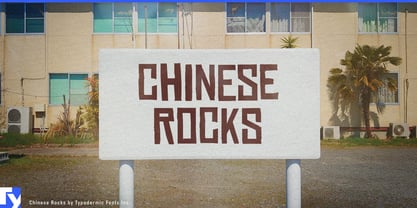
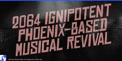
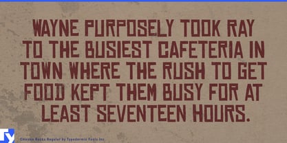
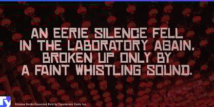
Chinese Rocks was built to go further. Its hand-cut, rubber-stamp character remains recognizable across condensed and expanded proportions, heavier styles, italics and shaded treatments. The family can change width, mass and emphasis while keeping the same crude freight-derived skeleton.
The design began with lettering found on twentieth-century Chinese export crates. Chinese Rocks preserves that irregular, knife-cut quality while turning it into a broad display system. The name refers to that freight source; the typeface is not an imitation of Chinese writing or decorative East Asian lettering.
Historical games and fictional worlds make especially good use of the range. Frontier settlements, mining camps, railway towns, ports and industrial outposts need far more than one title treatment. Chinese Rocks can move through faction names, shop signs, freight markings, chapter cards, wanted notices and vehicle lettering while preserving a common visual language. Condensed styles help long names fit narrow assets; Expanded styles fill storefronts and wide title cards; heavier variants give franchise and campaign names more mass.
That freight origin also keeps Chinese Rocks from collapsing into generic cowboy typography. Railway depots, warehouses, expedition bases, mining settlements and port districts all fit naturally within its visual world.
Contemporary sports provide a very different setting. Team identities have to survive chest lettering, merchandise marks, arena ribbons, scoreboard graphics and social campaigns. Chinese Rocks can supply a rough secondary voice for rivalry games, special editions, throwback programs and merchandise capsules while its width variations solve practical space problems.
Expedition luggage, overland storage systems, protective equipment cases and heritage travel products can use Chinese Rocks for product-family names and campaign graphics that relate naturally to crates and handling marks. Film and streaming production design can use the family similarly for fictional freight companies, railway operations, warehouses and mining businesses.
Chinese Rocks is useful because its roughness does not have to remain a one-off effect. It can narrow, widen, grow heavier, lean forward or take on a shaded treatment while still belonging to the same identity.