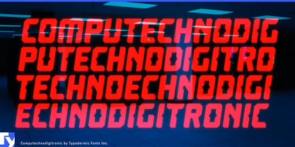
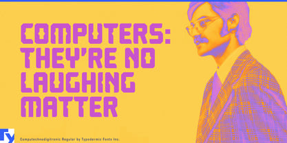
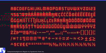
Computechnodigitronic draws on the visual language of 1980s LED and LCD displays without copying the mechanics of an actual segmented system. Its angled notches and machine-like rhythm suggest an electronic alphabet developed for hardware that never reached production.
Electronic instruments and equipment provide a natural setting. Computechnodigitronic can label synthesizer controls, effects units, audio-plugin interfaces, robotics kits, laboratory instruments, DIY electronics, and fictional control panels. Model numbers, operating modes, parameter names, warning headings, and readouts can all share the same fabricated hardware logic.
Its connection to digital timing displays makes it especially effective for sports. Track-and-field posters, lane assignments, starting lists, split-time tables, finish-line graphics, personal-best records, and stadium displays can carry the event and its results in a consistent electronic style. The monospaced numerals keep times, scores, measurements, prices, and percentages aligned in vertical columns.
Calculator displays suggest a different numerical territory. Market-data graphics, investment-report covers, trading simulations, financial-technology campaigns, economic conferences, and calculator interfaces can use Computechnodigitronic to make figures look processed and continuously updated. Its associations are closer to calculation and electronic readouts than to the sober authority of conventional financial typography.
Computer-history exhibitions, vintage-technology articles, arcade graphics, electronic-music packaging, software retrospectives, and science-fiction props can also draw on its invented digital history. Rather than reproducing one particular machine, Computechnodigitronic recalls an era when calculators, digital watches, stereo components, and home computers appeared to be developing a new alphabet together.
Its conspicuous construction is best suited to headlines, labels, captions, short quotations, and several lines of large display copy. A restrained sans serif or conventional monospace can handle longer explanations while Computechnodigitronic marks commands, specifications, event titles, and prominent data.