Costa® Std
by Typofonderie
- Aa Glyphs
-
Best ValueFamily Packages
- Individual Styles
- Tech Specs
- Licensing
Per Style:
$71.50 USD
Pack of 4 styles:
$286.00 USD
About the family
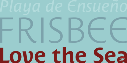
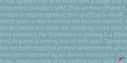
A mediterranean style sanserif in 4 styles
The original idea of Costa was to create a contemporary mediterranean typeface style. Costa is a synthesis of the purity, as found on Greek capitals, and softness, found in Renaissance scripts. First thing was the design concept that take its roots on the Chancery script. Such writing style appeared during Italian Renaissance. Later few typefaces have been developed from such cursive models. Today most serifed typeface italic take their roots on such triangular structure we can find on gylphs like the n, p, or d.
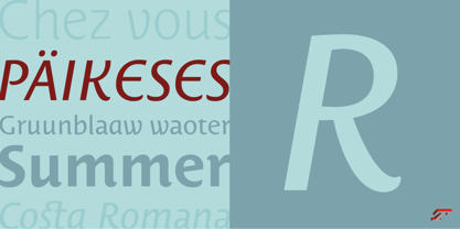
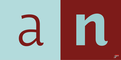
The Costa capitals remains close to pure sanserif models when the lowercases features an ending serif on many letters like the a, n, d, etc. This ending serif being more like a minimal brush effect, creating a visual contrast and referencing the exoticness of the typeface. Knowing that the Costa typeface family began life in the 90s as a bespoke typeface for Costa Crociere, an Italian cruise company — it suddenly makes sense and explains well why Jean François Porchez focused so much on Italian Chancery mixed to a certain exotism.
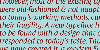
The curvy-pointed terminals of the Costa n can obviously get find on other glyphs, such as the ending of the e, c and some capitals. So, the sanserif looks more soft and appealing, without to be to pudgy or spineless. The general effect, when set for text, remains a sanserif, even not like Rotis Semiserif. Costa is definitly not a classical typeface, or serif typeface which convey past, tradition, historicism as Garamond does beautifully. Because of the Costa crocieres original needs, Costa typeface was designed to be appropriate for any uses.
Anytime you’re looking for good mood, qualitative effects, informal tone, cool atmosphere without to be unconvential or blowzy, Costa will convey to your design the required chic and nice atmosphere, from large headlines sizes, brands, to small text sizes. It’s a legible typeface, never boring. A style without neutrality which doesn’t fit comfortably into any typeface classification! Does it proves the novelty of its design and guarantees as well as its originality? Its up to you to be convinced.
Barcelona trip
Originally not planned, this need appeared because of a trip to Barcelona at the time of the project, where Jean François was giving a lecture. He wanted to pay an homage to that invitation to create something special. So, he designed during his flight some variations of the Spanish Ch, following ideas developed by the Argentinian type designer Rubén Fontana for his typeface called Fontana ND (published by the Barcelona foundry Bauer). Then, he presented during his lecture variations and asked to the audience which design fit the best to their language. They selected the design you can find in the fonts today.
Type Directors Club 2000
Typographica: Our Favourite Typefaces 2004

About Typofonderie
We are an independent French type foundry since 1994, we design, manufacture and distribute exclusive typefaces. Meticulously built years after years, our library includes type families suited for every aspect of typographic usage. We are passionate about our work. Each of our published typefaces is the result of years of teamwork at Typofonderie. Typofonderie is digital type foundry who has become over the years, a real institution in France and abroad. Our customers recognise the timelessness of our typefaces, which help them give meaning and strength to their projects, whether they are companies, brands, publications or institutions. Our typefaces can be found in the métro in Paris, as well as in Osaka, at the Opéra de Paris, La Tour d’Argent, Vuitton, Séphora, Galeries Lafayette, Yves Saint Laurent Beauty and are used by the French Olympic team. You will also encounter them in museums, in the Who’s Who, Wired, at Dell, at the Boston Consulting Group, on the jerseys of the French Olympic team and in the Alps thanks to SwissSki. Hillary Clinton and Emmanuel Macron used our typefaces during their presidential campaigns. The palais de l’Élysée uses three of our typefaces families for the identity and communication of the French president.
Read more
Read less
- Choosing a selection results in a full page refresh.