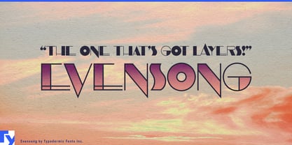
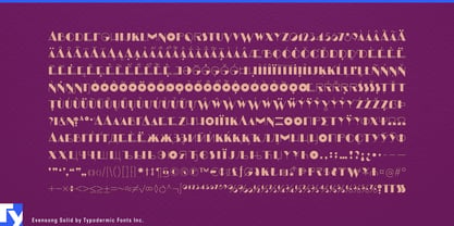
Art Deco is easy to recognize, which is exactly what makes it difficult to use without looking familiar. Evensong starts with the geometry and theatrical contrast associated with the period, then puts the weight in unexpected places. Curves become heavy where a conventional Deco alphabet might turn thin, while the unusual S and other eccentric forms give short words silhouettes that resist the standard Broadway formula.
That odd distribution of thick and thin has genuine fashion roots. Evensong grew from lettering used on an experimental 1927 Vogue masthead, from an era when the magazine changed its masthead frequently rather than treating it as a fixed logo. The source gives Evensong a connection to fashion history without tying it to the familiar Vogue identity.
Fashion editorial is natural territory. Collection names, feature openers, lookbook dividers, runway invitations, campaign titles and shop-window graphics can use Evensong when conventional geometric Deco feels too predictable. Its narrow capitals sit comfortably beside photography, while the unusual contrast gives even a short name enough structure to become part of the composition.
Beauty offers another strong setting. Fragrance launches, makeup collections, limited-edition packaging, salon identities and beauty pop-ups can use Evensong for names and campaign headlines that need polish without falling back on the usual high-contrast luxury serif. A salon name can move from storefront lettering and appointment cards to treatment campaigns and seasonal window graphics while a quieter companion face handles prices, services and booking information.
Jewelry, accessories and fashion-oriented exhibitions suit the same graphic precision. Collection names, launch invitations, display cards, costume exhibitions and decorative-arts events can use Evensong at the scale where its unusual weight distribution becomes part of the visual material rather than simply carrying a word.
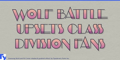
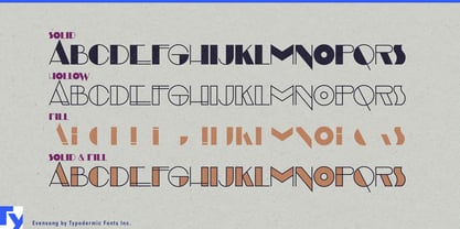
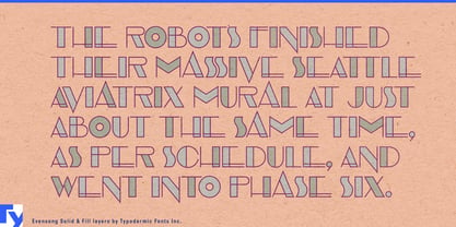
The free Hollow style shows the architecture of the design, but the full family goes further. Coordinated Solid and Fill styles can be stacked with Hollow to build multi-layer lettering, allowing separate colors, patterns and other treatments to occupy different parts of the same characters. Fashion campaigns, beauty launches, salon windows and exhibition graphics can therefore move from restrained outline lettering to elaborate layered treatments without redrawing the wordmark.
Evensong’s advantage is not nostalgia. Its unconventional thick-and-thin logic keeps it away from familiar Deco formulas, while its coordinated layers let designers treat the letters as graphic construction material; a fashion masthead can become a salon window, a cosmetics campaign or an exhibition title without losing its peculiar internal rhythm.