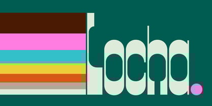
What if the letters we use every day didn't push us to go faster, be more efficient, consume more quickly? Locha is a typeface that invites us to be present, to slow down, notice details, and remember what connecting feels like.
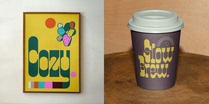
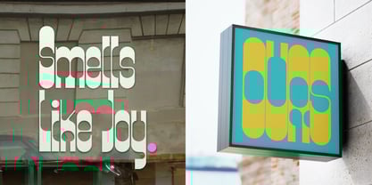
With its distinctly rounded counters, generous spacing, and softly geometric construction, Locha references the circular warmth of 1970s signage while infusing it with contemporary flexibility. Its rounded forms and flowing connections evoke hand-painted storefronts and weathered signage from an era when commerce meant community and design served place. Each character sits comfortably in its own space while creating satisfying visual rhythms in composition—design that served communities rather than algorithms.
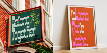
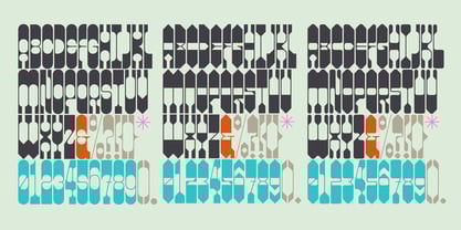
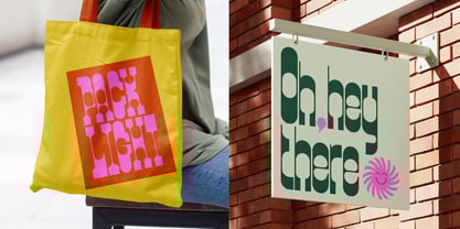
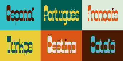
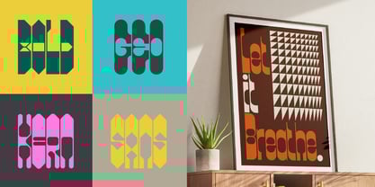
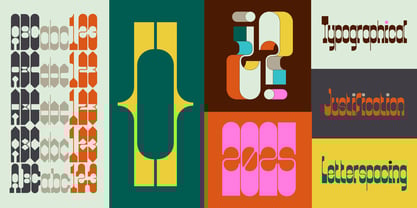
The typeface's five styles—Regular, Diagonal 1, Diagonal 2, Slab, and Soft—offer different interpretations of this essential character. When applied to contemporary designs, Locha brings unexpected warmth. Headlines set in its Diagonal variants create gentle rhythm and movement. Used in branding, the Regular and Slab styles convey trustworthiness without corporate sterility. And the Soft version? It's for when you need your words to feel like a friendly hand on the shoulder.
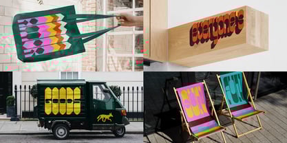
Locha captures the feeling of a Sunday afternoon in a public plaza, of dappled sunlight through the trees, of being connected, unhurried, present and embodied. Its retro elements aren't mere nostalgia but a reclamation of presence, connection, and the simple pleasure of experiencing the world at human scale. Whether applied to branding, editorial design, or environmental graphics, Locha brings with it a reminder that another pace is possible.
This is a typeface born from the recognition that something valuable has been lost in our rush toward optimization—the feeling of being present, unafraid, and connected to our surroundings and each other. Locha doesn't reject progress, but it remembers what's worth preserving. Locha includes complete character sets with extended Latin support across all variations.
Designed by Alexander Wright with Michu Benaim Steiner at In-House International. Type development by Rodrigo Fuenzalida at FragType. In-House International is a studio founded by Lope Gutiérrez Ruiz, Michu Benaim Steiner and Alexander Wright that delivers branding breakthroughs for game-changers.