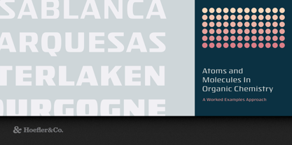
Inspired by a style of lettering invented to convey precision and reliability, Isotope is a new family of typefaces designed to be both luxurious and fit.
The Isotope typeface was designed by Jonathan Hoefler in 2018. A functionalist sans serif, in which large sweeping curves and subtle small ones are used in counterpoint to the design’s compact, brutalist construction, Isotope was inspired by a style of lettering popularized by the manufacturers of consumer goods in postwar Germany.
From the desk of the designer:
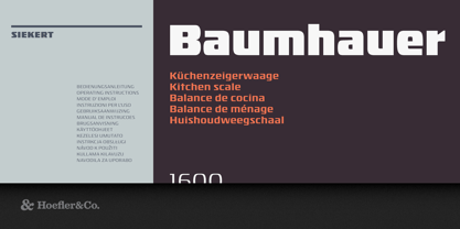
If your idea of a luxurious product is one that’s stainless steel rather than gold, you may be a Functionalist. Functionalism is an approach to design that gained popularity in the decade after World War II, especially among German manufacturers of consumer goods, for whom a thing’s visual design was the natural expression of how it was meant to be used. In their desire to be intuitive and straightforward, the designers of a generation of unobtrusive radios, bathroom scales, and turntables would define a new aesthetic, one that still resonates with us as useful, well-built, honest, and timeless.
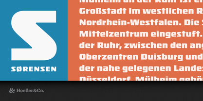
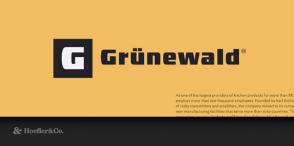
In the years that followed, the Swiss International Typographic Style would supply the letterforms for this philosophy, and industrial design would forever be associated with Helvetica and Univers. But briefly, before Swiss typography swept the continent, there was a strikingly beautiful species of letterform that arose in Germany — never produced as a typeface, but popular among lettering artists, through whom it became fossilized in company logos. For their precision-built products, companies like Sennheiser, Liebherr, Soehnle and Leifheit would adopt this new style of letterform, to convey the solidity, reliability, and practicality of products from kitchen appliances to bulldozers. It’s this style that we’ve explored in Isotope.
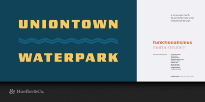
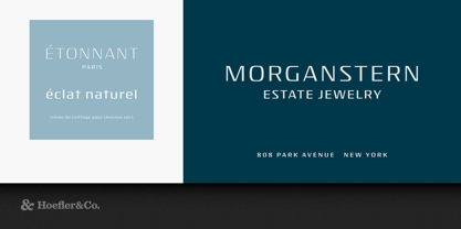
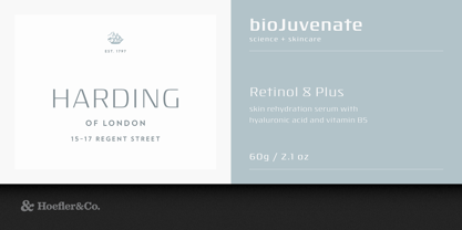
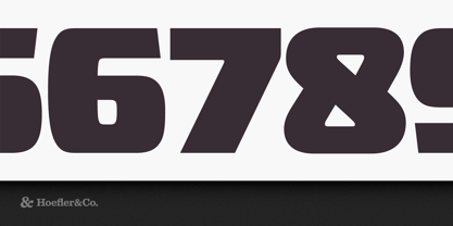
Where Functionalist lettering was limited to boxy capitals, Isotope reimagines the style across a full range of weights, and a complete character set including a lowercase. The broadest strokes of the style have been preserved — contrasting vertical and horizontal weights, complex letters like S reduced to their most linear essence — to which Isotope brings new subtleties that help make the design not just purposeful, but luxurious and elegant. Corners are intermittently softened, to heighten the momentum through letters like A, M, N, V and W; in the numbers, strokes are sheared at unexpected angles, to give them a welcome liveliness. From the initial Ultra at the heaviest end of the spectrum, Isotope descends through eight discrete weights down to a sinewy Thin, where subtle details rescue the design from sterility, to create a typeface that’s smartly clinical, and reassuringly exact.
Isotope®
is a registered trademark of The Hoefler Type Foundry, Inc.