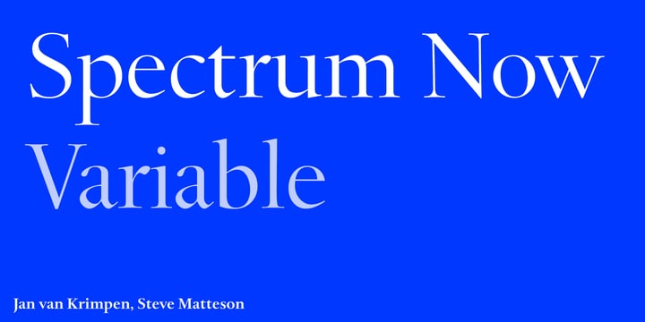
Jan van Krimpen
Dutch designer Jan van Krimpen (born 12. 1. 1892 in Gouda, died 20. 10. 1958 in Haarlem) created the font in 1952.
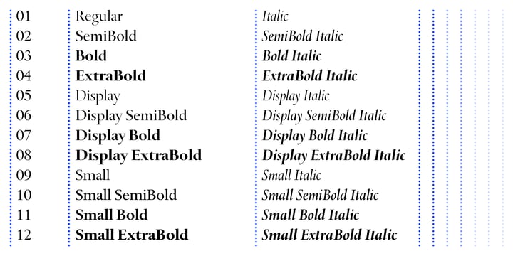
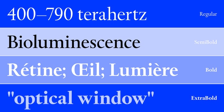
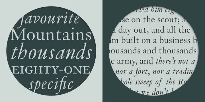
Jan van Krimpen worked on his typeface from 1941 to 1943 for use in a Bible of the Spectrum publishing house in Utrecht. The bible project was later cancelled but the typeface was so beautifully formed and universal that the Monotype Corporation in London completed it. Distinctive are the reserved elegance and unmistakeable beauty of form. The italic was kept fine and is a wonderful complement to the other weights, making it perfect for emphasis in text. The form of the lower case italic g is reminiscent of van Krimpen's italic for Lutetia and Romanée. A similar typeface in form is the Perpetua from Eric Gill. It displays not only similar forms to those of Spectrum, both typefaces also have uniquely designed old style figures. The 7 is particularly unusual with its slanted horizontal stroke and marked bend to the left in the lower third of the form. Spectrum is an extremely legible typeface even in smaller point sizes and is just as suitable for headlines as for long texts.
Spectrum is part of the Linotype Library.
Spectrum is a trademark of Monotype Typography.