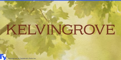
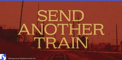
Formal typography often has an awkward choice to make. Full capitals provide ceremony and authority, but when every letter is the same height, hierarchy disappears. Ordinary lowercase restores that hierarchy, but it can soften the voice more than the project wants. Kelvingrove offers another solution: full-size capitals and smaller capital forms working together in the same line.
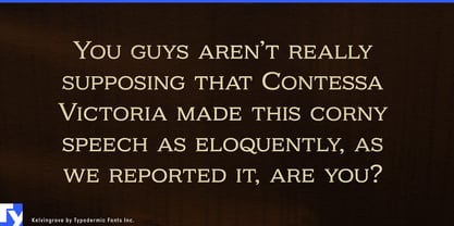
Kelvingrove is a mixed-height small-cap serif designed for display typography. Important initials, proper names and key words can occupy the full cap height while the smaller capitals create a quieter second level. The result preserves the structure and formality of capital lettering without forcing every word to speak at the same volume.
Historic hotels, private clubs, converted landmark buildings and premium residential developments can use that hierarchy for property names, wings, lounges, restaurants and amenity names. Museums and cultural institutions can apply the same logic to exhibition titles, gallery names, section headings, donor acknowledgments and catalog covers where names, dates and subtitles need to remain formal but distinct.
Historical documentaries, architecture programs, literary adaptations and archival media can use Kelvingrove for series titles, episode cards, names, locations and dates. Capital forms keep the screen language composed, while the smaller capitals prevent every element from competing equally for attention.
Estate wine, premium tea, olive oil, preserves and other provenance-driven products often need producer names, regions, vintages and founding dates to coexist on restrained labels. Kelvingrove can distinguish those layers while maintaining a consistent engraved character rather than relying on decorative historical styling.
Institutional anniversaries and commemorative programs present the same problem. Museum centennials, university anniversaries, cultural-foundation milestones and heritage-property reopenings need organization names, years and event titles to share one formal system across commemorative marks, programs and exhibition graphics.
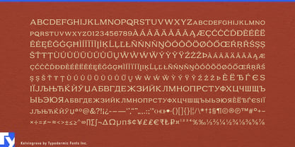
Kelvingrove began as an experiment combining elements of Biondi and Marion, resulting in a single distinctive serif style rather than a conventional revival. Alternate forms for K, Q, R and the ampersand provide additional control over prominent names and titles.
Kelvingrove is for projects that want the ceremony of capitals but still need hierarchy. It keeps the capital form intact while giving names, dates and supporting information more than one speaking volume.