Swiss designer Marco Ganz created the fonts (1988) and (1994).
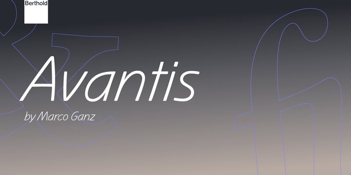
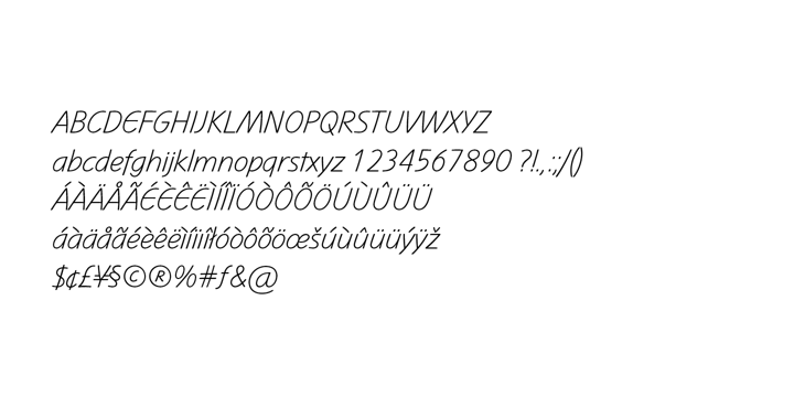
Linotype Mano, urgent and vital, suggests swift communication or the latest trends: spontaneous and informal, personal and individual. Ganz deliberately gave the characters a marked lean to the right, similar to that of quick handwriting. But Linotype Mano is not only nimble and quick, it also retains its legibility as a text font. Linotype Mano is as dynamic, brisk and casual as modern pop music.
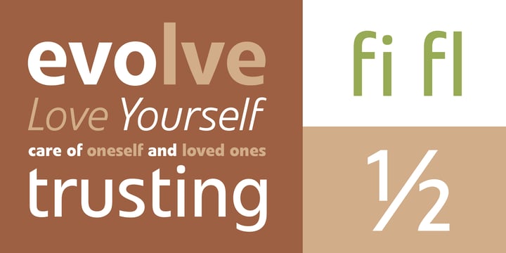
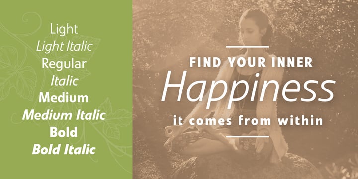
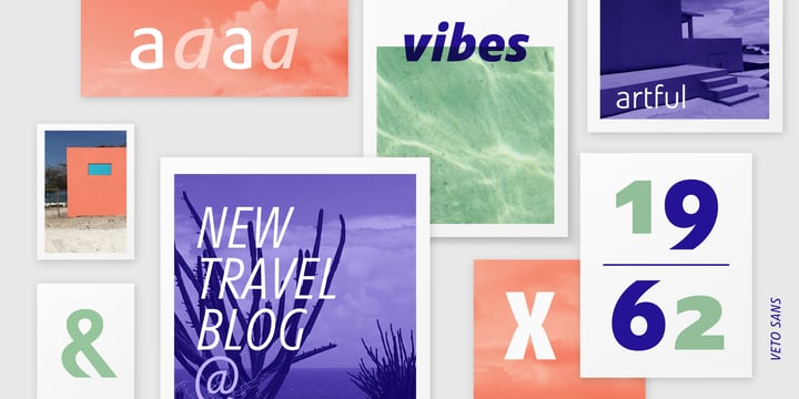
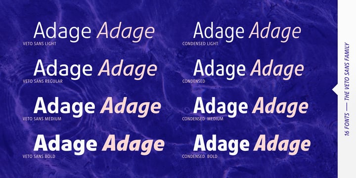
'Zero Gravity' is the motto of modern digital economy and culture: clear statements and no extra baggage result in optimal mobility and adaptation to quick changes. These principles apply to the typeface Linotype Veto. Dynamic, functional, and unencumbered by the past, Linotype Veto has no frills but everything that makes a font suitable for any use. Both light and normal weights are appropriate for body text, the italics are legible and the true bold weights can serve as striking display typefaces.
Linotype Mano and Linotype Veto are part of the Linotype Library.
Mano and Veto are trademarks of Heidelberger Druckmaschinen AG, which may be registered in certain jurisdictions, exclusively licensed through Linotype GmbH, a wholly owned subsidiary of Heidelberger Druckmaschinen AG.
Please take a look at the
personal designer portrait of Marco Ganz.