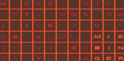
This is a listing of all glyphs contained in the font, including OpenType variants that may only be accessible via OpenType-aware applications.
Each basic character (“A”) is followed by Unicode variants of the same character (Á, Ä…), then OpenType variants (small caps, alternates, ligatures…). This way you can see all the variations on a single character in one place.
MyFonts licenses are tailored for individual creatives. Not all licenses are compatible with broad usage cases or complicated creative workflows, so make sure to read the full EULA text for details. If you are licensing fonts for use at an Agency or Company, or if you have a usage requirement that isn't listed below or are unsure about the use cases shown here, contact us and we'll help you determine the best fit for your needs.
The following licenses are available for this font.
Desktop: for creating designs
This entry-level license enables personal and commercial traditional graphic designer work.
The Desktop License allows you to create, print, and share flat, non-editable designs such as:
Brand identity
Use fonts to create a strong and consistent brand identity.
Videos
Apply fonts in titles, credits, and on-screen text.
PDFs
Style reports, brochures, and digital documents.
Greeting cards
Design unique, personalized cards for any occasion.
Logos
Craft memorable, professional logo typography.
Signage (wayfinding & billboards)
Make clear, eye-catching signage for indoor or outdoor use.
Flyers
Set readable, attractive headlines and layouts.
Packaging
Enhance product packaging with stylish text.
Album covers
Print custom text designs on t-shirts, hoodies, and more.
Posters
Bold, eye-catching poster layouts.
Invitations
Create stylish, personalized invitations for events.
Social posts
Enhance graphics and captions with unique fonts.
Business cards
Craft professional, memorable business card designs.
Fonts cannot be hosted on DAMs as downloadable assets.
Show all
Desktop licenses are based on the number of users of the fonts. You can change the number of users by clicking the quantity dropdown option on Buying Choices or Cart pages.
Please be sure to review the listing foundry's
Desktop license agreement
as some restrictions may apply—such as use in logos/trademarks, geographic restrictions (number of locations), and products that will be sold.
Adding users later:
Desktop licenses are cumulative. If you require a Desktop license that covers additional users, simply place a new order for the same Desktop package, for the number of additional users.
Webfonts allow you to embed the font into a webpage using the @font-face rule, so paragraphs and headings
of text can be styled as the webfont. You will be serving the webfont kit for your own site and linking
it in the CSS.
Webfonts can be used on a single domain. Agencies responsible for multiple websites, for example web
design agencies or hosting providers, may not share a single webfont license across multiple websites.
If the font file itself won't be embedded in the website (for example, when the font is used in a static
graphic image such as a logo) you should purchase a Desktop license instead.
Most foundries on MyFonts offer their webfonts with the Annual license model. Click here to
Learn more.
Helvetica’s 50-year anniversary celebrations in 2007 were overwhelming and contagious. We saw the movie. Twice. We bought the shirts and the buttons. We dug out the homage books and re-read the hate articles. We mourned the fading non-color of an old black shirt proudly exclaiming that “HELVETICA IS NOT AN ADOBE FONT”. We took part in long conversations discussing the merits of the Swiss classic, that most sacred of typographic dreamboats, outlasting its builder and tenants to go on alone and saturate the world with the fundamental truth of its perfect logarithm. We swooned again over its subtleties (“Ah, that mermaid of an R!”). We rehashed decades-old debates about “Hakzidenz,” “improvement in mind” and “less is more.” We dutifully cursed every single one of Helvetica’s knockoffs. We breathed deeply and closed our eyes on perfect Shakti Gawain-style visualizations of David Carson hack'n'slashing Arial — using a Swiss Army knife, no less — with all the infernal post-brutality of his creative disturbance and disturbed creativity. We then sailed without hesitation into the absurdities of analyzing Helvetica’s role in globalization and upcoming world blandness (China beware! Helvetica will invade you as silently and transparently as a sheet of rice paper!). And at the end of a perfect celebratory day, we positively affirmed à la Shakti, and solemnly whispered the energy of our affirmation unto the universal mind: “We appreciate Helvetica for getting us this far. We are now ready for release and await the arrival of the next head snatcher.”
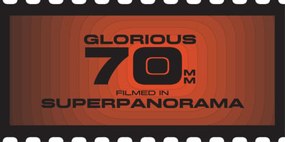
The great hype of Swisspalooza '07 prompted a look at Max Miedinger, the designer of Neue Haas Grotesk (later renamed to Helvetica). Surprisingly, what little biographical information available about Miedinger indicates that he was a typography consultant and type sales rep for the Haas foundry until 1956, after which time he was a freelance graphic designer — rather than the full-time type designer most Helvetica enthusiasts presume him to have been. It was under that freelance capacity that he was commissioned to design the regular and bold weights of Neue Haas Grotesk typeface. His role in designing Helvetica was never really trumpeted until long after the typeface attained global popularity. And, again surprisingly, Miedinger designed two more typefaces that seem to have been lost to the dust of film type history. One is called Pro Arte (1954), a very condensed Playbill-like slab serif that is similar to many of its genre. The other, made in 1964, is much more interesting. Its original name was Horizontal. Here it is, lest it becomes a Haas-been, presented to you in digital form by Canada Type under the name of its original designer, Miedinger, the Helvetica King.
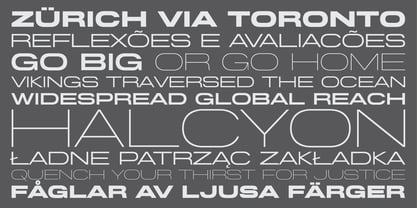
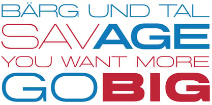
The original film face was a simple set of bold, panoramically wide caps and figures that give off a first impression of being an ultra wide Gothic incarnation of Microgramma. Upon a second look, they are clearly more than that. This face is a quirky, very non-Akzidental take on the vernacular, mostly an exercise in geometric modularity, but also includes some unconventional solutions to typical problems (like thinning the midline strokes across the board to minimize clogging in three-storey forms).
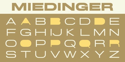
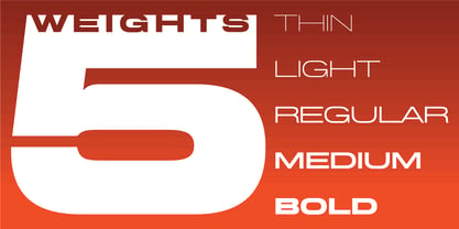
This digital version introduces four new weights, ranging from Thin to Medium, alongside the bold original. The Miedinger package comes in all popular font formats, and supports Western, Central and Eastern European languages, as well as Esperanto, Maltese, Turkish and Celtic/Welsh. A few counter-less alternates are included in the fonts.
Canada Type is an independent digital lettering and font development studio based in Toronto. We were founded in 2004 by a couple of experienced designers who were not pleased with the quality and licensing terms of fonts around the turn of the century. Since then we have greatly expanded, built a versatile and popular retail catalogue, and helped many designers bring international attention to their talents in the constantly changing and increasingly competitive world of type design.While Canada Type offers a varied library of fonts, our bread and butter are really the bespoke services we’ve been providing to companies across many fields on local, national and global levels. Over the past 20 years, we have developed custom fonts for companies in a variety of sectors, ranging from the marketing, financial and service industries to major film studios, big software corporations, and telecom/broadcast outfits.This is what we love to do, and we’re fortunate to do it on a daily basis. If you consider well-crafted typography essential to your brand’s visual communication, we’re here to help, so please reach out. The promise you get from us is one of care, quality and highly informed, satisfying results.https://canadatype.com