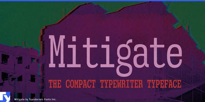
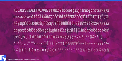
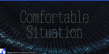
Monospaced typography has an obvious practical cost: every character gets the same amount of horizontal space, including the narrow ones. That fixed rhythm is useful for codes, figures, identifiers, and structured information, but it becomes expensive when columns are tight and strings are long. Mitigate began as a simple “what if” experiment: if traditional typewriter pitches were compressed further, what would the alphabet have to become?
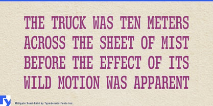
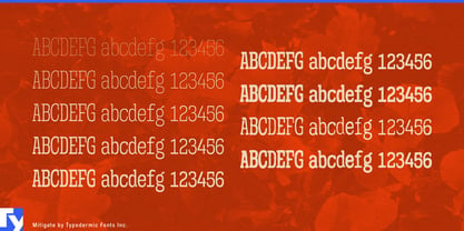
The answer is a narrow monospaced slab serif designed around the constraint rather than copied from a particular typewriter. Forms such as M, W, m, and k were adapted to survive inside the unusually slender character cell, giving Mitigate a compact mechanical rhythm without reducing the alphabet to a historical machine imitation. In the heavier clean styles, modulated strokes make the distinction even clearer; this is a typographic family built from a typewriter-like premise, not a simulation of typebar lettering.
That makes Mitigate especially useful when technical information contains more characters than the layout wants to accommodate. Semiconductor equipment, oscilloscopes, spectrum analyzers, calibration systems, laboratory power supplies, and other electronic test hardware generate model numbers, channel identifiers, option codes, measurements, and comparison data. Mitigate can distinguish those elements in datasheet covers, specification tables, equipment brochures, product-family graphics, and technical catalogues while consuming less horizontal space than a conventional monospace.
Industrial machinery creates the same problem at larger scale. Pumps, valves, bearings, compressors, machine tools, automation systems, and replacement components are often organized through long product codes whose individual characters matter. Parts catalogues, exploded diagrams, service literature, dealer materials, and product selectors need those identifiers to remain visually distinct without forcing every column wider. Mitigate gives part numbers and model codes the unmistakable rhythm of fixed-pitch typography while leaving more room for diagrams, descriptions, and adjacent data.
Aerospace component documentation and energy infrastructure bring similar demands. Serial numbers, revision identifiers, inspection dates, electrical ratings, capacities, configuration names, and component codes accumulate quickly in parts catalogues, technical brochures, installation literature, specification comparisons, and equipment-family identities. Mitigate gives that information a recognizable structure without claiming the role of safety-critical operational typography.
The narrow pitch also suits logistics, fleet systems, and automotive service information, where long strings are part of the visual landscape. Container numbers, trailer IDs, tracking references, VIN fragments, engine codes, service intervals, and replacement-part numbers can become a coherent information layer across fleet reports, vehicle graphics, warehouse-automation presentations, repair literature, and trade-show displays.
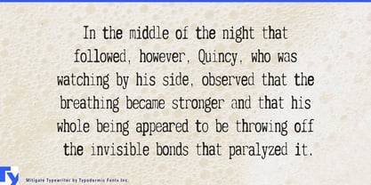
Two textured styles extend the family in another direction. When a documentary graphic, archival exhibition, investigation report, or historical presentation genuinely benefits from a worn-ribbon impression, they introduce typewriter texture without requiring a separate design language. The clean family remains the more versatile core.
Mitigate turns narrowness into a working feature. When identifiers are long, columns are crowded, and fixed-pitch rhythm still matters, it lets structured information keep its mechanical order without demanding quite so much of the page.