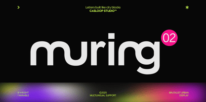
Muring.02 is the refined sibling in the Muring family — still brutalist at its core but with cleaner geometry and structured rhythm. Its forms are powerful yet practical, making it a reliable choice for both corporate branding and creative projects that demand clarity without losing strength.
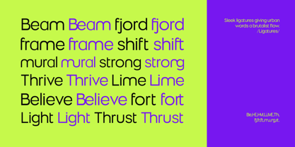
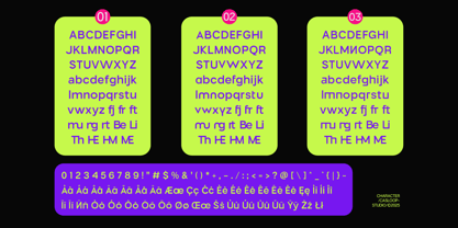
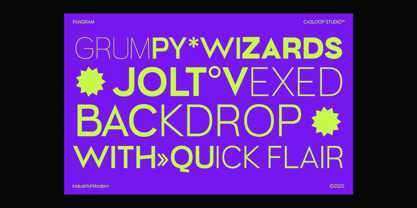
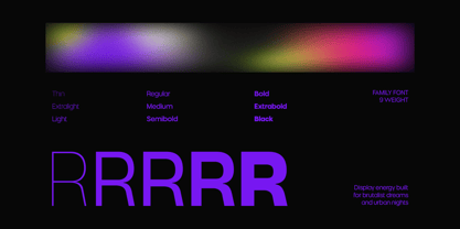
Its strongest detail is found in the character “R” — sharp, confident, and commanding. Along with stylistic alternates for letters like R, A, and T, Muring.01 allows expressive flexibility, giving every project a distinctive visual rhythm. Built in 9 weights (Thin to Black) it adapts easily across editorial, digital, and environmental design.
This typeface represents brutalism made accessible: raw energy distilled into modern clarity.
Personality
- “Muring” – industrial toughness, neatly tailored
- Brutalist DNA, refined with modern discipline
- Balanced geometry, structured proportions
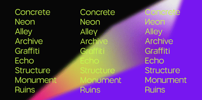
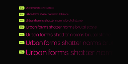
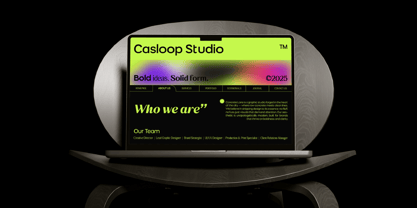
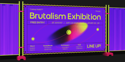
- Feels like: editorial grids, corporate systems, bold websites, structured layouts, signage design
Best For
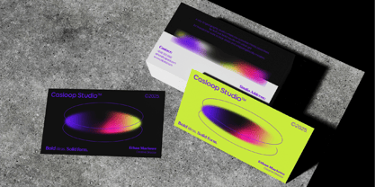
- Corporate identity & branding
- Digital UI/UX with bold structure
- Editorial spreads & magazine layouts
- Website headers & hero typography
- Posters & advertising campaigns
- Compatible with: Adobe Illustrator, Photoshop, Affinity, Figma, Canva, Kittl
Muring.02 is brutalism in balance — strong, modern, and built for clarity. Whether you’re shaping a global brand or designing a precise layout, this font delivers boldness with clean confidence.
From Casloop with love — strength made structured.