




Skip to content
Skip to main content

Ohitashi

by Typodermic
Individual Styles from $69.95 USD
Complete family of 6 fonts: $109.95 USD
The Ohitashi Font Family was designed by Ray Larabie and published by Typodermic. Ohitashi contains 6 styles and family package options. More about this family

About the family


Technology brands often need typography that looks completely at home beside engineered products without making the entire identity feel engineered. Strict geometric sans serifs can reinforce the technology but also amplify its coldness; softer typefaces may introduce warmth while looking disconnected from the product. Ohitashi occupies the useful space between them.

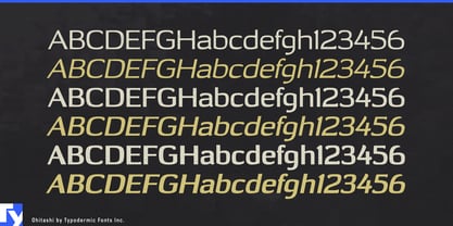
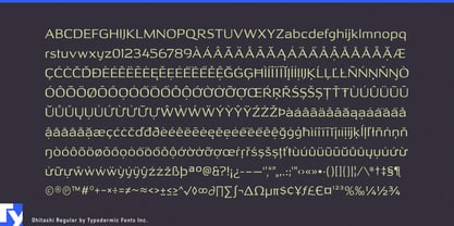
Its superelliptical structure gives the letterforms an underlying precision that harmonizes with hardware, interfaces, diagrams, and technical product photography. Against that geometry, tapered terminals and small calligraphic gestures introduce visible human decisions. The result is controlled without looking sterile and approachable without becoming soft or informal.

That balance makes Ohitashi particularly useful for technology designed to enter ordinary human spaces. Smart-home systems, connected appliances, home-energy equipment, battery storage, EV charging, environmental controls, and domestic robotics all have to communicate technical capability to people who will actually live with the products. Ohitashi can sit alongside a charging unit, control panel, sensor, or piece of household hardware without competing with its industrial design. Product names and campaign headlines carry the superelliptical character more visibly, while supporting copy can remain part of the same typographic system.

Medical and assistive technology present a similar problem. Diagnostic devices, rehabilitation equipment, mobility products, and patient-facing hardware need technical credibility, but an aggressively technological identity can create unnecessary distance. Ohitashi’s geometry belongs comfortably around precision equipment while its humanist details keep the typography from reinforcing the machinery at every level of the communication.

The same principle extends to refined industrial products such as lighting systems, architectural controls, acoustic equipment, and other hardware intended to share space with people. Here the typeface can accompany carefully designed objects rather than visually impersonating them. It provides enough structure for product families, launch graphics, packaging, websites, and technical literature to feel related without coating everything in the usual vocabulary of futuristic typography.

The superellipse supplies the compatibility; the humanist details supply the distance from pure geometry. Ohitashi can coexist with technology while leaving room for the person on the other side of it.

Designers: Ray Larabie

Foundry: Typodermic

Original Foundry: Typodermic

MyFonts debut: Jul 3, 2006

Ohitashi

About Typodermic

Welcome to Typodermic Fonts, a spirited type foundry rooted in Nagoya, Japan, started by the Canadian typeface designer, Raymond Larabie in 2001. Our library brims with 500+ diverse typefaces to fuel creativity in graphic design, advertising, web, and app development. As digital type pioneers, we adopted web fonts and app licensing early, consistently pushing the design envelope. With Canadian heart and Japanese precision, we're your global partners in extraordinary typography. Explore Typodermic Fonts—where creativity meets character.

Read more

Read less
