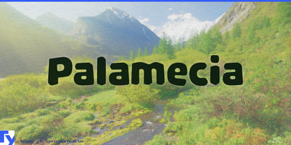
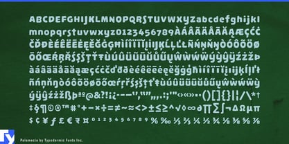
Most screen type starts with a clean letterform and tries to preserve as much of it as possible when resolution gets poor. Palamecia was designed from the opposite direction. Instead of protecting crisp strokes from fuzzy pixels, it accepts the fuzziness from the beginning. The letters were developed as soft, low-resolution shapes first, then turned into finished outlines.
That changes what can be optimized. Without a conventional stroke skeleton dictating every decision, counters can open wider, distinguishing features can grow, and awkward junctions can be simplified until the character remains recognizable after reduction and blur. Rather than having a crisp letter surrounded by uncertain pixels, Palamecia treats the whole form as equally soft. The degradation becomes consistent instead of accidental.
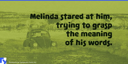
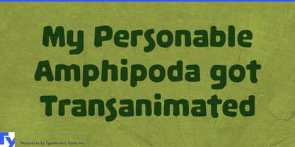
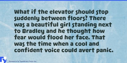
Those decisions also explain its unusual appearance at full size. Palamecia is chunky, open, and slightly irregular because its shapes were judged by what survived under imperfect conditions. Large counters and emphatic silhouettes give the alphabet a friendly, almost molded quality, but that personality was not added afterward. The same exaggerations that give Palamecia its character are the ones that clarify the letters when detail starts disappearing.
That makes Palamecia particularly relevant to interfaces that cannot assume a pristine display. Small embedded screens, inexpensive consumer hardware, rescaled interface graphics, and devices viewed from a little farther away all recreate some of the conditions that generated Palamecia in the first place. Countertop appliances, coffee machines, home controllers, exercise equipment, charging hardware, and other physical products can use it when the interface needs to remain approachable without looking like industrial instrumentation.
Family-oriented hardware is another natural setting. Interactive learning devices, children’s audio players, electronic toys, and other products shared between adults and children often need lettering that can survive modest displays while avoiding the severity of conventional technical typography. Palamecia’s broad counters and simplified forms provide clarity through shape rather than through a neutral or institutional appearance.
The same qualities can work at larger physical scale in interactive environments. Science-centre exhibits, family museum installations, theme-park interfaces, ticketing and queue systems, and hands-on educational displays may be viewed at odd distances, scaled across different hardware, or rendered on equipment chosen for durability rather than typographic finesse.
Palamecia treats imperfect rendering as a design condition. Instead of drawing an ideal letter and hoping enough survives, it starts by deciding what must survive and lets the finished letterform grow from there.