Select this license type when you are developing an app for iOS, Android, or Windows Phone, and you will be embedding the font file in your mobile application's code.
PF Bague Sans Pro™
by Parachute

- Aa Glyphs
-
Best ValueFamily Packages
- Individual Styles
- Tech Specs
- Licensing
About PF Bague Sans Pro Font Family
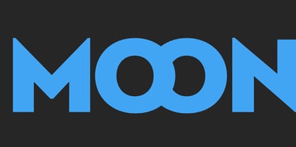
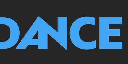
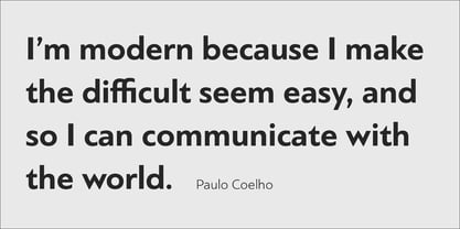
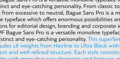
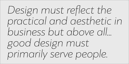
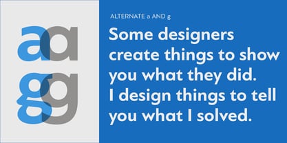
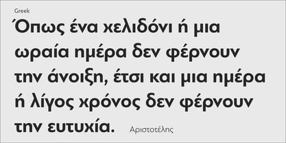
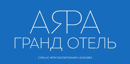
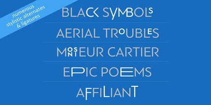
PF Bague Sans Pro is a versatile monoline typeface with a distinct and eye-catching personality. Despite its inspiration from early 20th century geometrics, it diverts from the mechanical rigidity of those typefaces by incorporating humanist characteristics, such as subtle variations in stroke width and open counter shapes with vertical endings. This is a very clean and legible typeface with a warm and well-balanced texture which is ideal for intense editorial use in magazines and newspapers. Bague Sans’ most remarkable feature is its vast array of uppercase alternates and ligatures which truly shine when set at display sizes. This typeface is automatically transformed into a flexible, charming and stylish typeface with strong modern aesthetics. From classic to modern, from excessive to neutral. Bague Sans Pro is a multipurpose typeface which offers enormous possibilities and variations for editorial design, branding and corporate identity. Bague Sans Pro signifies freedom and personal style. This superfamily includes 18 weights from Hairline to Ultra Black with a consistent and well-refined structure. Each style consists of 1063 glyphs with more that 330 alternates and ligatures and an extended set of characters which support simultaneously Latin, Cyrillic and Greek. Download the complehensive PDF Specimen Manual to explore the unlimited text variations of Bague Sans Pro.
Designers: Panos Vassiliou
Publisher: Parachute
Foundry: Parachute
Design Owner: Parachute
MyFonts debut: Feb 21, 2014
About Parachute
Parachute is a digital type foundry and design agency, specialising in bespoke type design, corporate typefaces and lettering. We use the power of typography to transform living brands to global brands, enrich their identity and localise their language in emerging markets. Never content with the average, we manage to bridge the West with the East, the North with the South and combine tradition with innovation. We have collaborated with several leading organizations since 2001 and designed proprietary typefaces for some of the world’s most iconic brands and institutions such as Bank of America, Apple, European Commission, National Geographic, Ikea, Kraft Foods, UEFA, Samsung, Financial Times, Pernod Ricard, Ogilvy, Emirates.Our work has earned numerous accolades around the world with top honours from TDC, Red Dot, European Design Awards, Tokyo TDC, HiiiBrand, Granshan Awards, Communication Arts and many others.
Read more
Read less
- Choosing a selection results in a full page refresh.