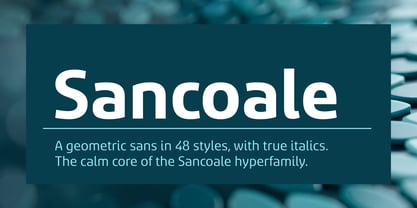
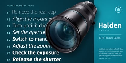
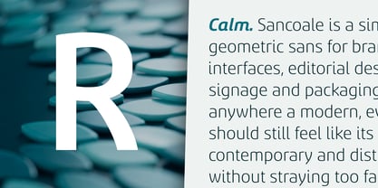
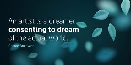
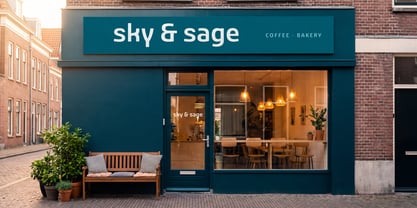
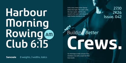
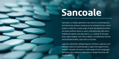
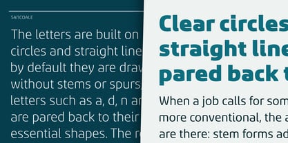
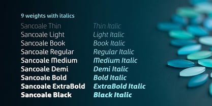
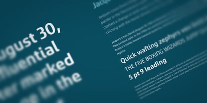
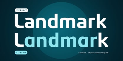
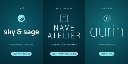
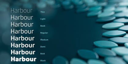
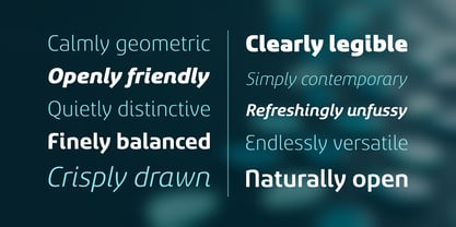
Sancoale is a geometric sans serif font designed for branding, logos, packaging, signage, and editorial design—ideal for any application where a modern, clean voice is essential. The design concept is straightforward: it strips a geometric sans down to its core elements of circles and straight lines, omitting the stems and spurs commonly found in most typefaces. As a result, letters like a, d, n, and u are crafted as pure bowls and arches, creating a contemporary and distinctive look that remains open, friendly, and easy to read, showcasing its personality with every word. What sets Sancoale apart is its unique stemless default, making it particularly effective for logos and wordmarks. For more conventional needs, the font offers several alternates: - Stem forms reintroduce stems and spurs for a familiar texture in longer texts. - Alternate characters for k, y, c, s, g, and 4 provide a softer aesthetic. - Traditional forms include more conventional capitals like E, M, and N, along with matching v, w, x, y, and z. - Historic forms of Q, E, and g lend an older, bookish charm. - Italic forms feature a single-storey a and a descending f. The font family is versatile enough to support an entire brand identity, featuring: - 8 weights, ranging from a fine Thin to a heavy Black. - 3 widths: Condensed for tight headlines and narrow columns, Normal for everyday use, and Extended for logos, wordmarks, and signage. - An italic variant for each style, totaling 48 fonts. Design applications include: - Branding and logos: The stemless forms ensure wordmarks are instantly recognizable, while the alternates allow one family to convey multiple brand voices. - Packaging and signage: The Extended and Black weights provide impactful presence for labels, shopfronts, and wayfinding, while open counters maintain clarity from a distance. - Editorial and web: Use heavier weights for headlines and Book or Regular for body text with stem forms activated. Pairings: Sancoale serves as the foundation of a larger superfamily. Sancoale Gothic introduces a measured amount of stroke modulation, while Sancoale Contrast features fine hairlines. All three share the same skeleton, allowing for harmonious pairings: set a headline in Sancoale Contrast, a subhead in Sancoale Gothic, and the body in Sancoale for a cohesive reading experience. Typographic features include: - Stylistic alternates and three stylistic sets. - Italic swash forms. - Standard and discretionary ligatures. - Oldstyle, lining, proportional, and tabular figures. - Fractions, superiors, inferiors, and ordinals. Character set: Latin, supporting over 300 languages across Western, Central, and Eastern Europe and beyond.