For everyone who’s ever wished Clarendons had italics, everyone whose favorite slab serif is shy a few weights, and everyone who’s ever needed a slab serif to thrive in text: we designed Sentinel for you.
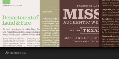
The Sentinel typeface was designed by Jonathan Hoefler in 2004. In the early nineteenth century, typefounders seeking novelty invented a freakish new category of typefaces with extreme weight, heightened contrast between thick and thin strokes, and stocky, unbracketed serifs. This style, which became known as ‘antique,’ would rise to prominence in the decades ahead, when these faces were paired with lighter typefaces in order to signal emphasis: they became the world’s first ‘boldface’ types. Sentinel updates and expands the antique genre to include both romans and italics, and a set of ornaments in period style. Created for Texas Monthly, in whose pages the typeface first appeared in 2004. First published in 2009, the Sentinel family was expanded in 2020 to include a broader character set, and two fonts of ornaments.
From the desk of the designer:
The first slab serifs were designed to be oddities. It was their intention to be eye-catching, to be novelties amidst the world’s conventional book types. Never mind that some of these faces treated different letters inconsistently, or had inherent qualities that limited the size of their families: these were eccentricities, and to a novelty typeface, eccentricity is strength. Two centuries later, their legacy includes three beloved species of typeface that are handsome, popular, and maddeningly difficult to use. Each is marred by a crippling deficiency, a situation inspiring us to create Sentinel.
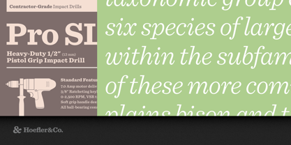
A slab serif whose capital O is close to a perfect circle is called a Geometric. Its capital H will have horizontal and vertical strokes that appear the same weight, a policy that’s consistently applied throughout the entire alphabet. If the strokes are inflated beyond a certain weight, it becomes impossible to create a matching lowercase: the structural complexity of the lowercase a, e and g limits how heavy the design can go before these characters close in on themselves. The Geometric that maxes out at the Bold weight can only achieve a Black by compromising the underlying design, and in a typeface characterized by rigid geometries, these kinds of concessions can be glaringly obvious
.
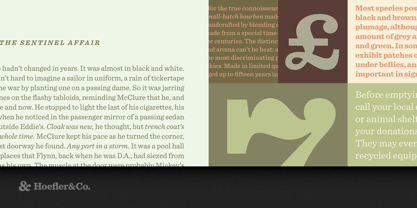
An early compromise was the introduction of contrast, which allowed horizontal strokes to remain thinner than vertical ones. This approach, which made it possible to create lowercase letters in extreme weights, proved to be an attractive motif among the capitals as well, and the resulting style became popular under the name Antique. A cousin of the Antique is the Clarendon, which adds rounded brackets that connect its serifs and stems, a useful feature that gives bolder faces the appearance of extra weight. These brackets are consequently a liability in lighter weights, where they begin to overpower the letters themselves, and in counterpoint to Geometrics that lack heavier weights, Clarendons rarely have lighter ones. Their absence of a Book weight makes Clarendons useless for text, a fate sealed by a greater problem which they share with Antiques: neither have italics.
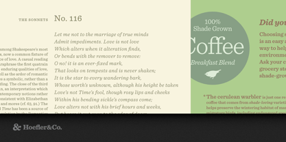
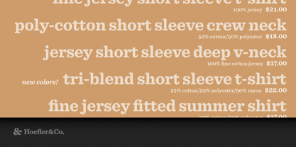
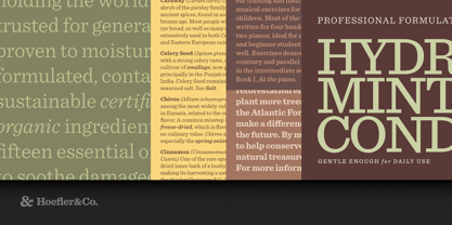
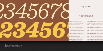
Sentinel was designed to address the many shortcomings of the classical slab serif. Unbound by traditions that deny italics, by technologies that limit its design, or by ornamental details that restrict its range of weights, Sentinel is a fresh take on this useful and lovely style, offering for the first time a complete family that’s serviceable for both text and display. From the Antique style it borrows a program of contrasting thicks and thins, but trades that style’s frumpier mannerisms for more attractive contemporary details. It improves on both Clarendons and Geometrics by including a complete range of styles, six weights from Light to Black that are consistent in both style and quality.
Planned from the outset to flourish in small sizes as well as large, Sentinel contains features like short-ranging figures that make it a dependable choice for text. And most mercifully, it includes thoughtfully designed italics across its entire range of weights.
Sentinel®
is a registered trademark of The Hoefler Type Foundry, Inc.