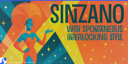
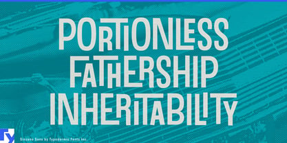
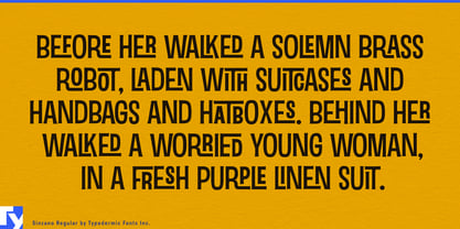
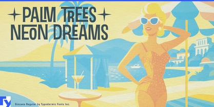
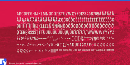
Sinzano is built for names that need to feel composed rather than simply typed. Its interlocking letter combinations pull neighboring forms into tight arrangements, turning short words into compact pieces of lettering with the character of a custom lockup. The idea came from 1960s and 1970s jazz and lounge record sleeves, where closely fitted display lettering was often assembled specifically for the title rather than set from an ordinary typeface.
That technique gives Sinzano a useful life beyond its historical source. In hospitality branding, the name of a venue often has to carry much of the identity on its own. Cocktail bars, rooftop lounges, supper clubs, members’ clubs, casino-resort venues, destination restaurants, and live-music rooms can use Sinzano for the distinctive naming layer while a quieter companion face handles reservations, menus, wayfinding, and practical information. On an entrance sign, glass graphic, drinks menu, hotel directory, or campaign image, the interlocks make the name feel deliberately fitted to the space.
Premium drinks offer a similar opportunity. Aperitifs, vermouths, liqueurs, cocktail mixers, limited releases, and sophisticated non-alcoholic drinks often depend on the product name as a major part of the label. Sinzano can give each variety a different word shape while keeping the range visibly related across bottle labels, gift cartons, bar displays, launch campaigns, and hospitality partnerships.
The effect is particularly useful for sub-brands inside larger destinations. A hotel may contain a rooftop bar, restaurant, lounge, spa, and entertainment venue, each needing an identity of its own without becoming disconnected from the parent property. Sinzano can give those named spaces a recognizable signature while the hotel’s main typography continues to handle the systematic work. The same approach suits cruise-ship venues, theatre bars, casino lounges, cabaret rooms, and other entertainment spaces where the name appears repeatedly across signage, menus, event graphics, and promotional material.
Cultural events can use the historical association more directly without becoming period reproductions. Jazz festivals, film festivals, performing-arts seasons, nightlife programs, and exhibitions dealing with music or postwar design can make the title itself an active part of the composition. Because different letter combinations produce different interlocks, Sinzano works especially well when a campaign needs several related event names rather than one fixed wordmark.
There is also room for the same composed-name effect in fragrance collections, jewelry campaigns, beauty ranges, and fashion capsules. Sinzano can turn a short product name into a compact arrangement that feels more tailored than neutral sans-serif typography and less personal than handwriting.
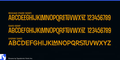
Sinzano’s slender forms keep the interlocks from becoming heavy. The original flared version carries more of the jazz-era flavor, while Sinzano Sans lets the close-fitting structure come forward more directly. In either case, the important feature is composition: the letters respond to their neighbors, and the word becomes the design.