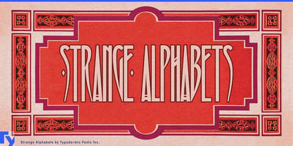
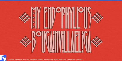
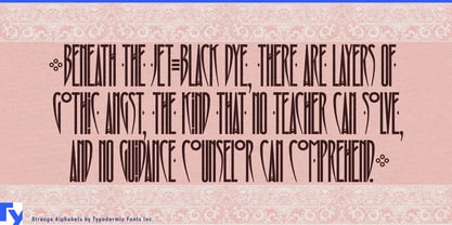
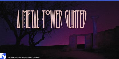
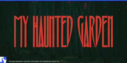
Strange Alphabets turns extreme narrowness into a display tool. Its tall, high-contrast capitals, diamond details, eccentric alternates, and sharply compressed proportions let long names occupy serious visual space without spreading across the page. A title can loom vertically while leaving room for photography, illustration, or dense supporting information around it.
That makes the face especially useful for post-punk, gothic rock, darkwave, and related music culture. Album covers, vinyl reissues, tour identities, festival campaigns, artist websites, streaming artwork, and merchandise often need typography that feels severe, elegant, and unmistakably alternative. Strange Alphabets reaches that territory through proportion and ornament rather than blackletter or distressed-punk conventions. Long band names and event titles can be set enormous while remaining economical with horizontal space.
Fashion, fragrance, and cosmetics offer another natural setting. Tall perfume cartons, narrow bottle labels, candle packaging, jewellery boxes, clothing hangtags, and campaign graphics can make direct use of its vertical proportions. A short perfume name can become almost architectural; a longer fashion label can stretch upward instead of turning into a wide block. The diamond forms and unusual variants provide enough decorative material to make restrained layouts distinctive without surrounding the type with elaborate ornament.
Publishing can use the same qualities for gothic fiction, decadent literature, supernatural novels, literary horror, historical mysteries, and deluxe editions. Cover titles, series names, slipcases, chapter openers, and especially book spines benefit from a typeface that can make a long phrase tall rather than wide. Its connection to inventive Edwardian book-cover lettering gives it a natural relationship with historical material while leaving room for contemporary treatment.
Strange Alphabets also suits theatre, dance, cabaret, fashion exhibitions, and other cultural projects where a title needs ceremony or cultivated darkness. Programme covers, posters, season identities, and event graphics can build strong vertical structures while a quieter companion face handles dates, venues, credits, and explanatory copy.
The design grew from two related sources: condensed lettering found on late nineteenth- and early twentieth-century book covers, and the narrow visual language associated with Siouxsie and the Banshees. Together they explain its combination of historical ornament and post-punk severity without limiting the typeface to either context.
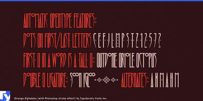
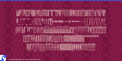
Alternate letters, ligatures, diamond ornaments, and unusual punctuation can push short titles closer to custom lettering, while the basic alphabet already carries plenty of character. Strange Alphabets is for long names, dramatic verticality, and words that need to loom rather than sprawl.