Imagine yourself standing in a late mediaeval square, watching workers hoist stones for the massive Gothic church being built there. Over the ring of a blacksmith’s hammer on a glowing bar of iron, you hear people talking about an explorer named Columbus and the discovery of a new continent. And in a nearby workshop, books are being printed using Johannes Gutenberg’s invention, a movable-type press.
It is the dawn of the modern era, a time when information is increasingly available as book reproduction becomes much cheaper. Replacing scribes, the printing press is the first machine used to reproduce long texts – but its letterforms are still based on quill handwriting. Vertical strokes on both sides help most letters align neatly with their neighbours. This iconic style is broadly known as blackletter – a family of script that later gave rise to Fraktur.
While blackletter is closely associated with the Gothic period and traditional artisanship, it has been a long time since anyone actually communicated in it. If you were to turn away from this bustling square and stroll down the street, the shopkeepers’ signs and the books coming off the press would be difficult to read. Individual letters are so antiquated that they are practically impossible to make out; you can only identify each letter once you’ve figured out the word. Reading archaically styled texts is cumbersome, as we continuously stumble: “Is this a k? It looks like a t … Is this a Z or a 3?” And on it goes with every A, G, H, I, J, K, N, and Z you encounter.
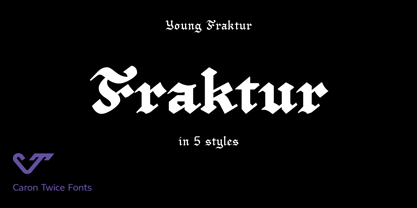
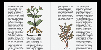
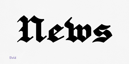
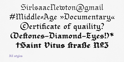
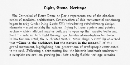
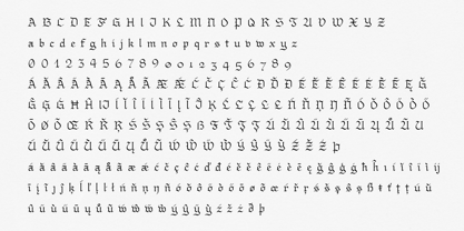
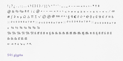
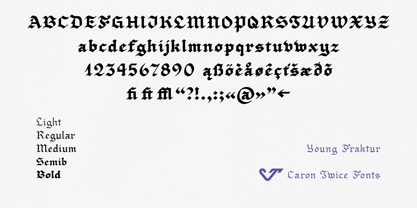
This is where Young Fraktur comes in. Inspired by such legendary typefaces as Gutenberg’s Textura, Schwabacher, Fette Fraktur, and Old English, Young Fraktur replaces the obsolete characters with letterforms that are easier for today’s reader to decipher. This allows text set in Young Fraktur to embody the spirit of a Gothic typeface while remaining comfortable to read, even now.
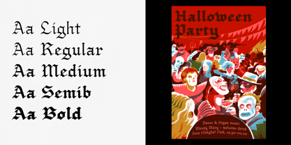
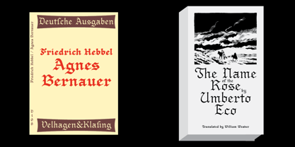
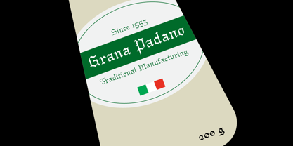
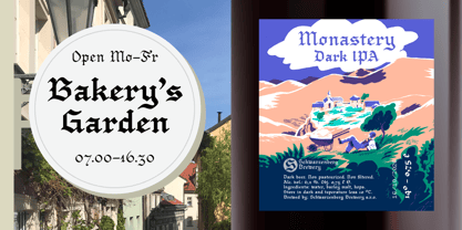
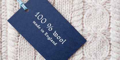
Young Fraktur was created by using a calligraphy marker to handwrite letters and converting them to digital form, a process that preserves their natural, hand-crafted quality. This style is particularly apt for communications by traditional establishments and artisanal creators, such as bakeries, restaurants, and beverage producers like breweries. It also serves as a bold choice for fashion brands and streetwear labels looking to inject historical edge into apparel graphics and seasonal collections. Young Fraktur is also an ideal tool for books and posters meant to evoke the Gothic era and for visual communication connected with alchemy, sorcery, monasteries, Halloween, heavy metal, tattoos, and historical towns. The typeface works well on certificates, labels, and newspaper mastheads.
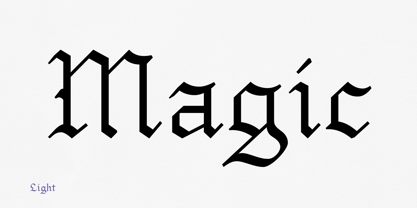
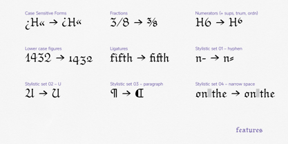
Unlike most digital Gothic typefaces, Young Fraktur has five weights, providing designers with a range of options for emphasising important information. Young Fraktur also lets designers maintain a similar weight across designs that combine various point sizes. In spite of its Gothic soul, Young Fraktur is perfectly suited to professional applications today.