Type on the vertical manual.

Just about every designer has an opinion about type set on the vertical. The thing is: you’d be hard pressed to find a statistical or empirical study that establishes the best way Latin type should be set when it’s flipped on its end.
If there are few words, the type is relatively small and about eye level (like the spines of books on a shelf), it probably doesn’t make much difference whether it’s set top-down or bottom-up. In these instances, we are looking at the type, rather than reading it. Our eyes are grasping all the words at a glance. We can simply look at the type to determine its meaning. If we move closer, or if there are more than just a few words we are required to read – things change.
Under normal conditions (Latin type on the horizonal) the ideal reading process is when the eye is able to quickly scan across a line of copy, grasping a group of three or four words at a time, then jumping to another set of words, and then to another. These individual stops are called “saccadic pauses”, and take about 1/4 second each. When we get to the end of a line, if line spacing is optimized, the eye is naturally pulled down to the next line and returns to the left margin to begin again. This reading process has been proven optimal in numerous studies.

Because type set on the vertical is not how we normally read, the eye is not able to quickly grab as many words as when it’s set horizontally. Two or three words (like a book title) is probably the maximum.
While a number of languages are written vertically, they are almost always written in columns going from top to bottom. This is how Chinese, Japanese, and Korean are almost always read when set vertically. In fact, it’s rare for any language to be read from the bottom up. This is more than likely because the eye is naturally drawn-down by the pull of gravity.
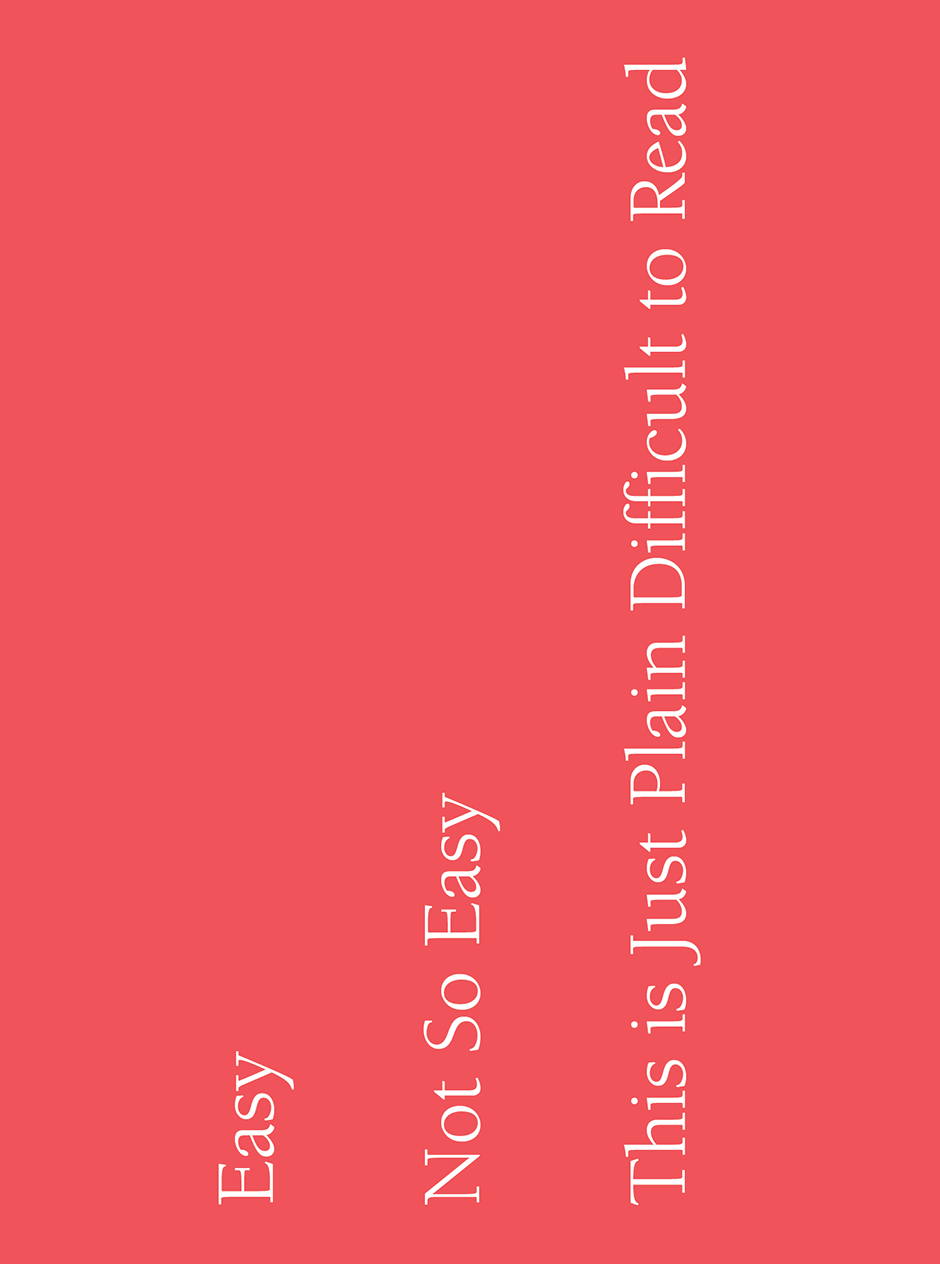
So, how does this effect communication designers? Quite often, we’re asked, or required, to flip type on its end. The first rule of setting type on the vertical is to try to avoid it. Latin type is just plain harder to read this way. Which is why almost all emergency signs are set on the horizonal. If there are no viable alternatives and conditions require that the sign be read, rather than just looked at, the type should be arranged so that it’s read from the top down. Banners, signage and wayfinding that has an unobstructed view from a distance, can be set with type on the vertical. If the information is to be read relatively close-up, vertical type can be problematic. Forcing the reader to start at the bottom of a series of words and work her way up is counter-intuitive and makes reading more difficult.

How about stacked type? Avoid it like a bad client. Stacked type forces the viewer to read individual letters and then assemble them into a word. It might work for a café sign – but not much else.
Most things typographic are “horses for courses”. If type is meant to be read, the reading circumstances and environment should be taken into account. This influences type choice, size, spacing, color, alignment ¬– and whether it’s read from the top down or the bottom up
Download a pdf version of the Type on the Vertical manual.


