Legibility manual.
Even though much of the typographic community treats legibility and readability as interchangeable terms – they are not. Different typefaces have varying degrees of legibility; while typography should be readable.
Legibility is about being able to distinguish one letter from another in a particular typeface design and is ultimately controlled by typeface designers. Readability, on the other hand, is the degree of ease with which typography can be read.
Generally, the most legible typefaces are those which offer big features and have restrained design characteristics. While these attributes may seem contradictory, actually they are not. “Big features” refers to things like large, open counters, ample lowercase x-heights, and character shapes that are obvious and easy to recognize. The most legible typefaces are also restrained, in that they are not excessively light or bold; their stroke weight changes within characters are subtle; and if serifs are present, they are not overly elongated, very thin, nor extremely heavy.

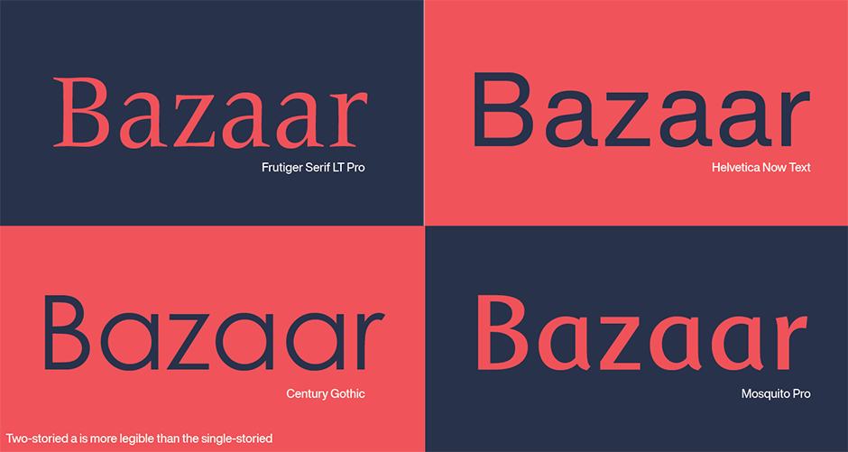
Individual letter shapes can also affect typeface legibility. Ideally, letters should be distinctive and easy to recognize. For example: the two-stored “a”, like the one found in Frutiger® Serif or Helvetica® Now is much more legible than the single storied “a” found in Century Gothic™ or Mosquito™. The lowercase “g” based on roman letter shapes is more legible than the simple bowl and descender “g”.
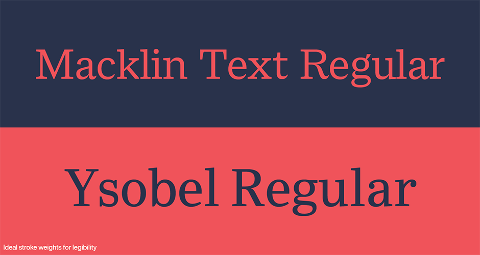
Typefaces that are very bold or exceptionally light tend to rate low on the legibility scale. It’s been found that the optimal stroke thickness for character is about 18% of the x-height letters. Typeface weights like the roman designs of Macklin™ Text and Ysobel™ fall into this general category. As far as departures from the norm are concerned, lighter faces tend to be more legible than heavier weights of type. Many bold and black designs become only caricatures of the original design with very small counters and drastically modified letter shapes.
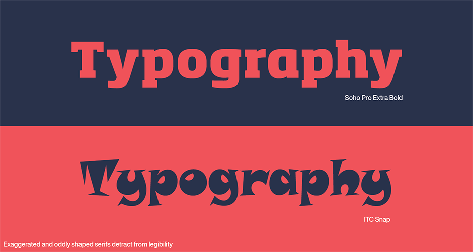
In serif typefaces, individual letter legibility begins to suffer as serifs take on exaggerated shapes. Very long serifs, or those which are exceptionally heavy, will detract from individual letter legibility; as do those which have unusual or highly modified shapes.
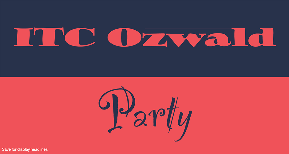
While not all typefaces should be designed to be paragons of legibility, those that are intended to be used for text or lengthy display composition should be the ones designers choose. Save the “Partys” and “ITC Ozwalds” of the typographic palette for three or four-word headlines.
Download a pdf version of the It’s About Legibility manual!


