Type Trends: 2022 Q1 Trends by Liza & Tim
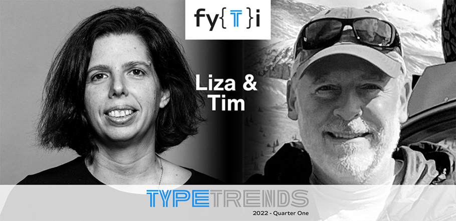
Liza Enebeis
Type Trends Quarter One 2022
As part of our on-going efforts to keep you typographically informed, up-to-date and in-the-know, we reached out to two very different designers with very different processes – but with very similar typographic goals.
Evocative typography and the use of variable fonts, are here to stay. They may not be new trends but, they are certainly forces to be reckoned with.
Evocative typography has been around since Gutenberg came up with the idea to make printed words look like calligraphy. It’s just that, today, we have so many ways to create evocative graphic communication, and it is being used in wildly different applications.
Typographic Pioneer
While studying in Paris, Liza Enebeis was looking for a design internship. She always liked Dutch design. To her, it felt like the Dutch were prepared to take bigger risks, and liked experimenting.
A particular agency caught her eye: Studio Dumbar/DEPT® in Rotterdam. She approached them and they offered her a position. Today, Liza is a partner and creative director at the same company. She is directly involved with all main projects such as the visual identity for Amsterdam Sinfonietta, D&AD Creativity festival, brand refresh of the van Gogh Museum and co-initiator of Demo - Design in Motion Festival.
While a creative tour de force, Liza does not work alone. She was quick to give credit to Benoit Brut and Bart Vollebregt, type-focused visual designers in the studio, who also contributed to this article.
Designer and Lover of the Outdoors
Tim McGrath is a lover of the outdoors, who also cofounded (and is a design director) at 3 Advertising in Albuquerque, New Mexico. He studied design at Rochester Institute of Technology (RIT) and the Laguna College of Art and Design in California.
Over the past 25 years, Tim has worked on national, regional and local brands in virtually every category. His work has been recognized by the National Addys, Communication Arts, Lürzer’s Archive, The One Show, Print, Step and Type Directors Club. As a passion project, he also runs overland outfitter company Sackwear.
When he’s not designing work for a client, Tim is probably designing some of Sackwear’s apparel. When he’s not designing, you’ll probably find him on the back roads of Colorado or Iceland, or as far from a computer as a human can get.
Like Liza, Tim also depends highly on people in his office for creative support: Jason Rohrer, Sam Maclay, and Zak Rutledge. (Another trend shared by Tim and Liza: collaboration with other creatives.)
Animation and Variable Fonts
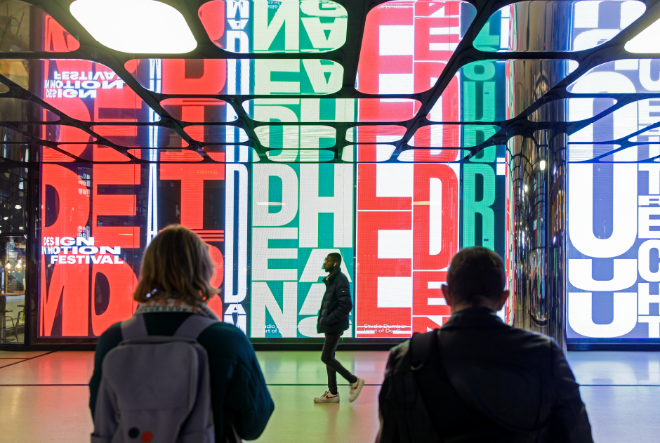
Liza, and Studio Dumbar are big fans of typographic animation and variable fonts. When we asked what she thought was a major factor in current typographic trends, her answer was brief and immediate. “100% variable - and here to stay!” It is this positive attitude that drives much of the studio’s evocative design solutions.
“Variable fonts have become a valuable tool and a real help in creating different types of motion,” Liza continues. “They not only give us flexibility in the way we work, but also when applying typography across different mediums.”
“In addition, variable fonts help us create a wide range of different expressions easily – and with modest expense. They also provide a vehicle to reveal a surprise to the audience. Variable fonts allow us to easily switch from one state to another, and change from a functional statement to one that is more illustrative, or outspoken.”

Static Fonts do the Trick
Tim, on the other hand, relies primarily on static font choices. “MyFonts has such a huge selection of typefaces,” he says, “that we can always find what we want.”
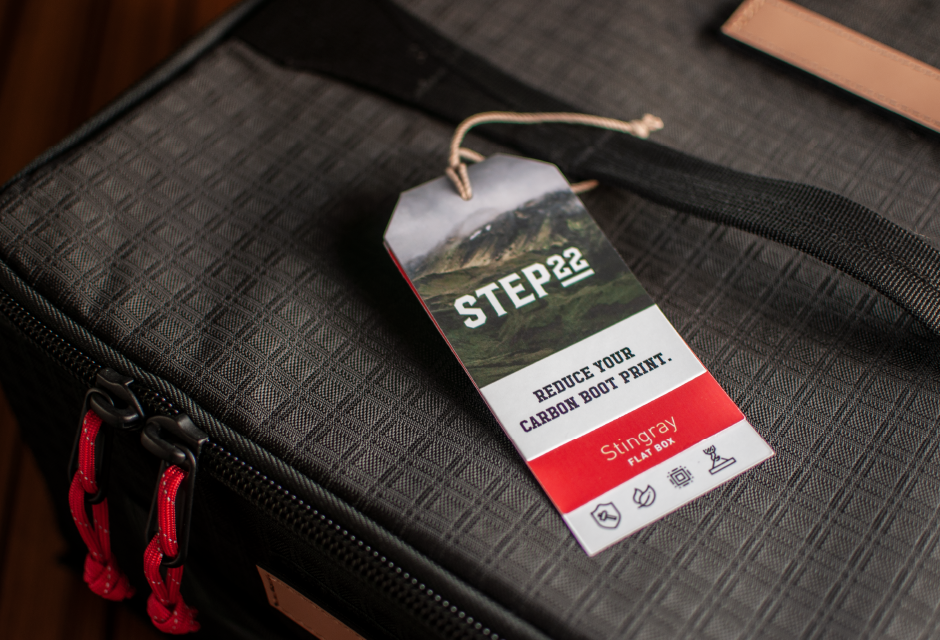
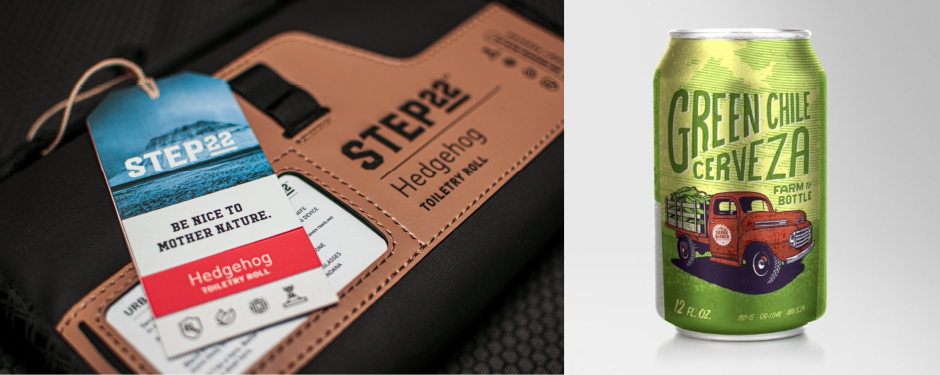
“The Step 22 project is a perfect example,” he explains. “The Step brand is masculine and outdoorsy. We were looking for a simple suite of typefaces, that spoke to the brand, and complemented each other perfectly. After some searching we found Hudson NY Slab and Hudson NY Serif. We then found DIN® Next, which is an excellent companion to the main branding designs.”
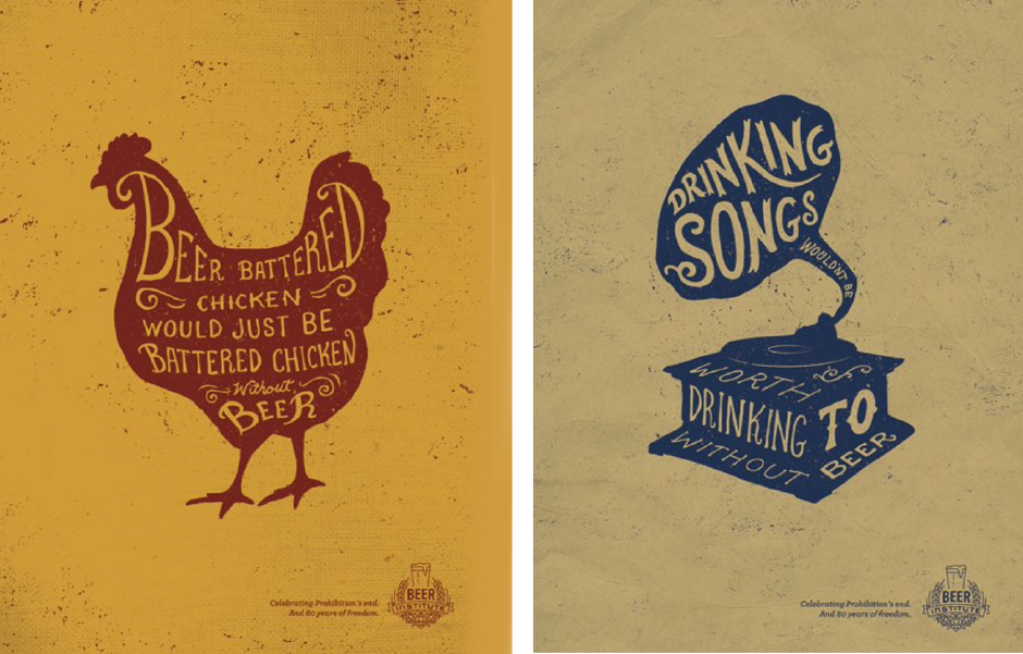
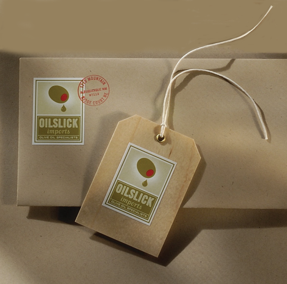
Other projects take advantage of static fonts to bring voice and, many times, humor to address client needs. This ranges from the Green Chile Cerveza packaging solution to the many pieces for the Beer Institute’s celebration of the 80th anniversary of the repeal of Prohibition, and the corporate ID system for the Fine Law Firm and the identity for OilSlick Imports. “ For Oilslick, we designed an identity system that felt old world,” says Tim, “but still addressed the quirkiness of the name ‘OilSlick.’ Humor creates memorability. It’s personal and can build a one-to-one relationship between the brand and its audience.”
Type is a Multifaceted Tool
Liza, also, clearly understands the power of type, when it comes to brand awareness. “We believe that the use of typography is a direct way to communicate information and to deliver a clear and straightforward message. Through the use of strong and distinctive typography, the message can be expressed more directly and can replace the use of illustration or ‘embellishment.’ The typography then becomes the image and the focus of the project.”
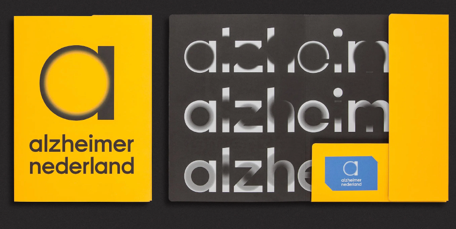
The branding for Alzheimer Nederland is a perfect example of this typographic expression. The Studio Dumbar website explains the rational. “We developed a strong and instantly recognizable identity. The new logotype is bold and confident, but like the human mind it also changes… The ‘vanishing points’ – the blurred, fading elements in the typographic style – visualize the effects of dementia, although some people have also seen them as sources of light and hope.”
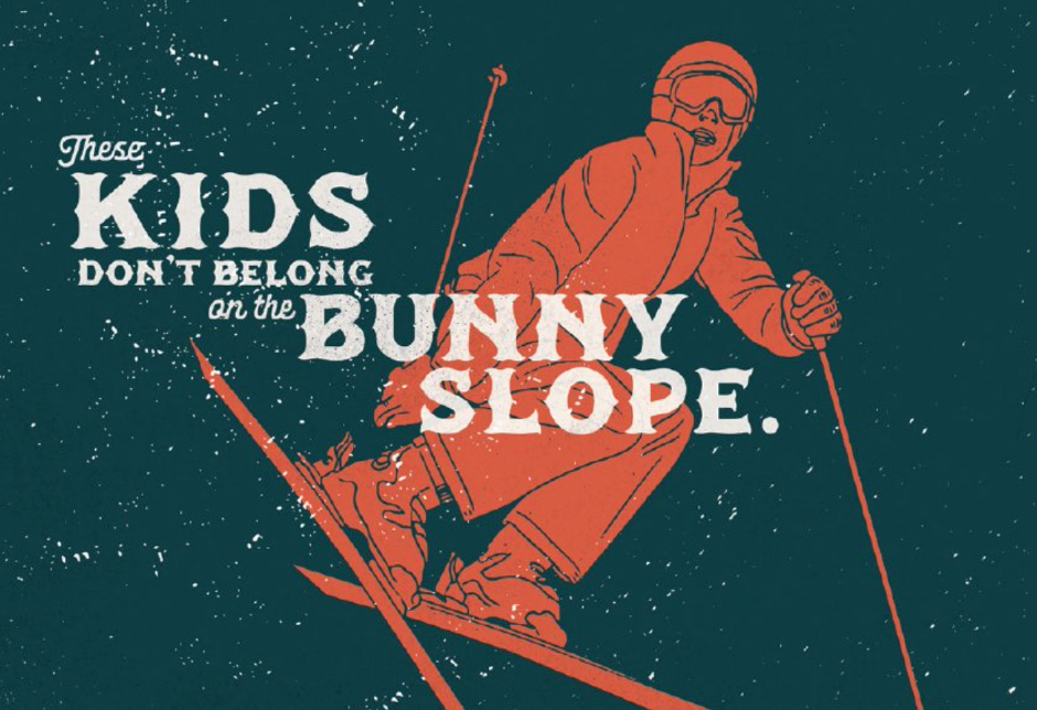
“Sometimes,” says Tim, “with good copywriting and concept, even the most mundane of font choices can become powerful images. The Roswell UFO Festival and Mogul Ski ads are just a couple of examples.”

There are also times when, both, Studio Dumbar and 3 Advertising reach out to typeface designers for bespoke fonts.
“Although we have visual designers in the team that are experienced in font development,” explains Liza, “it is actually not something we do in-house. For projects that require any type of custom typefaces, we reach out to type designers and foundries. But having the knowledge in-house definitely helps us in various ways. The refinement of custom word marks and the creation of variable logos can be created on the spot. In our work, we lean heavily on typography and motion so bringing this expertise into the team was a natural choice.”
No Substitute for Expertise
“We like to bring a handmade or humanistic quality to our work,” says Tim. “While there are plenty of fonts that have that demeanor, sometimes hand lettering – especially for wordmarks – is the best answer. We say that a lot of our typographic decisions are made from the ‘gut,’ but they’re really based on many years of working with fonts and creating typographic design with a staff of seasoned experts. There is no substitute for that.”
Liza and Tim may address their typographic goals in very different ways, but their results are remarkably similar: engagement of the audience, and the creation of memorability. Their work is trendsetting but, more important, their goals are universally smart. Just ask Gutenberg.
Click on the name for more information about 3 Advertising or Studio Dumbar, and to see more of their work.
Download a pdf version of the Type Trends: 2022 Q1 article and add it to your bookmarks.
- Tim McGrath
