Wählen Sie diesen Lizenztyp, wenn Sie eine app für iOS, Android oder Windows Phone entwickeln und Sie die Datei Font in den Code Ihrer mobilen Anwendung einbetten.
Pieches
von PintassilgoPrints
Einzelschnitte ab $29.00

Pieches Font Familie wurde entworfen von
Erica Jung,
Ricardo Marcin und
herausgegeben von
PintassilgoPrints. Pieches enthält
1
Stile.
Mehr über diese Familie
Über die Schriftfamilie Pieches
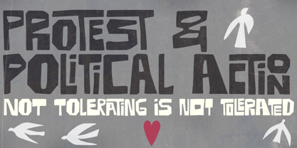
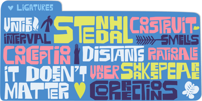
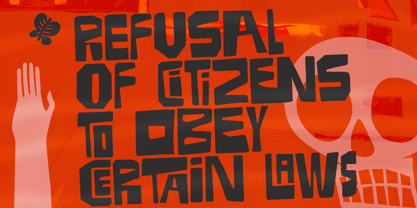
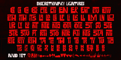
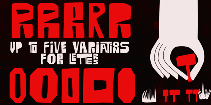
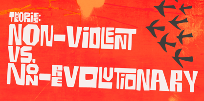
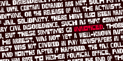
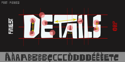
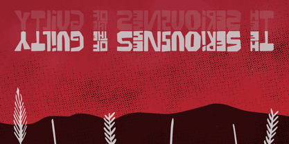
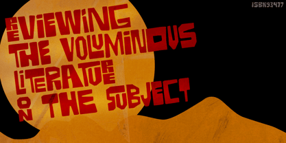
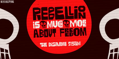
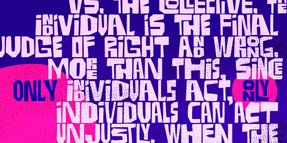
Diese Schrift ist inspiriert von den kraftvollen politischen und sozialen Plakaten von Paul Peter Piech, einem unermüdlichen Künstler und Drucker. Auf die Frage Über nach seiner endlosen Energie und seiner Konzentration auf die Arbeit antwortete er: "Ich will nicht herumsitzen und schweigen". Bei Pieches handelt es sich um einen Linolschnitt Font mit vielen Verzahnungen, darunter vertikale Buchstabenpaare. Es gibt auch Alternativen, und zwar nicht gerade wenige: vier Glyphen für jeden Buchstaben, so dass unzählige Ausdrucksmöglichkeiten offen stehen. Auch grafische Elemente sind enthalten, für hinzugefügt am Wildnis. Dies ist ein lautsprachiges Font für alle, die nicht schweigen wollen. Komm schon, lass uns schreien!
Designer: Erica Jung, Ricardo Marcin
Herausgeber: PintassilgoPrints
Foundry: PintassilgoPrints
Eigentümer des Designs: PintassilgoPrints
MyFonts Debüt: August 9, 2019
Pieches
Über PintassilgoPrints
Their first commercial font is from 2009. And it didn’t take long for PintassilgoPrints typefaces to be picked by creatives to speak for brands such as McDonald's, Starbucks, Cartoon Network, Jamie Oliver, Hasbro, Mattel, Gap, Taschen, Rovio and others. Check out examples of the foundry's fonts in use here. With a strong background in hand printing techniques, PintassilgoPrints has been developing a consistent and original library, with fonts ranking to our best-selling list and Rising Star issues. Their work was also featured in printed magazines and books such as Computer Arts, Page Magazine, Slanted, PicNic, Typolyrics, Typodarium, The Yearbook of Type. The foundry was interviewed for our Creative Characters newsletter as well as for the prestigious 8 Faces Magazine. PintassilgoPrints fonts are often packed with many alternative glyphs and a clever touch of OpenType programming. Their typefaces mostly reflect a vigorous handcrafted feel, seasoned with some 'je ne sais quoi' that decidedly works. Horst was their first Best Seller and Rising Star font, the same route taken by Monstro and Populaire. This ubiquitous one also made it to the Most Popular Fonts of 2011 list. Now established in Florianópolis, an island city in Brazil, the foundry is run by Ricardo Marcin and Erica Jung, who also share life, kids and a long time love of typography, graphic arts, music and sun. By the time of their interview for Creative Characters they were based in Vitória, curiously also an island. Definitely many more sunshiny fonts are yet to come from PintassilgoPrints. Stay tuned!The premium foundry page can be viewed Here.
Mehr lesen
Weniger lesen