Select this license type when you are developing an app for iOS, Android, or Windows Phone, and you will be embedding the font file in your mobile application's code.
Camila
by Latinotype
Individual Styles from $39.00
Complete family of 14 fonts: $199.00

Camila Font Family was
designed by
Paula Nazal Selaive and
published by
Latinotype. Camila contains
14
styles and family package options.
More about this family
- Aa Glyphs
-
Best ValueFamily Packages
- Individual Styles
- Tech Specs
- Licensing
About Camila Font Family
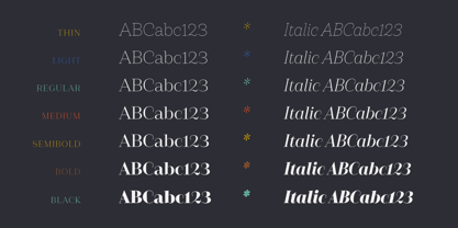
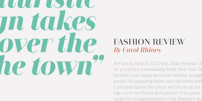
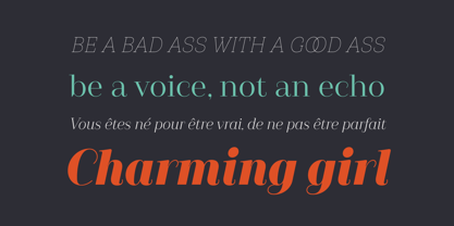
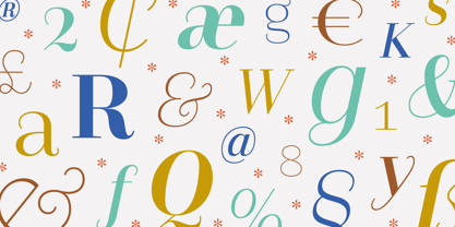
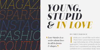
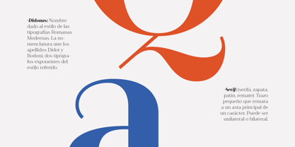
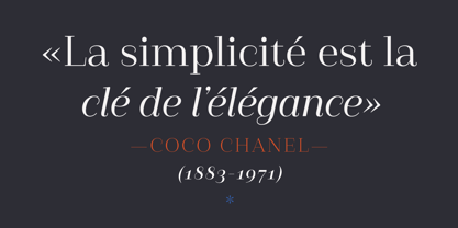
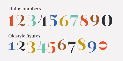
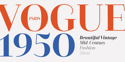
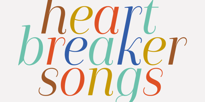
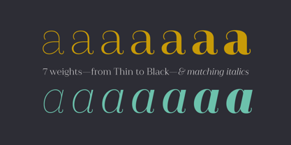
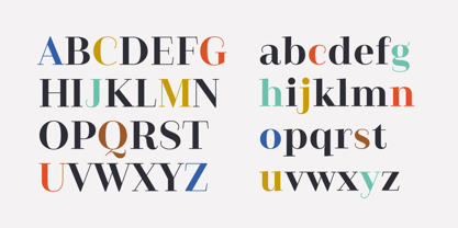
Camila is a delicate and smooth Didone typeface designed by Paula Nazal. The family is inspired by concepts such as elegance, simplicity, femininity, and primarily based on Coco Chanel. A remarkable feature of this font is that it lacks teardrop terminals, characteristic of Didone typefaces. This font of thin serifs and soft finishes also includes italics, strengthening the concept of its design. A great variety of shapes makes Camila an ideal font for both display and small sizes. Camila is the perfect choice for branding and publishing projects.. This font family comes in 7 weights, ranging from Thin to Black, each with matching italics and includes a set of 426 characters that support 206 different languages.
Designers: Paula Nazal Selaive
Publisher: Latinotype
Foundry: Latinotype
Design Owner: Latinotype
MyFonts debut: Jun 14, 2016
Camila
About Latinotype
Based in Concepción and Santiago, Chile, Latinotype’s founders say, “Our goal is to design new typefaces remixing diverse influences related to our South American identity with high quality products for the contemporary design industry.” And the duo have been doing just that since their foundry’s creation in 2007. One of the most successful foundries on MyFonts in recent years, Luciano Vergara and Daniel Hernández, have put together a rapidly growing collection of typefaces in a wide array of genres. Specializing in colorful display and script faces, the group’s name “Latinotype” emphasizes the strong tie they feel to their cultural identity. The Premium foundry page can be viewed Here.
Read more
Read less
- Choosing a selection results in a full page refresh.