Select this license type when you are developing an app for iOS, Android, or Windows Phone, and you will be embedding the font file in your mobile application's code.
Seibi Mita
by Nihon Literal
Individual Styles from $169.00 USD

The Seibi Mita Font Family
was designed by
and published by
Nihon Literal. Seibi Mita contains
1
styles.
More about this family
About the family
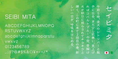
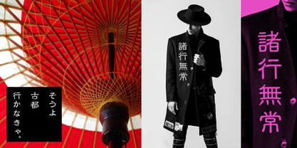
In contrast to the traditionally orthodox and vintage image of the Clerical script (Reisho), this typeface aims for a flat and minimalist design. It features a modern style, minimizing remnants of brushwork, making it suitable for use in TV captions and other contemporary applications. While traditional Reisho is characterized by distinctive brush movements and a flattened appearance, this new variation softens those flat proportions and removes traces of brush texture, presenting a fresh take on the script.
Even with its modern adjustments, the overall atmosphere of the Reisho script is preserved. This allows it to convey a classical, Chinese-like impression, even when used in texts containing kana characters. Though elements like brush texture (bleeding and fading) and stroke flow have been eliminated as much as possible, the original movement and structure of Clerical script have been retained and simplified, ensuring the essence of Reisho is not lost.
古くオーソドックスなイメージを持つ隷書体に対し、フラットでシンプルな書体を目指しました。TVテロップにも使用される、毛筆の名残を極力なくした現代風デザインの隷書体です。扁平で運筆が特徴的な正統隷書体に比べ、やや扁平を緩和し、毛筆の名残を取り除いた新しい隷書体です。現代的にアレンジしているものの、隷書体の雰囲気は保っているので、かなが入った文章でも漢文のような印象に組むことができます。毛筆さび(にじみ・かすれ)や運筆を極力除いていますが、隷書本来の筆の動きや字形を生かして簡略化しているので、隷書体の雰囲気は損なわれていません。
Designers:
Publisher: Nihon Literal
Foundry: Nihon Literal
Design Owner: Nihon Literal
MyFonts debut: Mar 15, 2019
Seibi Mita
About Nihon Literal
Since its foundation, Nihon Literal has accumulated trust and a successful track record mainly in the production of characters used for the headings of book advertisements by publishers and newspaper companies. Among them, "Seibi Font" is a unique typeface brand created to satisfy a customer's request for a font that does not exist in print and typesetting and cannot be represented with existing characters. We will continue to combine the technologies and know-how that have been cultivated over the years in the development of "Seibi Font" and bring passion to the making of fonts by paying attention to details while foremost thinking about customers who wish to convey their sentiments. 日本リテラルは創業以来、主に出版社や新聞社の書籍広告における見出し用文字の制作に携わりながら、多くの信頼と実績を積み重ねてまいりました。 その中で、活字や写植にない書体、または既成の文字では表現できない書体がほしい、というお客様のご要望に応えて誕生した独自の書体ブランド、それが「セイビフォント」です。 これからも私たちは、セイビフォント開発において長年培ってきた技術とノウハウを結集し、思いを伝えたい人のことを第一に考えながら、細部にまでこだわった書体づくりに情熱を注ぎ続けてまいります。
Read more
Read less
- Choosing a selection results in a full page refresh.