Select this license type when you are developing an app for iOS, Android, or Windows Phone, and you will be embedding the font file in your mobile application's code.
Rational TW
by René Bieder
Individual Styles from $0.00
Complete family of 36 fonts: $299.00

Rational TW Font Family was
designed by
René Bieder and
published by
René Bieder. Rational TW contains
40
styles and family package options.
More about this family
- Aa Glyphs
-
Best ValueFamily Packages
- Individual Styles
- Tech Specs
- Licensing
Rational TW Uprights
18 fontsPer style:
$11.05
Pack of 18 styles:
$199.00
Rational TW Uprights Starterpack
10 fontsPer style:
$14.90
Pack of 10 styles:
$149.00
Rational TW Italics Starterpack
10 fontsPer style:
$14.90
Pack of 10 styles:
$149.00
About Rational TW Font Family
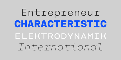
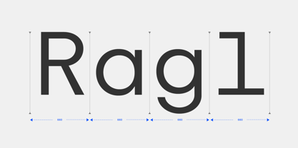
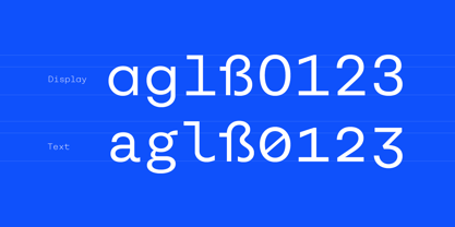
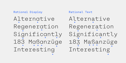
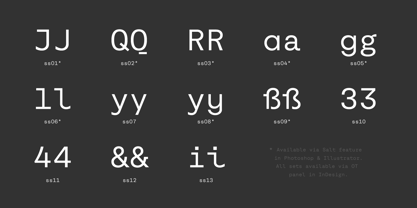
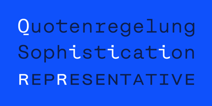
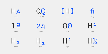
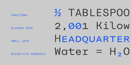
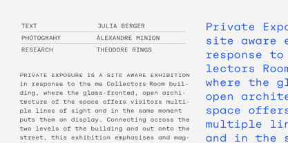
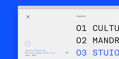
Rational TW is the typewriter addition to the Rational family. It is a monospaced font building on the same principles as its proportional, neogrotesque brother, such as maximum legibility and flexibility while combining Swiss and American gothic elements with a modern aesthetic. Due to the monospaced environment, some of its letter shapes like “r”, “m”,“f”, “i” and “w” have been slightly adapted but kept the same in appearance. Rational TW comes in two version: Rational TW Display and Rational TW Text. As indicated by its name, Rational TW Text is not limited to, but works best in small font sizes because it features distinctive letter shapes like a double storey “a” or “g” in order to help differentiate similar glyphs in small sizes. Rational TW Display, on the other hand, creates a geometric uniformity by implementing round shapes in “a” and “g”, giving it a subtle friendly and open character. Unlike many other monospaced fonts, Rational TW has a large amount of opentype features like small caps, alternative glyphs, case sensitive shapes, and many more making it the perfect choice for countless scenarios. With more than 700 glpyhs per font, it performs excellently in any project from print to digital.
Designers: René Bieder
Publisher: René Bieder
Foundry: René Bieder
Design Owner: René Bieder
MyFonts debut: Jun 14, 2016
Rational TW

About René Bieder
René Bieder (*1982) is a trained Graphic designer and Art Director and self taught type designer. Before setting up his own studio as a type designer in 2013, he was employed in various small and large advertising agencies as an Art Director and Graphic Designer working for national and international clients. During his agency time he developed a deep interest in type design and started designing typefaces as a side project. His second commercial release has won the title "Myfonts Most popular typeface of the year 2012". Since then his typefaces were a constant on the Myfonts best seller lists. Today, you can find his work all around the world. From the Nemo Science Museum in Amsterdam to the University of Florida.The Premium foundry page can be viewed Here.
Read more
Read less
- Choosing a selection results in a full page refresh.