About the family
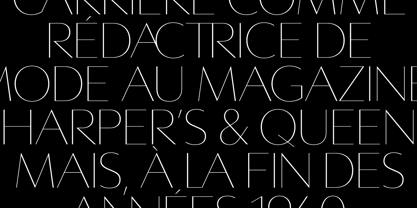
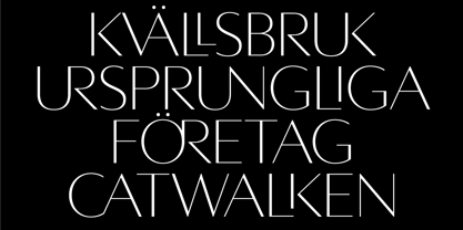
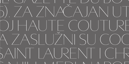
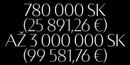
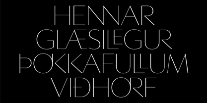
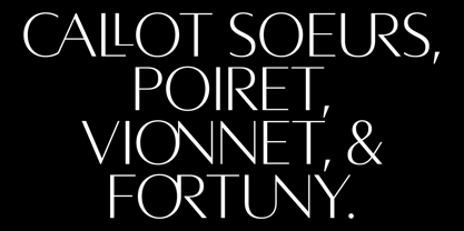
Averes Title Roman is a high contrast sans titling typeface available in three weights. It features an array of stylistic discretionary ligatures with corresponding accented variants supporting numerous languages.
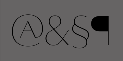
Features include:
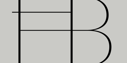
Discretionary ligature feature
Romanian s accent language feature
Dutch IJ language feature
Polish kreska language feature
Slashed zero
Ordinals feature
Language: Afrikaans, Albanian, Asu, Basque, Bemba, Bena, Catalan, Chiga, Congo Swahili, Cornish, Danish, Embu, English, Esperanto, Faroese, Filipino, French, Galician, Ganda, German, Gusii, Hungarian, Icelandic, Indonesian, Irish, Italian, Jola-Fonyi, Kabuverdianu, Kalaallisut, Kalenjin, Kamba, Kikuyu, Kinyarwanda, Luo, Luyia, Machame, Makhuwa-Meetto, Makonde, Malagasy, Malay, Maltese, Manx, Meru, Morisyen, North Ndebele, Norwegian Bokmål, Norwegian Nynorsk, Nyankole, Oromo, Polish, Portuguese, Romanian, Romansh, Rombo, Rundi, Rwa, Samburu, Sango, Sangu, Sena, Shambala, Shona, Soga, Somali, Spanish, Swahili, Swedish, Swiss German, Taita, Teso, Turkmen, Vunjo, Welsh, Zulu
*Requires an application with OpenType and/or Unicode support.
Averes Title Roman
About Reserves
Reserves is an independent type practice focused on a library of designs spanning structured, utilitarian forms and experimental, expressive styles. The collection includes condensed sans-serifs, modular stencils, geometric constructions, and idiosyncratic display faces, often shifting between clarity and graphic intensity. Some families emphasize versatility and restraint, while others explore unconventional rhythms and contrast. The library documents a formative period of independent exploration in typography.
Read more
Read less