About the family
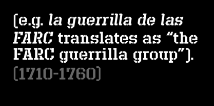
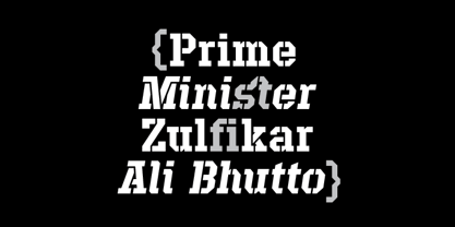
Defense is an unyielding rectangular slab-serif stencil face designed with consistently balanced letterforms and a refined finish. It’s extremely angular geometric form commands attention in display settings, yet is also legible in short text blocks.
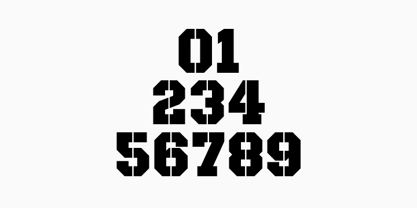
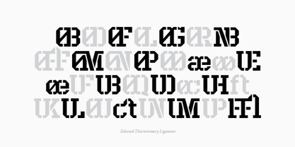
The stencil mark width varies accordingly with each weight, helping to further define each style. Numerous alternate character sets allow room for customization, while the expanded ligatures push letter combinations to the limit.
Stylistically, Defense’s almost crude, sharp-cornered construction is balanced by it’s sophisticated finish and attention to detail, often unrealized in similar faces of this genre. The upright weights are complimented by pairings of true italics, completely rebuilt, slightly narrower in width with modified letterforms, increasing their contrast and flow.
Features include:
Precision kerning
Standard Ligatures set including 'f' ligatures (fi, fl, ff, fh, fj, ffl, ffi, ffj)
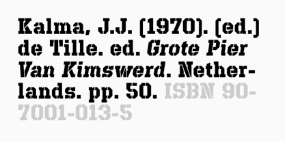
Discretionary Ligatures set including (ft, rt, ae, oe, st, ft, ct, oc, oo, ry, AE, OE, AL, TH, HE, AK, AN, TT, HD, AM, AP, AR, NF, NE, NH, NL, NB, FL, ND, FE, AB, OB, OD, OF, OG, OH, OK, OL, OM, ON, OO, OP, OQ, OR, OU, AH, UE, UF, UB, UD, UH, UK, UL, UM, UN, UP, UR, UU, MP, XY, YX, KY, WY, VY, AF, FF, FI)
Alternate characters (O, o, S, s, a, h circumflex, @, ®, ™, ¶, $, &, _, and various ligature alternates)
Case forms (shifts various punctuation marks up to a position that works better with all-capital sequences)
Capital Spacing (globally adjusts inter-glyph spacing for all-capital text)
Slashed zero
Full set of numerators/denominators
Automatic fraction feature (supports any fraction combination)
Extended language support (Latin-1 and Latin Extended-A)
*Requires an application with OpenType and/or Unicode support.
Defense
About Reserves
Reserves is an independent type practice focused on a library of designs spanning structured, utilitarian forms and experimental, expressive styles. The collection includes condensed sans-serifs, modular stencils, geometric constructions, and idiosyncratic display faces, often shifting between clarity and graphic intensity. Some families emphasize versatility and restraint, while others explore unconventional rhythms and contrast. The library documents a formative period of independent exploration in typography.
Read more
Read less