




Skip to content
Skip to main content

Phonk

by Slava Antipov
Individual Styles from $39.00 USD
Complete family of 6 fonts: $69.00 USD
The Phonk Font Family was designed by Slava Antipov and published by Slava Antipov. Phonk contains 6 styles and family package options. More about this family

About the family


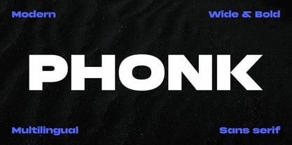
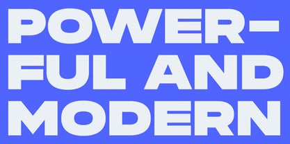
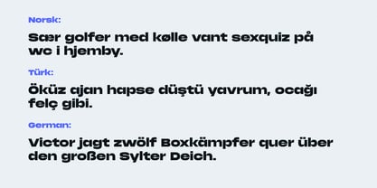
Phonk is an extra-wide, heavy sans serif with a bold geometric character and a strong visual presence. Its broad proportions and massive letterforms make it especially effective when typography needs to command attention and become a central part of the composition.

Designed for expressive display typography, Phonk works particularly well for logos, logotypes, branding, posters, headlines, advertising, packaging, editorial graphics, social media, and other high-impact visual applications. Its deliberately wide proportions give short words and headlines an immediate, powerful silhouette, making the typeface a strong choice for identities and compositions that need confidence, energy, and a distinctive contemporary feel.

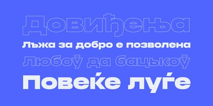
The family includes four styles: Regular, Regular Italic, Contrast, and Contrast Italic. The Regular styles provide the core Phonk look, while the Contrast styles introduce a more expressive variation with stronger stroke contrast. Italic styles add movement and emphasis while retaining the characteristic wide proportions of the family.

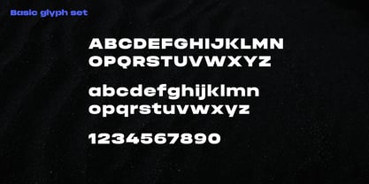
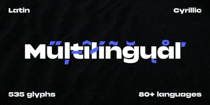
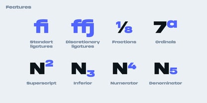
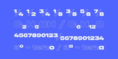
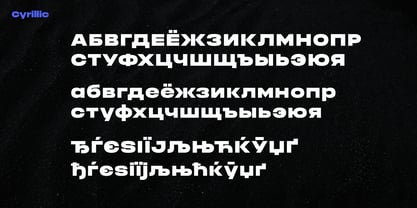
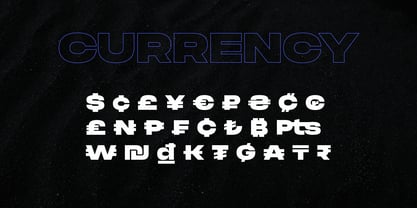
Phonk supports Latin and Cyrillic scripts with broad multilingual coverage. The family includes 537 glyphs per style and a range of OpenType features, including standard and discretionary ligatures, Romanian localized forms, fractions, numerators, denominators, superscript and subscript figures, and access to alternate forms.

With its combination of extreme width, heavy weight, geometric construction, and expressive contrast, Phonk is suited to contemporary branding and graphic design where typography needs to make a strong visual statement.

Designers: Slava Antipov

Foundry: Slava Antipov

MyFonts debut: Sep 22, 2021

Phonk

About Slava Antipov

Slava Antipov is an independent typeface designer focused on contemporary type families, with a particular interest in grotesques and sans serifs. His work explores the balance between functional typography and distinctive visual character, combining geometric construction, expressive details, varied proportions, and flexible typographic systems. Slava creates typefaces for a wide range of contemporary design applications, from branding and visual identities to editorial design, packaging, posters, digital products, and display typography. His families often explore multiple weights, widths, styles, and advanced typographic features, with an emphasis on creating useful and versatile systems rather than isolated typefaces. Multilingual typography is an important part of his work. Latin and Cyrillic have been the foundation of his typefaces from the beginning, while newer projects increasingly expand into Greek and Vietnamese and explore additional writing systems. He is particularly interested in developing high-quality typefaces that make contemporary typography more accessible to designers working across different languages and writing systems. While contemporary grotesques remain the main focus of his work, Slava continues to explore new typographic directions, visual approaches, and writing systems as his type library grows.

Read more

Read less