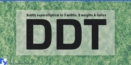
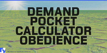
Technical branding has an awkward typographic problem. A conventional corporate sans can be practical enough for an entire identity, but it may say very little about engineering or technology. Push too far toward squared futuristic lettering and the character arrives immediately, along with a typeface that can become tiresome in paragraphs, captions, specifications, and everyday communication. DDT was designed for the territory between those extremes.
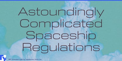
Its underlying geometry was developed quite literally between Univers and Eurostile. The capital and lowercase O from each were scanned and overlaid, and a new curve was drawn midway between them. That intermediate superellipse became the foundation of DDT: engineered enough to establish a technological setting, but conventional enough to keep working after the headline is over.
That balance is particularly useful in aerospace and space technology. Satellite manufacturers, avionics companies, launch-services firms, autonomous-systems developers, and aerospace engineering groups can use DDT for mission names, exhibition graphics, product families, vehicle graphics, and large technical-marketing displays, then carry the same visual language into explanations, captions, specifications, and corporate communication.
Advanced engineering and precision manufacturing offer similar demands. Robotics, semiconductor equipment, industrial automation, optical systems, measurement hardware, and specialist machinery benefit from typography that feels designed for their world without turning every page into science-fiction scenery. DDT can move from a trade-show wall or product name into catalogues, diagrams, technical documentation, and supporting text while maintaining a consistent identity.
Scientific institutions provide another natural setting. Research laboratories, observatories, science museums, biotechnology equipment companies, and research programs often need typography that can bridge institutional communication and technical subject matter. DDT can establish the tone in exhibition titles and program identities, then step down into report covers, diagram labels, captions, and explanatory text.
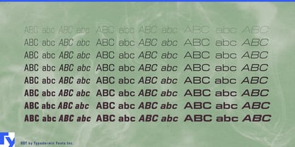
Three widths make that range practical. Condensed fits information into narrow spaces; Regular handles the everyday work; Extended gives the superelliptical construction more room to become a visual feature. Each width comes in eight weights with matching italics, creating 48 styles for building hierarchy around one design rather than reserving DDT only for conspicuous technological headlines.
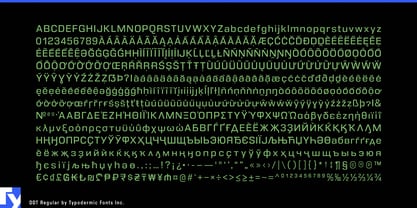
The numeral system is similarly flexible. Monospaced lining figures keep columns and tables aligned; proportional lining figures sit more naturally in display typography; proportional oldstyle figures integrate with running text. A technical catalogue, research report, or information-heavy corporate system can therefore handle data and prose without forcing the same numerical treatment into every context.
DDT’s advantage is not simply that it looks engineered. It can establish that character at large sizes, then keep doing the less glamorous work that surrounds them.