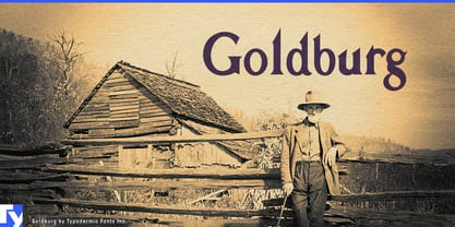
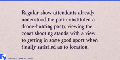
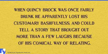
A project about history does not always need typography pretending to come from the period being discussed. Victorian wood type, distressed slabs and faux-antique lettering can quickly turn interpretation into costume. Goldburg takes a different route. Its source is mid-century public-history lettering: a typeface descended from signs used to explain the past rather than imitate it.
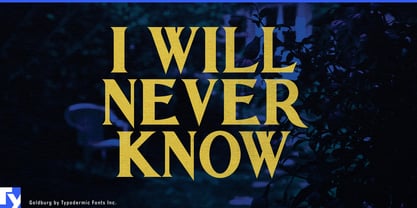
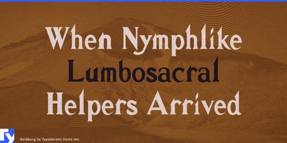
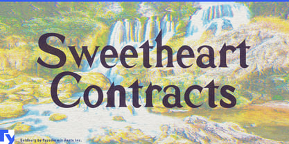
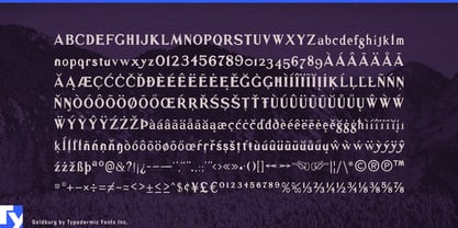
Goldburg is based on lettering George Bowditch designed in 1957 for Idaho’s historical-marker program, part of a statewide effort to treat roadsides and significant sites as an outdoor museum. The digital version preserves most of Bowditch’s distinctive forms while adjusting the spacing for contemporary use. That origin gives Goldburg an unusual historical voice: established and place-conscious, but not tied to the visual language of the century being interpreted.
Historic districts, mining towns, railway sites, preserved industrial complexes, archaeological parks and culturally significant landscapes can use Goldburg for visitor-center titles, heritage-trail identities, interpretive headings and event graphics. It can sit above maps, photographs, oral histories and artifacts without forcing every story through the typography of one particular era.
Regional-history museums, transportation collections, migration exhibitions and shows about settlement, infrastructure or environmental change face the same problem. Goldburg can give exhibition titles, gallery headings and section names an institutional historical character while leaving labels and long interpretation to a quieter companion family.
The same role extends into digital heritage. Mobile history trails, museum websites, interactive maps, location-based tours and augmented reconstructions can use Goldburg for tour names, chapter headings, map sections and digital exhibition titles, helping the screen feel like another layer of interpretation rather than a separate contemporary brand.
Historic hotels and adaptive-reuse properties can use Goldburg when the building’s past is genuinely part of the experience. Restored railway buildings, mills, civic structures and landmark commercial properties may need heritage-room names, restaurant titles, exhibition graphics and commemorative programs that acknowledge history without turning the property into a period theme.
Place-based documentaries, civic centennials, park anniversaries and long-established institutions can use the same language for series titles, chapter cards, dates, location headings and commemorative graphics.
Goldburg is a single display style, best used as the identity-bearing historical voice within a broader typography system. It does not imitate the past being exhibited; it comes from a tradition of explaining the past.