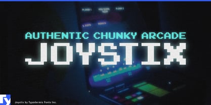
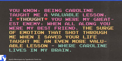
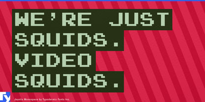
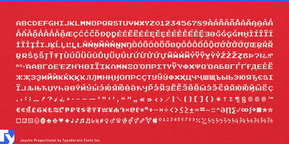
Classic arcade lettering was built for character cells. That fixed-width rhythm is part of what makes it look authentic, but it can become a problem the moment the typography leaves the game screen. Enlarge it for a remaster title, product name, exhibition wall, or launch graphic and the gaps around narrow letters can start to look accidental rather than nostalgic.
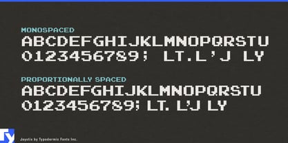
Joystix Proportional keeps the familiar all-caps arcade construction while letting each character occupy the space it actually needs. Narrow letters tighten up, wider forms retain their room, and kerning gives headlines a cleaner, more deliberate fit. The result still reads immediately as classic arcade lettering, but it behaves more naturally when the job is graphic design rather than a simulated score table.
That distinction is especially useful for retro-game remakes, remasters, anniversary collections, and franchise revivals. Fixed-width lettering can still make sense inside reconstructed game screens, while Joystix Proportional is better suited to key art, collection titles, trailers, storefront graphics, convention displays, and collector-edition packaging.
Contemporary gaming hardware presents a similar opportunity. Arcade sticks, leverless controllers, compact retro consoles, FPGA systems, specialty keyboards, replacement control panels, and other enthusiast hardware often need to signal classic arcade culture without pretending to be original period equipment. Joystix Proportional can handle product-series names, controller graphics, cartons, instruction covers, launch graphics, and trade-show displays without the conspicuous spacing of strict monospacing.
Commercial arcade spaces, gaming museums, interactive exhibitions, and themed attractions can use it for entrance titles, attraction names, leaderboard headings, wall graphics, token-card lettering, and event identities. Gaming-history documentaries and retrospectives gain the same advantage in chapter cards, decade markers, historical timelines, and anniversary graphics.
Joystix also carries a broader character set than many arcade-style display faces, giving designers more room for international names and multilingual material without abandoning the visual reference.
The design remains all caps deliberately. A conventional lowercase would make it more general-purpose, but it would also dilute the particular arcade language Joystix is meant to preserve. When authenticity calls for rigid character cells, monospaced arcade lettering remains the right solution. When the same visual language needs cleaner headlines, tighter product names, and more polished display typography, Joystix Proportional is built for that job.