
Skip to content
Skip to main content

Permanence

by Typodermic
Individual Styles from $69.95 USD
The Permanence Font Family was designed by Ray Larabie and published by Typodermic. Permanence contains 1 styles. More about this family

About the family


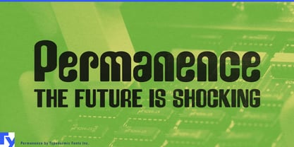
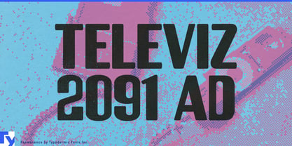
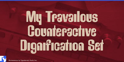
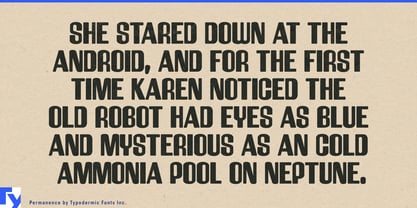
Rounded display type often becomes childish by becoming simpler. Permanence takes a stranger route. Its broad, swollen forms have the friendliness of molded plastic, but underneath them sits a machine-age geometric skeleton. The result can feel cute, psychedelic and technical at the same time.

That combination suits beauty packaging that behaves more like a collectible object than a restrained cosmetic container. Lip oils, nail products, compact cosmetics, pimple-patch packs and playful skincare can use Permanence for product names and collection titles; translucent plastics, jelly finishes, chrome and iridescent surfaces all complement lettering that already looks almost molded.

Collectible toys push the same idea further. Blind-box figures, soft-vinyl characters, capsule toys, miniatures and keychains give Permanence a physical world that matches its proportions. Series names and packaging can feel chunky and approachable without slipping into preschool typography; the unusual geometric details keep the softness from becoming generic.

The same quality works for bag charms, resin jewellery, translucent sunglasses, playful watches and other accessories that blur the line between fashion and collectible object. Friendly technology provides another contemporary direction: desktop robots, smart pet devices, coding toys and educational electronics can use Permanence for names and packaging without falling back on severe angular techno lettering.

Permanence is strongest when something technical has been turned into an object of affection: a cosmetic compact, collectible figure, translucent accessory or small companion robot. Its heavy rounded geometry makes those products inviting, while the underlying construction keeps them from becoming merely bubbly.

Designers: Ray Larabie

Foundry: Typodermic

Original Foundry: Typodermic

MyFonts debut: Mar 14, 2012

Permanence

About Typodermic

Welcome to Typodermic Fonts, a spirited type foundry rooted in Nagoya, Japan, started by the Canadian typeface designer, Raymond Larabie in 2001. Our library brims with 500+ diverse typefaces to fuel creativity in graphic design, advertising, web, and app development. As digital type pioneers, we adopted web fonts and app licensing early, consistently pushing the design envelope. With Canadian heart and Japanese precision, we're your global partners in extraordinary typography. Explore Typodermic Fonts—where creativity meets character.

Read more

Read less
