Discover legacy content from FontShop.com, preserved for your reference.
Getting Menus Under Control
Jason Tselentis in Learning on July 27, 2015
When designing website menus, it’s important to consider quantity and location. How many navigation points should you show the reader? How few? Where will the menu be located, and does it warrant using a hamburger? And what’s a hamburger? As you define and design the menu’s broad strokes, its structure and hierarchy, you’ll also need to mind the details that shape your menu’s overall look and feel.
Menu Conventions
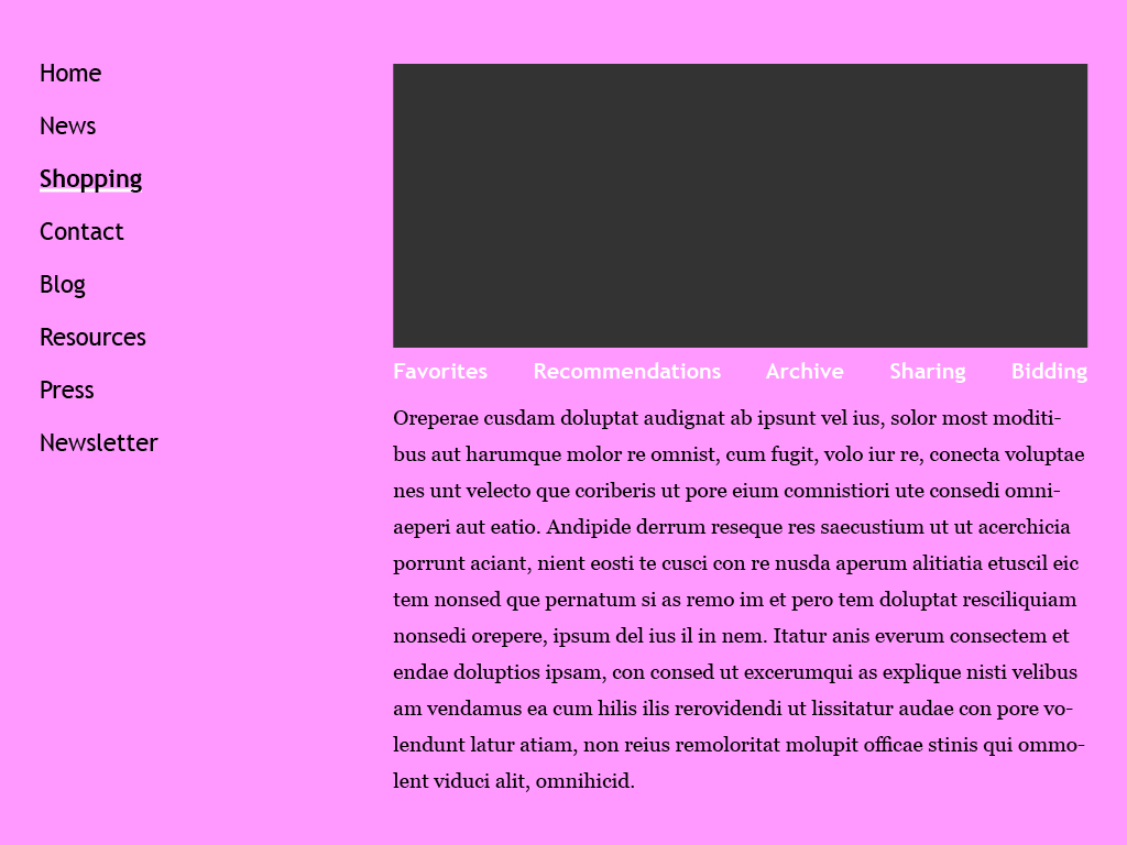
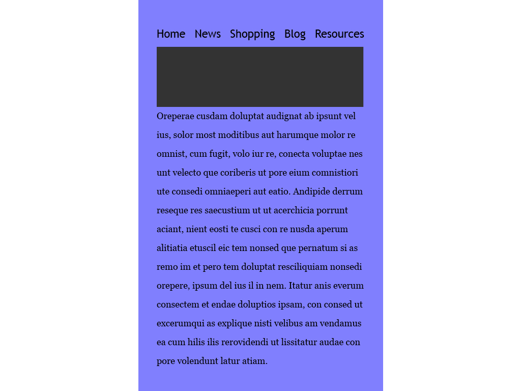
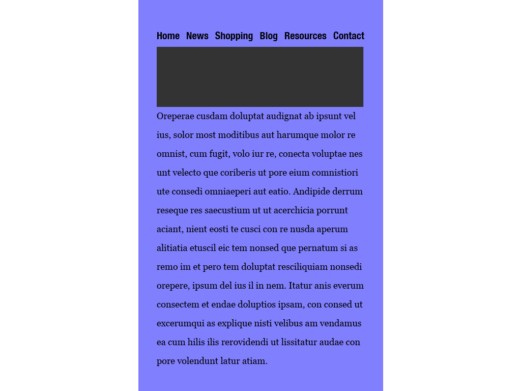
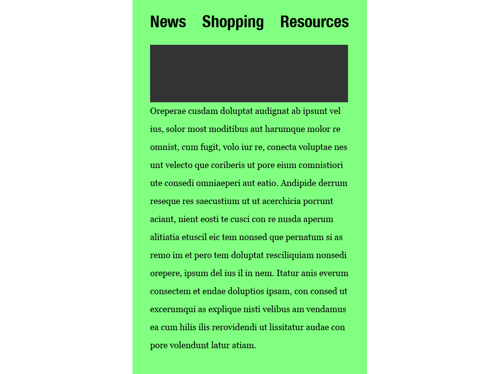
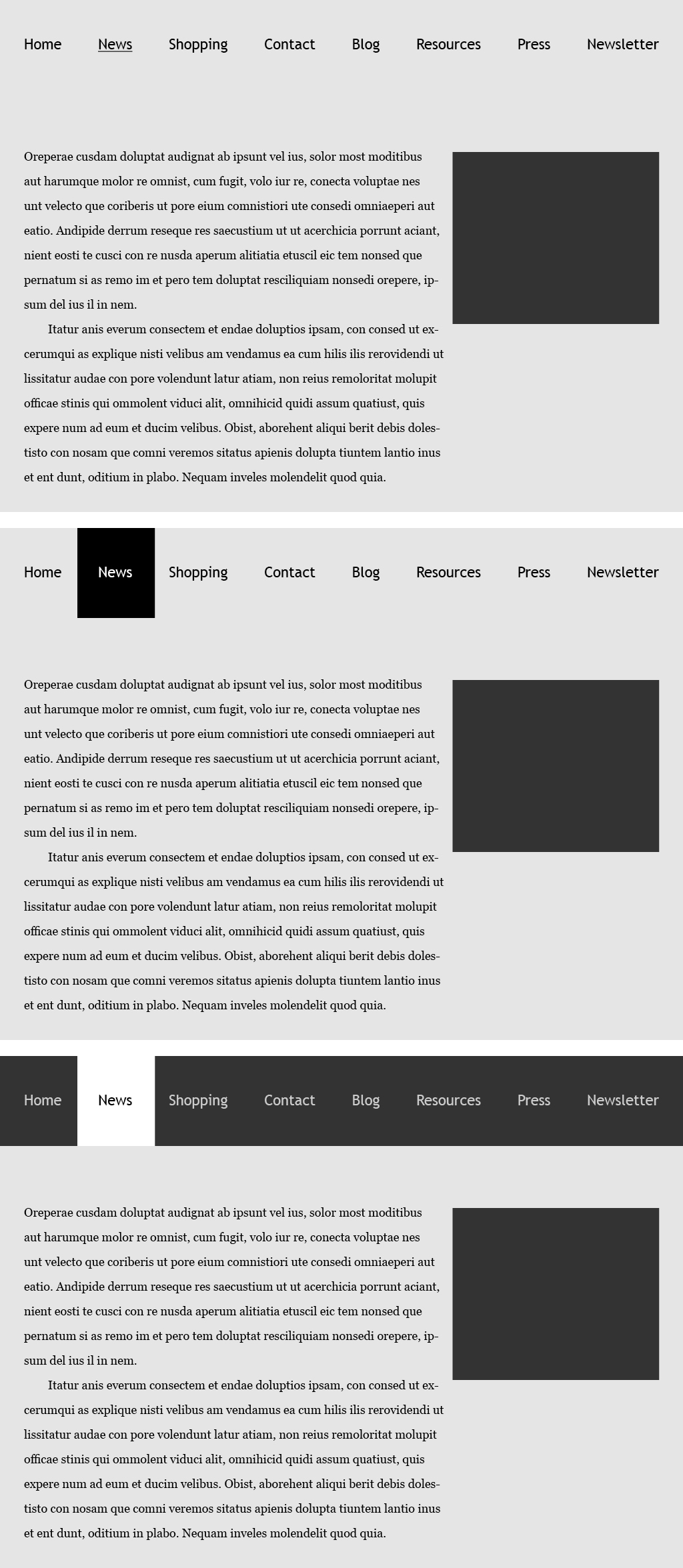
Many navigation conventions used during the Internet’s infancy are still in use today. Then, as now, menus can be located at the top of a site or on the side, or on the top and the side. There are primary and secondary menus. And there’s the “everything and the kitchen sink” approach to show users as much as possible.
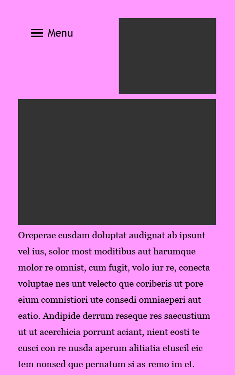
And when even more menu choices get added, what should users see first? The menu over an image? Menu on the top? Typographic styling helps create hierarchy, and also creates a unique tone of voice. One convention that has climbed to popularity in a very short period of time is the hamburger-icon menu: the three short lines stacked on top of each other. Click it to reveal a menu, click it again to conceal it. For many designers, the hamburger is especially useful during our “mobile-first” day and age, when you have to cram a lot into a very small screen.
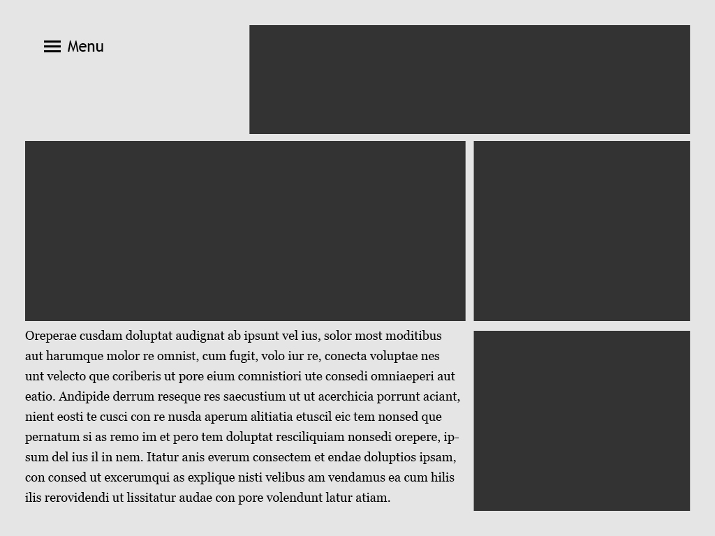
A hamburger-icon prompts a user to click to expand menu choices. When limited screen space is available or if you want to put more imagery and text within the layout, the hamburger-icon can be a saving grace. But hiding content in this way can limit or prohibit users from navigating your site. Does the hamburger help with navigation or hurt it? Although user experience designers continue to debate the hamburger’s usefulness—or uselessness—it can be found on a wealth of websites, as well as the web browsers themselves, such as Google Chrome® and Mozilla Firefox®. Whether you love it or hate it, the hamburger is here to stay—at least for now.
Use Factors
Whichever menu convention—or conventions—you employ will depend on a lot of factors, including but not limited to:
- Who – user profile(s) – Do users have an experienced, average, or below-average understanding of the site, content, and/or web navigation itself?
- What – the content – How deep is your website, and how many choices will you need to give users?
- Where and How – device(s) used – Where will users access the content most frequently, and will it be in stasis or while traveling, while traveling? And via mobile or desktop, or both?
- Why – use cases – How can role playing and user feedback teach you about what the user wants to get out of the site? Why do they go there, and why do they come back?
Use exploration can define those issues and influences, with the design team conducting role-playing exercises to help identify menu design opportunities. Having subjects conduct use testing with the site’s preliminary design—whether a paper mock-up, digital mock-up, website wireframe, or beta version of the site—will also prove valuable. And when the site is ultimately released, be sure to test adequately and regularly, iterating and revising the site as needed based on feedback you receive from users or from website analytics such as cursor tracking.
How much and how little information users immediately see, and then dig deeper to access, will define the site’s look and feel. Have too many selections in too many places? You’ll appear complicated, making your user feel overwhelmed. Too few choices? The user may not know where to go, and feel lost. And even though version 1.0 of your site may have given users a positive experience, over time, you may receive feedback that warrants minor redesigns, or even major ones.
Tone of Voice: Quiet, Loud, or Indiscernible
Typographic size, contrast, color, weight, and style will factor into a menu’s look and feel, sometimes referred to as tone of voice in written and spoken language. If the type is too small, the menu becomes quiet and unnoticeable, even difficult to locate. Too big? You wind up yelling at the reader, making them feel like you don’t trust them to find what they want to or need to. To learn more about type size and style, you can read how it impacts readability and legibility in a prior post.
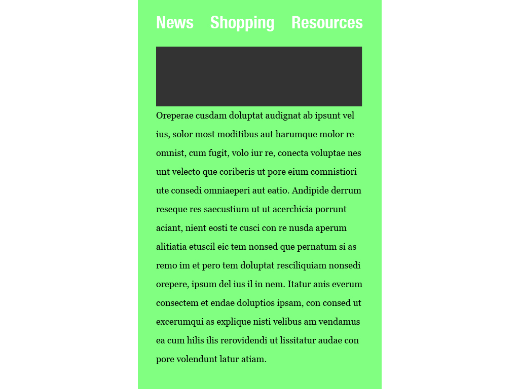
One overlooked area in menu design is contrast. If the menu has low contrast with type that’s too close in value to the background, you might get on people’s nerves because it’s too difficult to read.
Another area where contrast between typography and background comes into play is with a menu item’s rollover state. Typographic styling can help identify when a menu choice has been rolled over. This styling should help users recognize that their input has been received.
When styling the menu typography, and the way it appears when it’s rolled over, consider:
- Usability across users and media, be it a large-screen or small-screen
- Meeting brand identity standards that relate to your communication goals and intended purpose
- Site use and navigation trends, even changes in technology such as how a website is built or what screens people use to access the site, coupled with user feedback
Be conscious of your brand identity standards, and use typefaces that align with or enhance that identity, but also be sure to monitor the site’s use, so you deliver a positive user experience. The quantity and location of menu choices, as well as the typographic tone of voice, should speak to your users appropriately, and allow them to get what they want and to go where they want. Last but not least, include a search input field so users can quickly and easily enter their query, in case they want to or need to bypass the menu altogether.