Mantika Book
Mantika Book expands the Mantika super family: a contemporary serif font with a soft, yet robust character and a classic look
Mantika Book, an Antiqua, is the third member of the Mantika super family, which consists of the Mantika Sans and Mantika Informal. Designer Jürgen Weltin has gone back to the roots of his font, which he had originally derived from a Renaissance Antiqua. These origins are recognizable in the first member of the Mantika family, Mantika Sans, in the form of carefully suggested line use and a contrast in the weights that recalls the Antiqua. This solid sans serif, optimized for use in text, also has a particularly energetic and dynamically designed italic.
 Mantika Informal also brings to mind a cursive font at first glance; ultimately, however, it is not easily categorized. Its light, organic shapes combine the informally flowing style of cursive handwriting with the open and airy form and contrast of a humanist sans serif.
 Find out more information about Mantika Sans and Mantika Informal here.
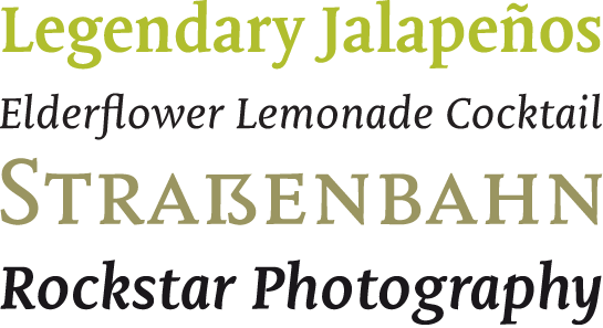
The shapes in the serif Mantika Book are also based on the Renaissance Antiqua, just like the other members of the Mantika super family. However, the contrast in the weights is somewhat stronger than is conventional for this genre, and the serifs are characteristically asymmetrical, with slanted ends. Lightly grooved stems with an implied curvature in the lower-case letters as well as dots whose shape flirts with a fountain pen lend the Mantika Book a dynamic and particularly friendly character. Details like the open “g” or the contoured foot of the “k” emphasize this dynamism. The letters of Mantika Book have the same large x-height as the other members of the super family, but are equipped with somewhat longer ascenders and descenders.

Like Mantika Sans Italic, Mantika Book Italic has only a very slight italic. The more rounded design of these letters have significantly drawn out line ends, the lower-case “a” changes to a closed and the “e” into a more rounded shape; the “f” has a descender and the upper bar of the small “k” is designed with an arch shape.

The open counters, the large x-height and the ascenders and descenders that support the appearance of the words help Mantika achieve perfect legibility, even in longer passages. The Italic, with its slight slant, is interesting for scientific use. References, often set in the Italic, are easily legible without fatigue – even over multiple lines – thanks to the minimal incline.
The primary application of this reading font is, as the name suggests, for books. However, its many striking details and warm and friendly charisma lend Mantika Book a very good figure in larger display sizes, as well. Mantika Book demonstrates a slick combination of the somewhat old-style feeling of a contemporary serif font with a soft, yet robust, character.
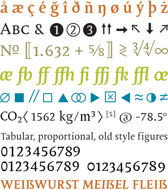
Mantika Book is available in Regular and Bold weights, each with their own Italic. All four styles are, like the rest of the Mantika family, designed with nearly the same letter-spacing. Character sets with upper-case characters and medieval numerals, intended for tables and proportions, as well as small capitals in the Regular styles, make Mantika Book well equipped for various design tasks. Additional scientific symbols, arrows and graphic elements round out the selection of characters. Typography experts in the German-speaking realm will be happy to note the capital German double s. The paneuropean character set in Mantika Book covers a total of 89 languages in the Pan-European area, including Greek and Cyrillic characters.
The new Mantika Book not only expands the Mantika super family to a total of three members; the new options for combination enable new areas of application, as well. Mantika Book and Sans make for an ideal pair when combined for large typesetting projects. You could, for example, use the Sans for headings and introductory passages and Mantika Book for the continuous text.
 Example applications for book composition: Mantika Sans (headlines) and Mantika Book (continuous text) were used
Mantika Informal also makes a great addition to Book, with its loose and cheerful manner – for the design of marginal notes, for instance, or large citations. Use the qualities of the Mantika super family to create designs with a very open and friendly character in a well-equipped typography universe.
 Example applications of Mantika Informal and Mantika Book