Finador Slab Font Field Guide

Best Practices
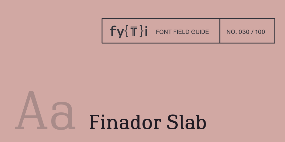
Finador Slab is a soft slab-serif family. It has a strong character and can be used for many applications, especially for editorial, branding, packaging and logos. The family supports almost every of your needs. It has all the requirements to become your next favorite workhorse family.

Family
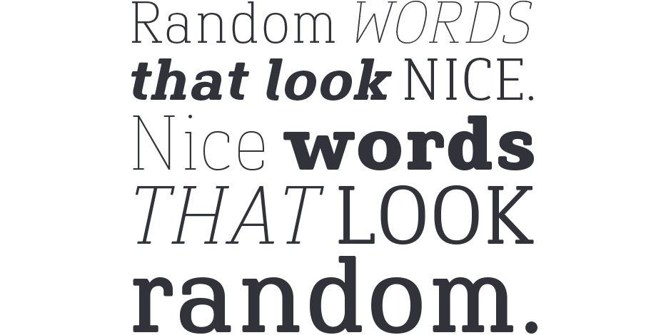
Finador Slab is a soft slab serif family with a total of 16 weights, from thin to heavy and matching italics.
Font Facts
- Finador Slab is based on Finador Sans.
It matches perfectly and can be used easily together. - The Finador Slab family includes many Open Type Features like small caps, ligatures, fractions, alternates and many more. The Stylistic Sets give you the opportunity to choose the best look and feel for your projects.
Roots
When Finador Sans was released, Julien Fincker couldn’t get rid of the feeling that he wasn’t finished yet. Something was missing, something with more expression, an opponent with the same character. So he took the designs of Finador and started to sketch. Line contrasts, classic antiqua serifs, none of them really matched the original character. But one thing seemed to work well at first glance. A little more line contrast together with thick slab serifs. The thick serifs with rounded corners complemented the overall look of Finador perfectly. So the starting signal for the Finador Slab was given.

Legibility
The lighter and heavier weights are particularly suitable for headlines, while the middle weights can be used for typographic challenges and body text. A large x-height and slight contrast provide a high level of typographic legibility.
How to spot Finador Slab

Alternate Choices
Perfect Pairing
Download a PDF version of the Finador Slab Font Field Guide and view the Finador Slab font family.
More Font Field Guides

Royalis is an expressive and extravagant serif typeface family. It is characterized by a high contrast and dynamic features in the details, such as long terminals or deep inktraps. Royalis is available in three versions: a display version in six weights, a corresponding condensed version also for display applications, and a text version for body text in four weights.

Finador is a modern, soft sans serif family. The functional style of a sans-serif has been soften by open apertures and rounded corners. This makes Finador functional and friendly.


