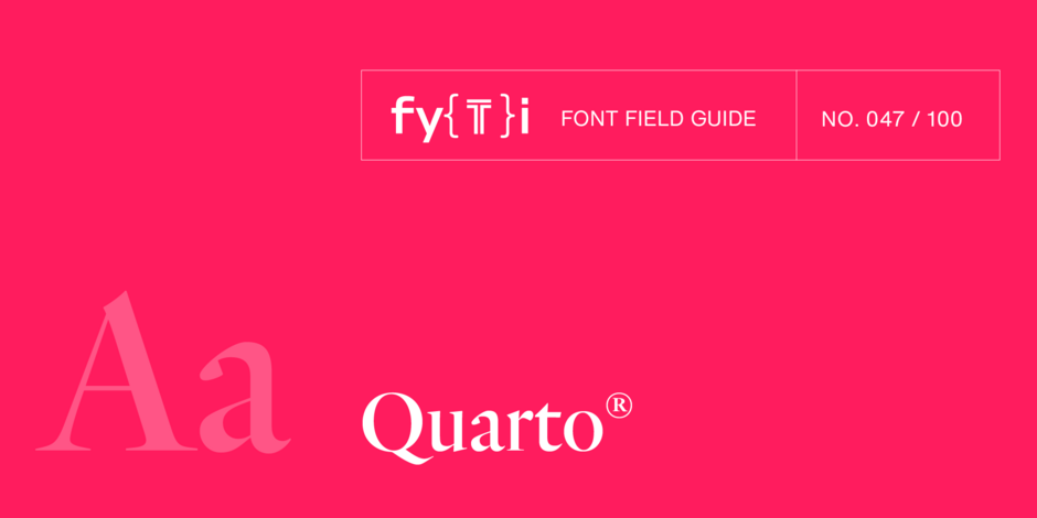
Quarto® Font Field Guide

FOUNDRY: Hoefler & Co.
DESIGNER: Sara Soskolne with Jonathan Hoefler
CLASSIFICATION: Old Style
BEST PRACTICES
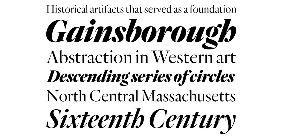
Quarto is designed for headlines and subheads. A large x-height, short descenders, and small serifs invite both tight tracking and solid linespacing. Quarto can be an excellent choice for setting display copy in print or on-screen.

FAMILY
The Quarto family contains 10 designs of Roman and italic, ranging from Light to Black.
FONT FACTS
- Fonts of Quarto contain stylistic sets of non-descending cap J’s, short-tailed Q’s, cursive italic lowercase h’s, in addition to old style and ranging figures.
- Quarto should not be used at sizes below 15 pt in print, or 40 px on screen.
ROOTS
Dutch Old Styles typefaces date back to the late sixteenth century. In reviewing the historical artifacts that inspired Quarto, Soskolne and Hoefler decided the design should not simply replicate this period style but instead interpret some of its more intriguing and open-ended ideas. They introduced tension between contrasting qualities: dark, gothic strokes were balanced by bright, crisp serifs; a forest of vertical stems was punctuated by moments of lush roundness. This carefully controlled tension became a defining theme of the family.

LEGIBILITY
Quarto’s large x-height, open counters, full apertures, and distinctive character designs make for a highly legible design. A simple elegance also makes Quarto perfect for publication applications, in addition to packaging and branding design.

ALTERNATE CHOICES
PERFECT PAIRINGS
MORE FONT FIELD GUIDES

Gotham’s unfussy directness and authority, especially in its heavier weights, create a brawny mien, while lighter weights are elegant and stylish.

FF Clan is a friendly design that melds a strong geometric aesthetic with humanist warmth. It’s appropriate for a wide variety of typographic applications, from branding to display heads and lengthy text copy, in hardcopy and digital applications.


