Manual: Four Rules of Shapes & Wraps
Four Rules of Shapes & Wraps
Prior to digital technology, setting type to a shape or wrapping it around an image was difficult at best – and virtually impossible if the shape or wrap was the least bit complicated. Now, it is relatively easy to define a shape and “pour” the type into it. Technically, it is simple. Aesthetically, however, it can be problematic.
If you want to add a little visual dynamism to a page, take into account the following: and you’ll be well on your way to creating dramatic typography – that is also relatively easy to read.
1. Keep things simple
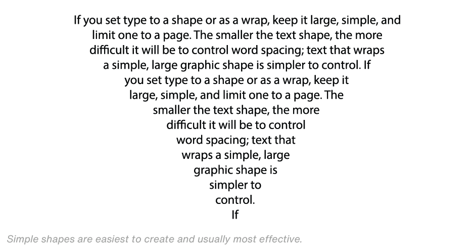
Text that takes on a shape or has unorthodox alignment is almost always distracting and rarely easy to read. If you set type to a shape or as a wrap, keep it large, simple, and limit one to a page. The smaller the text shape, the more difficult it will be to control word spacing; text that creates a simple, large graphic shape is simpler to control. Many text shapes on a page will make content flow hard to follow. And wrapping text around several graphic images will almost always create a page that is cluttered and difficult to read.
2. Make adjustments for readability
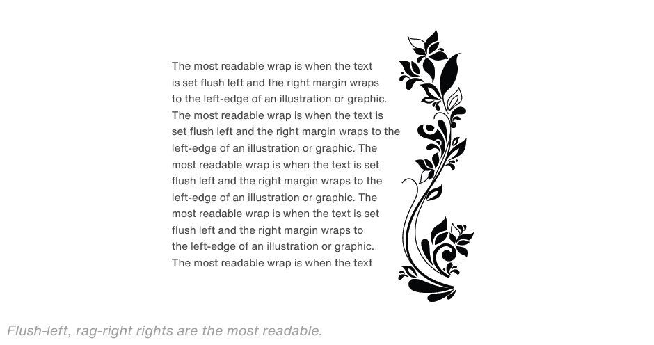
Defining the shape and pouring in the copy is only part of the process. Copy and spacing may have to be manipulated to maintain the shape’s integrity and content readability. A block of text copy set to a shape that has poor word spacing is even more difficult to read than justified columns of type with poor word spacing. Keep in mind that the text content is always more important than the shape in which it is set. The most readable wrap is when the text is set flush left and the right margin wraps to the left-edge of an illustration or graphic.
3. Watch the margins
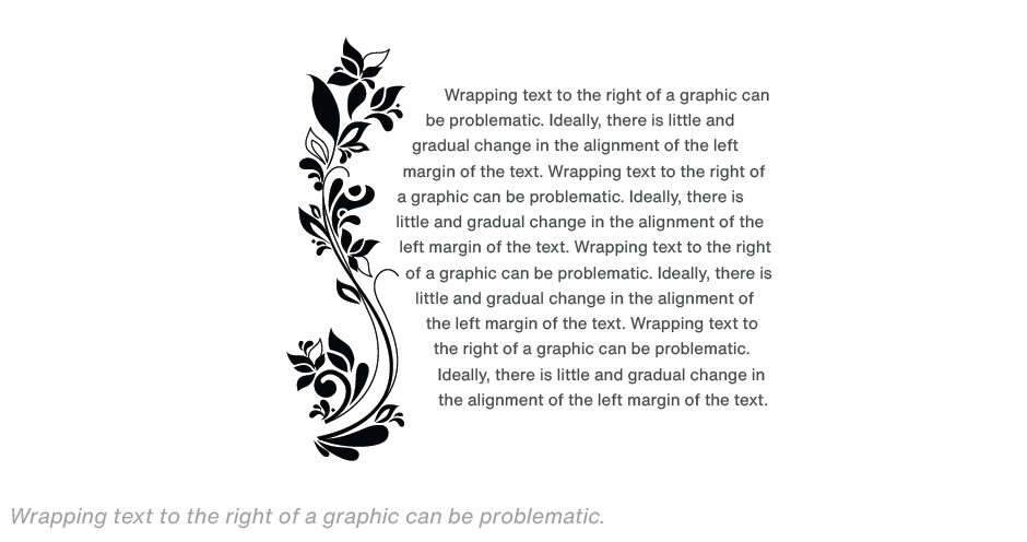
Margins may have to be adjusted to provide an optically even wrap. Part of the reason for this is that it is not the edge of the characters that aligns to the margin, but the character’s bounding box. As the margin deviates from absolute vertical, the space between the character and the graphic may appear more distant. The solution is to adjust the margin shape to produce optically even alignment with the graphic. Wrapping text to the right of a graphic can be problematic. Ideally, there is little and gradual change in the alignment of the left margin of the text.
4. Remember the reader
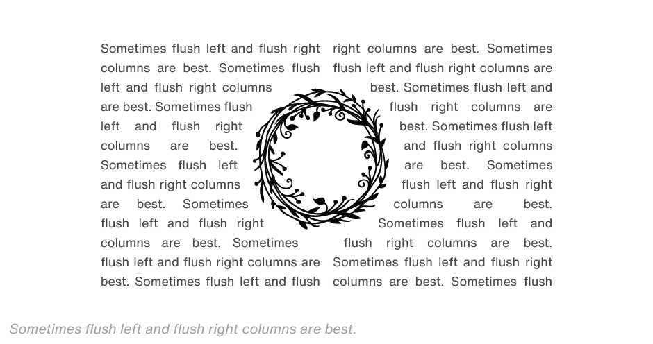
Two-sided wraps are the most problematic. Here, the text should almost always be set in two columns. Forcing the reader’s eye to jump over a graphic to continue reading a line of copy is rarely successful. The larger the graphic, or jump the eye has to make, the more copy flow is disrupted. If the columns are set flush-left, rag-right, the right edge of the first column may also have to be set flush-left as it wraps around the graphic. The most readable two column wrap is when the text is set flush left and the right margin wraps to the left-edge of an illustration or graphic, while the second column wraps to the right edge of the illustration and is flush right.
Text shapes and wraps can create arresting and engaging pages. Follow the four rules above and they will also be pages that will be read.
