Manual: Word Spacing
Why is Word Spacing Important?
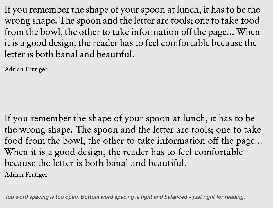
Word spacing is the single most important factor contributing to typographic readability. This seemingly small detail plays an important role in the color, texture and readability of graphic communication. Correct word spacing is something that isn’t noticed: page texture is even, inviting and easy to read.
Word spacing that’s too tight makes it hard for the eye to distinguish one word from the next. Words appear to run into each other. But this is almost never the problem. Open and uneven word spacing is almost always the culprit. When there is excessive word spacing, copy breaks into separate elements, forcing the reader to read individual words rather than phrases or blocks of copy. This dramatically slows down the reading process – and reduces reader comprehension.
Tips for Spacing
Although assigning appropriate space between words is more of an optical determination than an exact science, some typographic factors have a direct and important influence. The best word spacing can be affected by the proportions of a typestyle, letter fit, and point size of the setting.
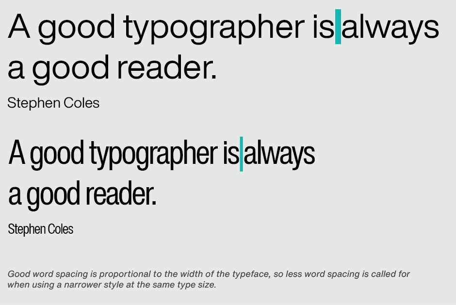
• A condensed type design requires less space between words than an expanded face.
• A typeface with tight letter spacing needs less word space than a more openly fitting design.

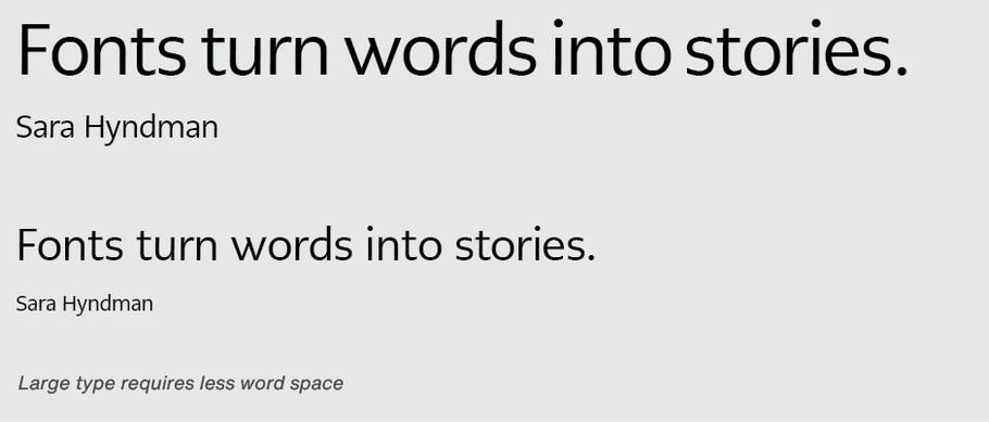
• Larger point settings require slightly less word space than smaller sizes.
There is a quick check to determine if there is too much word space: turn the copy upside down. If one word can be easily distinguished from another, word spacing is too open.
