Text Readability Manual.
Readability is a relative gauge of how easily words, phrases and blocks of copy can be read. Many things can affect readability – everything from the number of typefaces used, to the kind of surface on which the type is imaged. There are a few areas, however, which require the most attention.
Type Size
This is one of the most subjective decisions you’ll have to make, regarding readability. The question, “What’s the right size to set type?” is roughly akin to, “How long is a piece of string?” It depends.
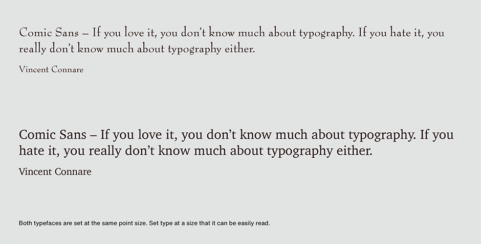
The right type size is appropriate to application and to reader. Informative material requiring sustained reading normally benefits from a larger type image. If your audience has to make an effort to read the copy – they won’t. Referential information (classifieds, box scores, etc.) can get away with considerably smaller type. This is because readers are predisposed to obtaining the information.
Line Length
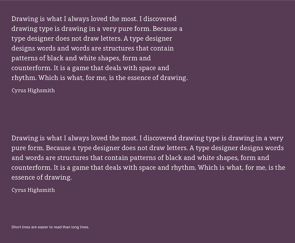
Contrary to what many think, the eye does not read individual words, one at a time. Actually, the eye scans a line pausing momentarily to record groups of three or four words. Studies have found that the eye can make about three or four of these pauses on a line before it becomes tedious. Simple math says that somewhere between 9 and 16 words ought to occupy a line. Long lines tire the eye and interfere with referencing the beginning of the line that follows, while short ones can break up sentence structure. Overly long lines, however, are generally considered worse offenders of readability than lines that are too short.
Line Spacing
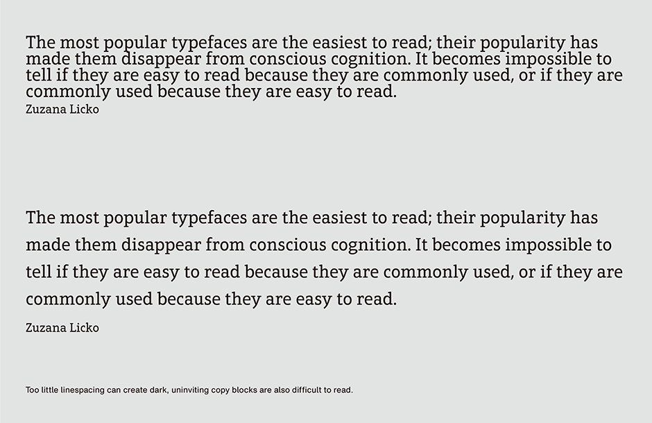
Optimum line space serves as a guideline for the eye. When there is too much line space, the eye must make conscious jumps between lines, slowing down the reading process. Too little line space creates dark, uninviting typographic “color” and undefined horizontal guidelines.
A general rule for achieving good line spacing is that it should be approximately 20% of the point size of the type being used. This is, however, just a rule-of-thumb. Heavy faces, and those with large lowercase x-heights, usually require a little more line space to avoid a dark page. Light typefaces, and those with long ascenders and descenders, can get away with less line spacing. And sans serif typefaces, because they do not have the benefit of serifs to guide the eye, generally need a little more line space than serif designs.
Letter Spacing
Fonts from established providers are usually “industrial strength” products that have been through rigorous test and edit cycles. Since the space around letters is just as important as the strokes that describe them, type designers and type foundries spend a lot of time making sure that inter-character spacing is as good as it can be. There are only a few instances when you would want to change the letterspacing as delivered by the font provider.
Adjusting for very large or very small point sizes
Correcting for all-cap copy
Setting reverse copy
Adjusting for Extreme Point Sizes
Most text typefaces are designed to space well within a relatively narrow range of type sizes – usually between 8 and 14 point. At large sizes the letter spacing may appear to be too loose and at small sizes too tight. If the built-in spacing is not ideal for the way you use the font, try opening or closing the tracking. This will add or reduce the overall letter spacing in a selected block of text.
All-capital Copy
Capital letters do not combine as well with each other as do lowercase characters. Because capitals have more diverse character shapes, intercharacter spacing often appears uneven. If you need to set words in all capitals, adding a little extra letterspace will often improve things.
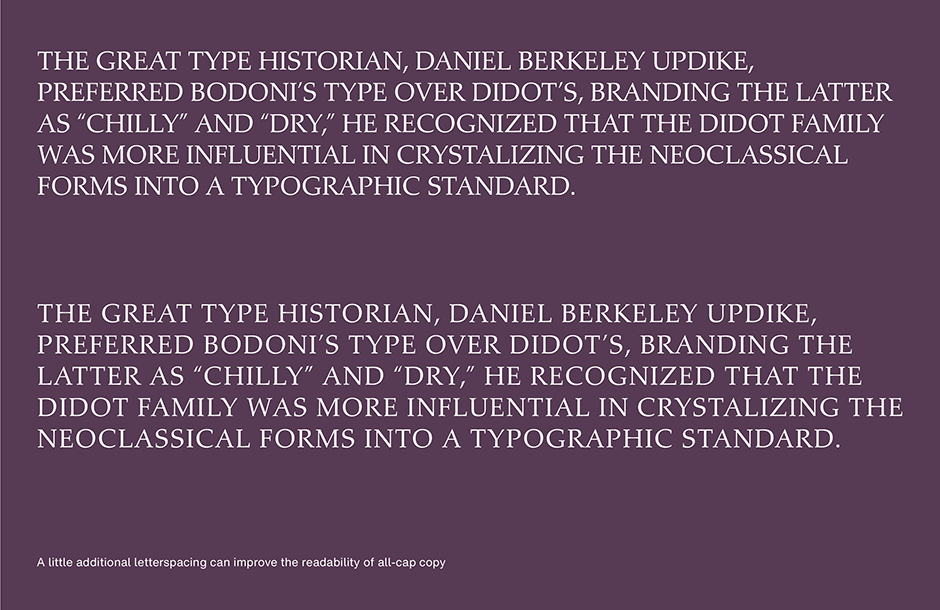
Reverse Copy
It’s a good idea to open up letterspacing a little when setting reverse copy (light type on a dark background). This will make the text easier to read.
Word Spacing
Word spacing is the single most important factor contributing to typographic readability. This seemingly small detail plays an important role in the color, texture and readability of graphic communication. Correct word spacing is something that isn’t noticed: page texture is even, inviting and easy to read.
Open and uneven word spacing is usually the culprit when it comes to word spacing issues. Excessive word spacing forces the reader to read individual words rather than phrases. This dramatically slows down the reading process – and reduces reader comprehension.
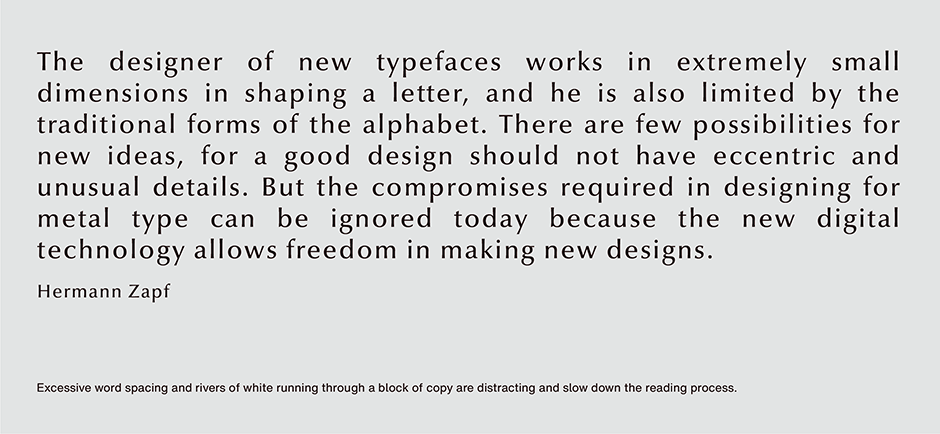
Although assigning appropriate space between words is more of an optical determination than an exact science, certain factors have an influence. The best word spacing will be affected by the proportions of a typestyle, letter fit, and point size of the setting.
- A condensed type design requires less space between words than an expanded face.
- A typeface with tight letter spacing needs less word space than a more openly fitting design.
- Larger point size settings require slightly less word space than smaller sizes.
Finally, there is a basic “goodness” test for text readability: when you look at a block of copy do you see letters, words, or phrases? Phrases are best. Words will do. Never settle for just letters.
Download a pdf version of the Text Readability article.


