Emphasizing in Text Manual.
Once you’ve got the “discretion” thing is in mind, there are a few basic tools you can use to create typographic emphasis.
- Italics
- Boldface
- Size
- Color
- Typestyle Change
Italics
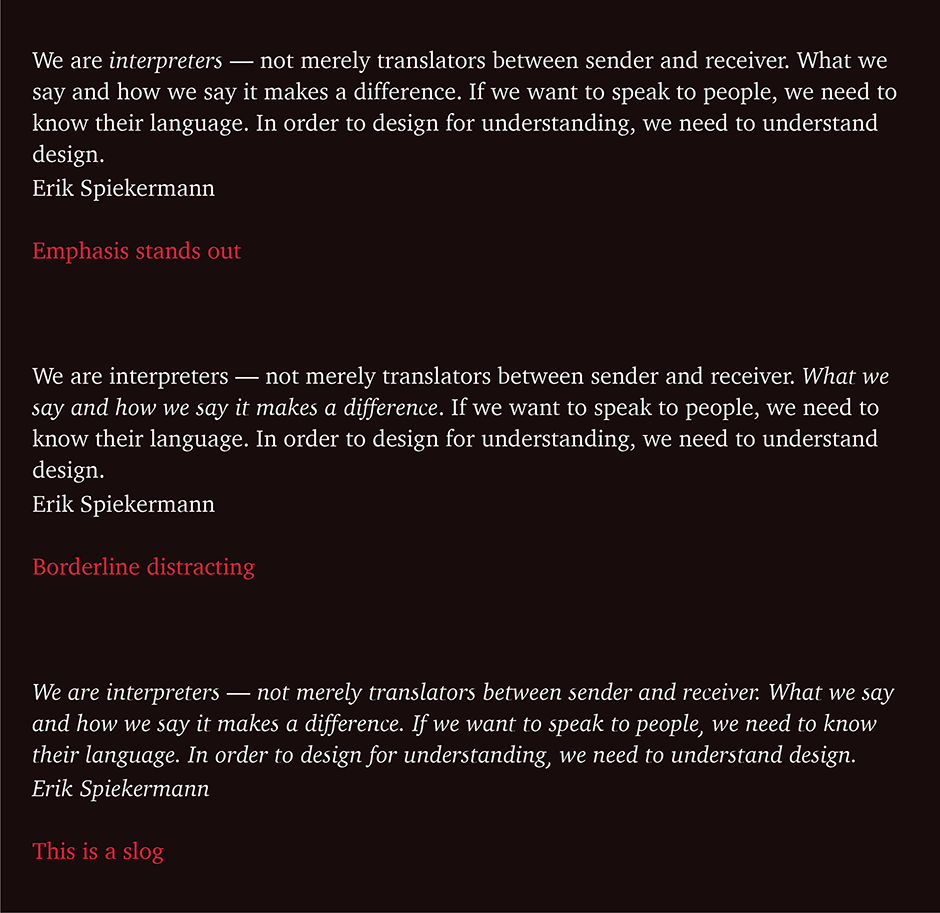
One of the simplest ways to create emphasis is to use an italic. Even though italics are generally intended for titles, foreign words, technical terms and the like, they can also be subtle emphasizers. Using the italic form of a typeface creates a distinct, yet harmonious departure in text copy.
Use italics to emphasize words, phrases or short sentences in text copy. Because their designs are usually cursive (as opposed to simply obliqued or slanted), the italic counterpart of serifed typefaces stand out a little more in a block of copy than sans serif italics.
One or two words in italic stand out without interrupting the reading process. A sentence set in italic beings to be more of a distraction than emphasis; and a paragraph becomes downright difficult to slog through.
Boldface
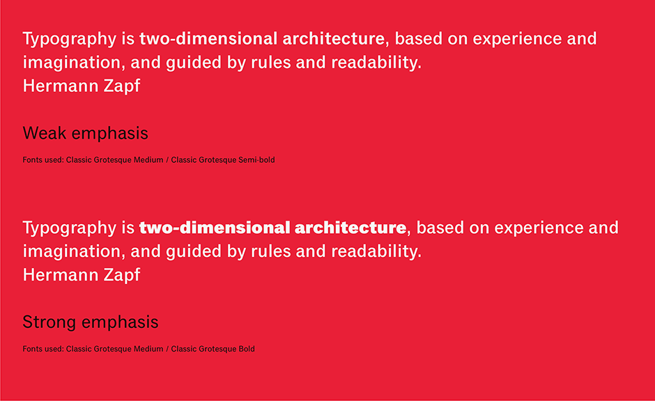
Emphasizing using bold type is just about as easy as using italics – and you’ll be making a stronger statement. The weight you use to create emphasis, however, should be the result of a conscious decision and not just the click of a mouse. Using the next heavier weight in a family might not be the right choice. In some typeface families weight changes are subtle. The next weight up from the basic text design may be too light to make a strong statement. Using it will simply distract the reader, rather than highlight an important point.
Size
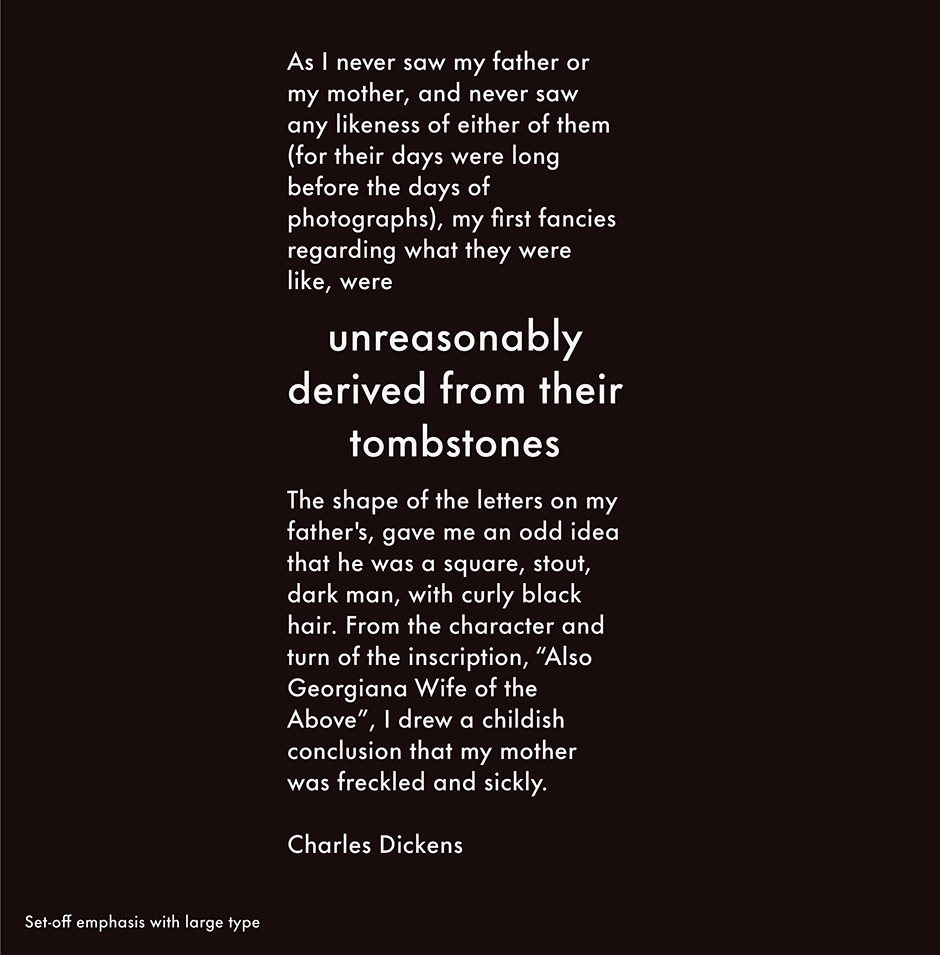
“Make it bigger” may seem like a logical guideline for creating typographic emphasis, While this can be effective, but there are some potential drawbacks to just bumping up the point size.
If you are emphasizing by increasing the point size of the important information, it’s best to separate the word, phrase, or sentence from the rest of the copy. Try centering it in the text column, like a pull-quote, or run it as it’s own copy block keeping the column width consistent with the text around it. If you are emphasizing a phrase or sentence, word spacing may also have to be adjusted to be optically consistent with the smaller copy.
Color
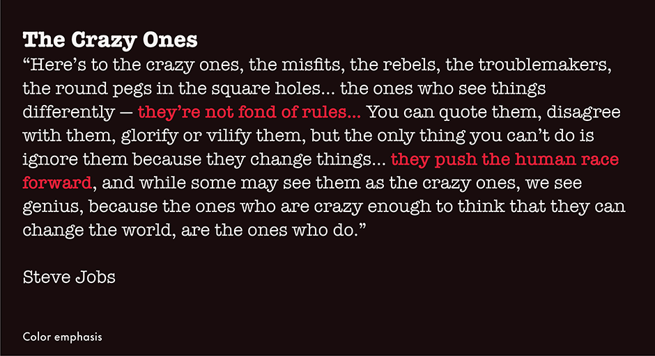
Color is an excellent emphasizer. Color is irresistible – unless there’s too much of it. It is color’s rarity that makes it noticeable and a powerful emphasizer. The less color you use, the more valuable it becomes.
A couple of tips for emphasizing with color: Set colored type in bold, to compensate for color’s paleness relative to black. And don’t waste color on headlines. Headlines already stand out by virtue of their size and boldness. Color only decorates them.
Typeface Change
A change in typeface also creates emphasis. There is, however, a typographic “Golden Rule” of sorts for combining fonts from unrelated families: The greater the difference in type designs, the better the mix – and the more powerful the emphasis. The least risky combination is using a sans serif typeface for emphasis in copy set in a serif design. Using a sans serif design as an emphasizer in copy set with a different sans serif face almost never works. Visually, strong contrasts typically don’t create problems, but when typefaces from different families that look a lot alike are combined the result is visual discordance rather than emphasis.
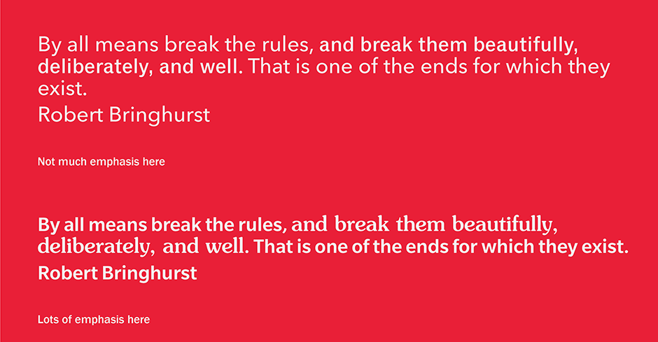
The typeface used as an emphasizer should also be bolder and have about the same x-height as face used for the rest of the text copy.
The Nevers of Emphasizing
Most typographic rules leave a lot of room for “artistic” interpretation. There are a few associated with creating emphasis, however, that are right up there with not eating crackers in bed.
- Never underline
- Never emulate a “highlighter” by putting a yellow tint over the copy.
- Never use bold italic. If you want to be subtle, use italic. If you want to make a strong statement, use bold. Bold italics suffer from dissociative identity disorder.
- Never set all caps for emphasis. If you have to use caps in text copy, use small caps.
All methods of typographic emphasis are seductive; some are downright fun. The best uses of them, however, are restrained rather than effusive.
Download a pdf version of the Emphasizing in text manual.


